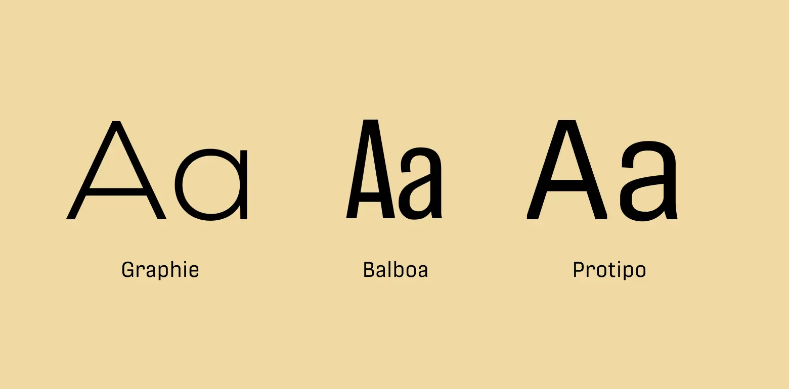
Emulate
OverView
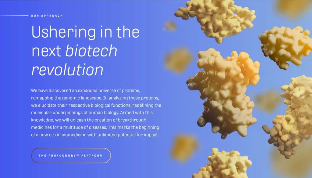
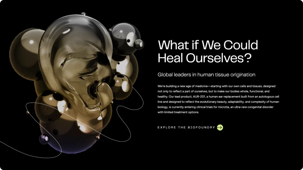
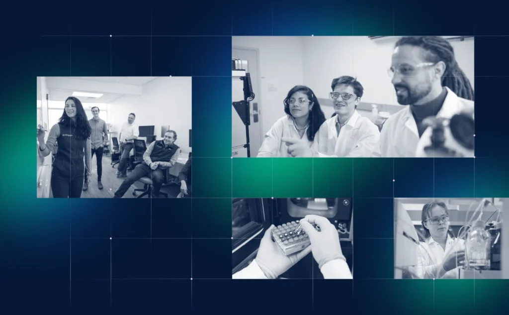
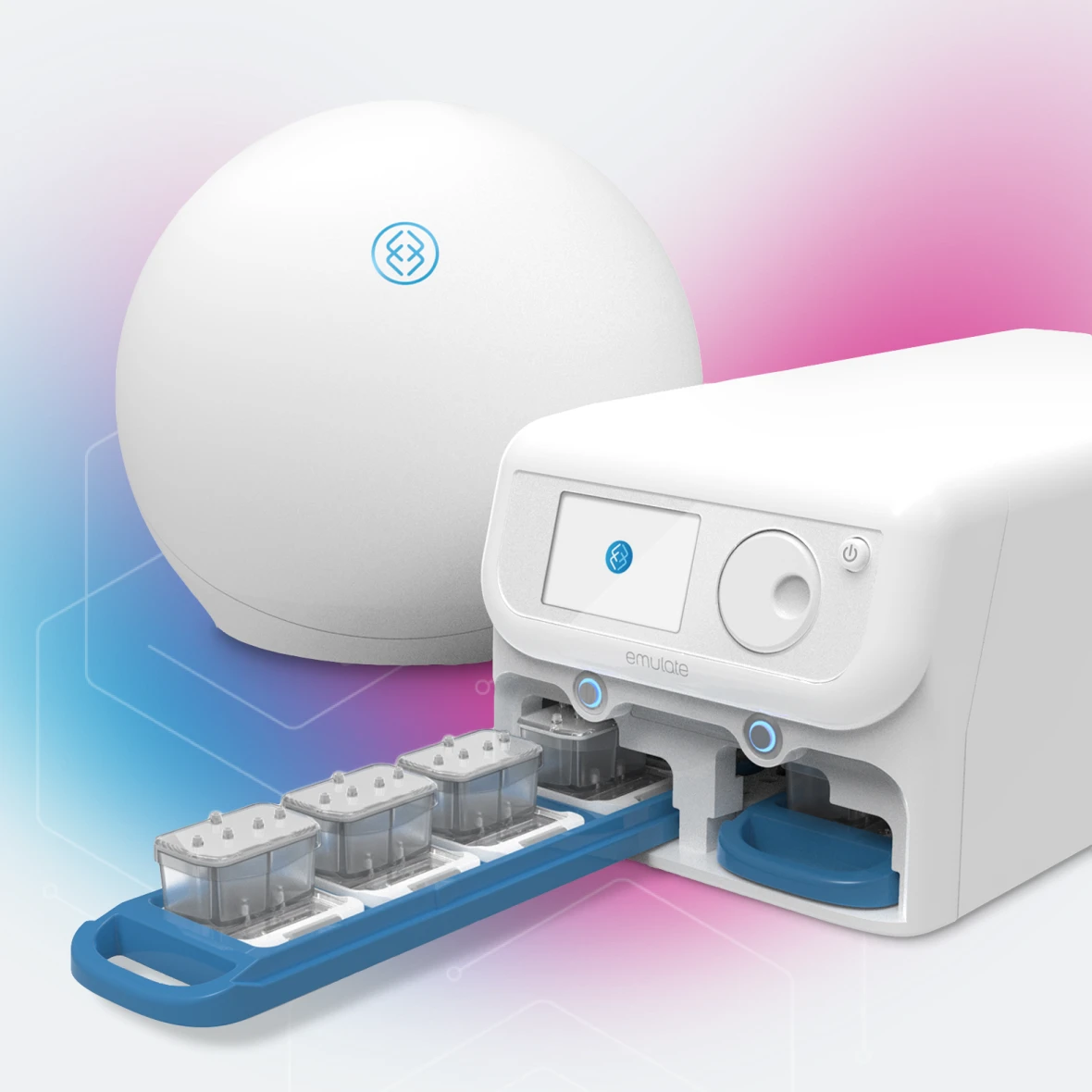
Emulate is an energetic company pioneering a new era in human health through the power of organ-chip technology. Through a combination of biology, design, and engineering, Emulate has developed the Human Emulation System, which gives researchers unprecedented abilities to recreate the human microenvironment for the purposes of understanding how disease, drugs, chemicals and cosmetics affect our health.
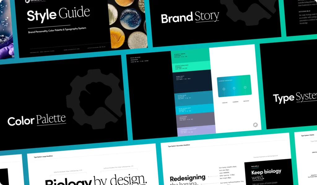
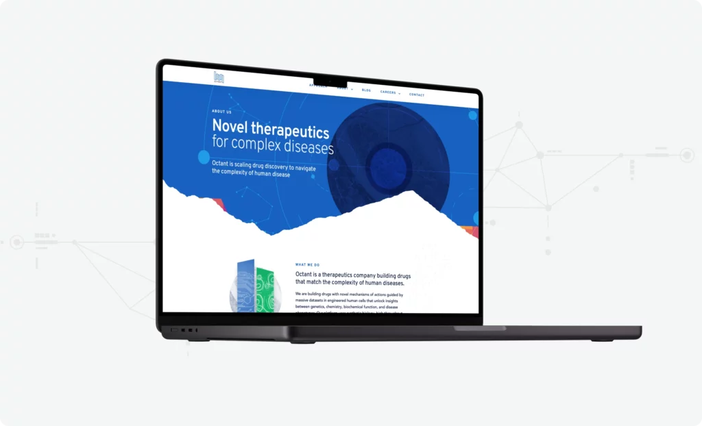
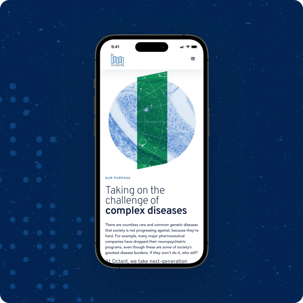
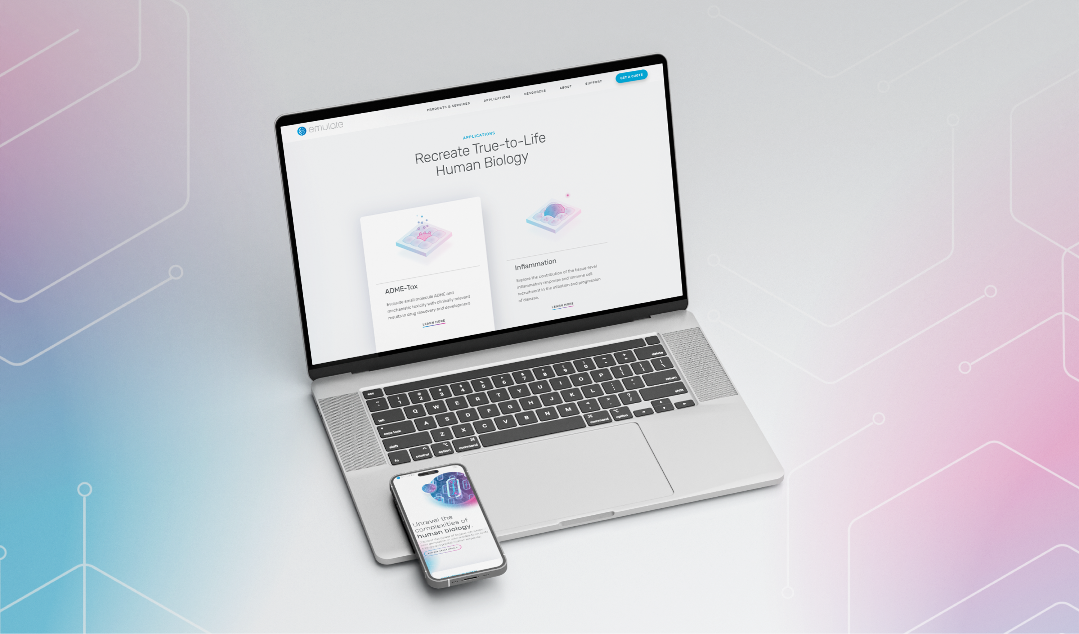
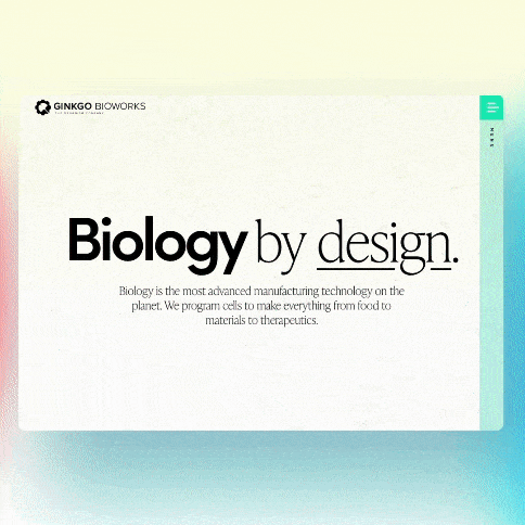
The Emulate team came to us motivated to evolve and deepen their brand language, while also building a new website with a robust infrastructure that could scale with their business. The ICS team was also tasked with expanding the existing Emulate visual language by creating a sleek, modern, and responsive website to better communicate the benefits of Organs-on-a-Chip, and create a hub for their digital marketing efforts.
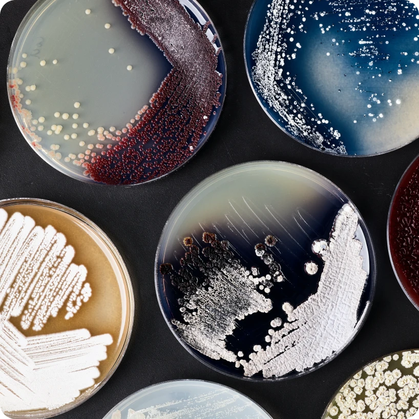
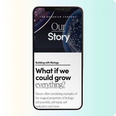
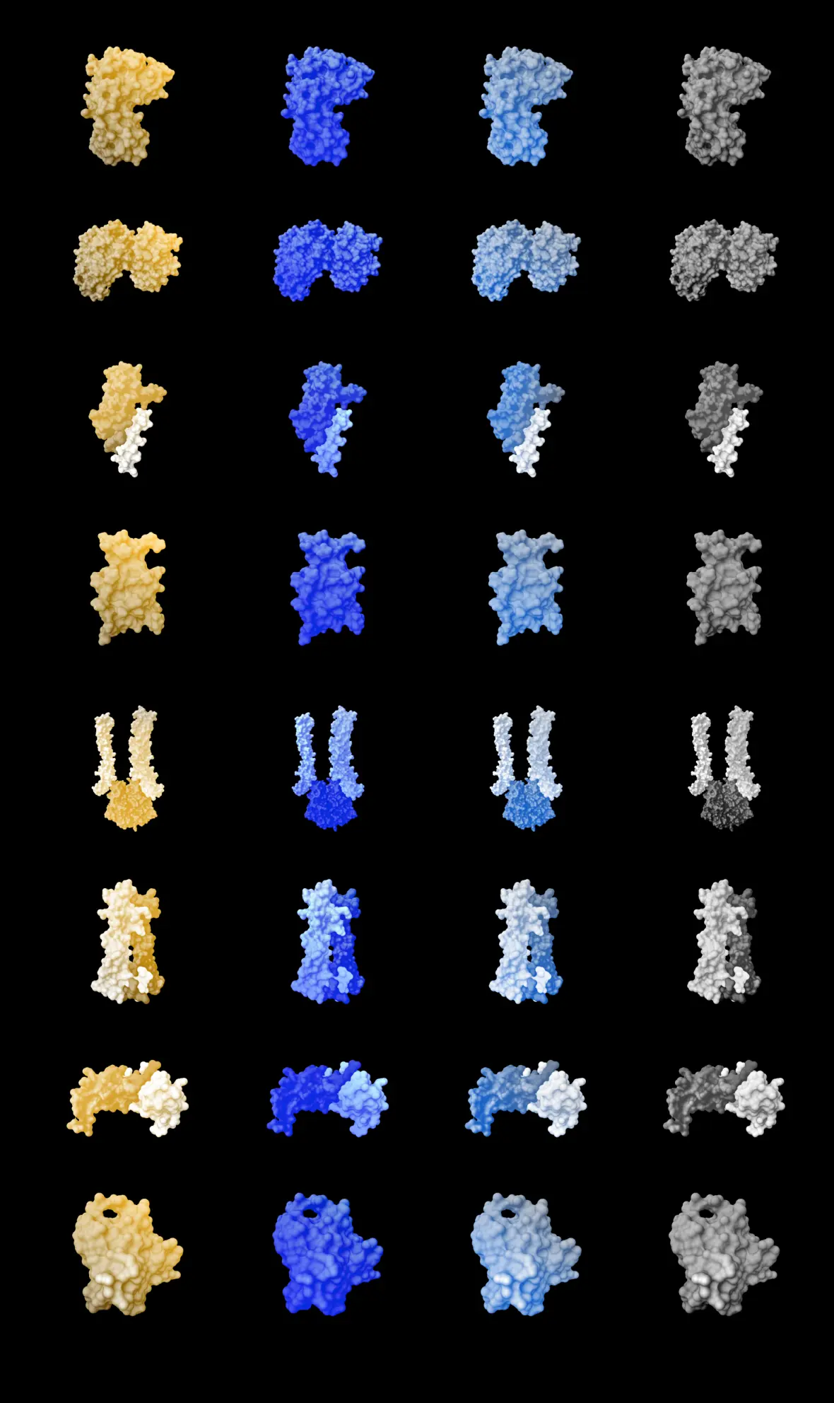
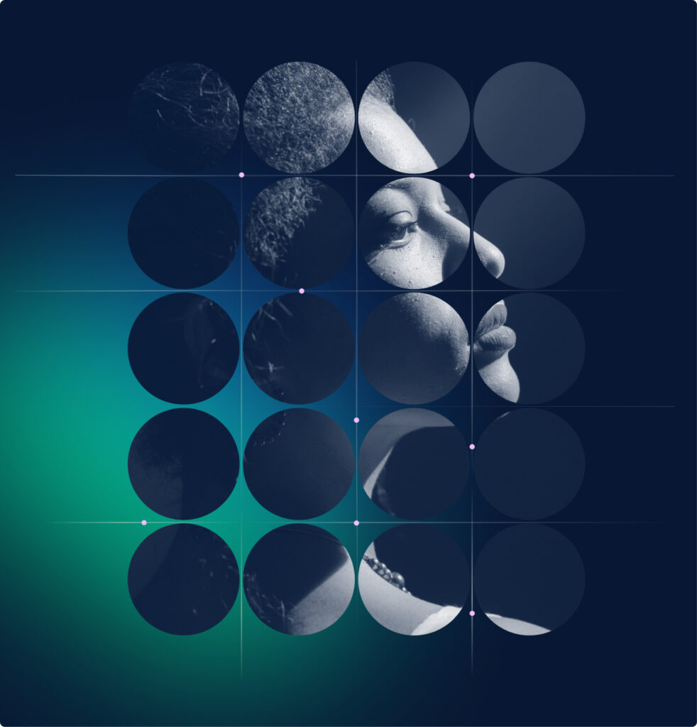
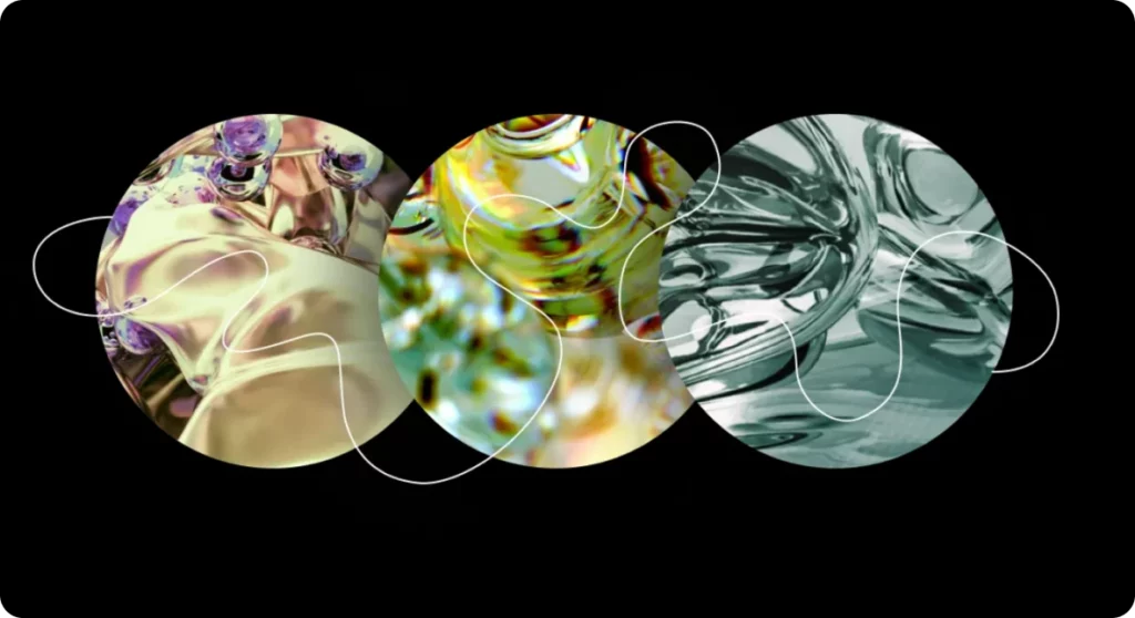
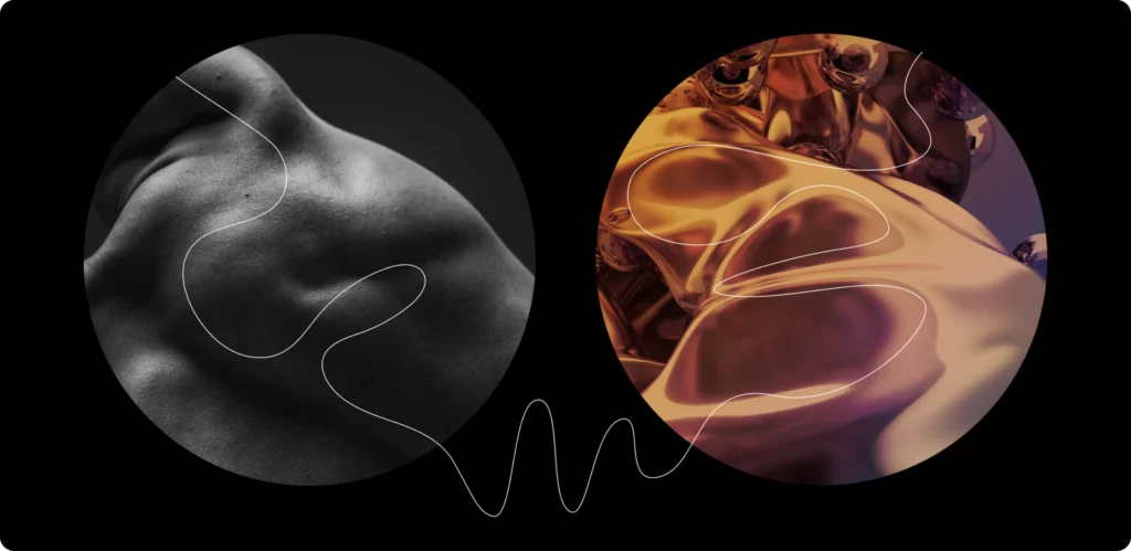
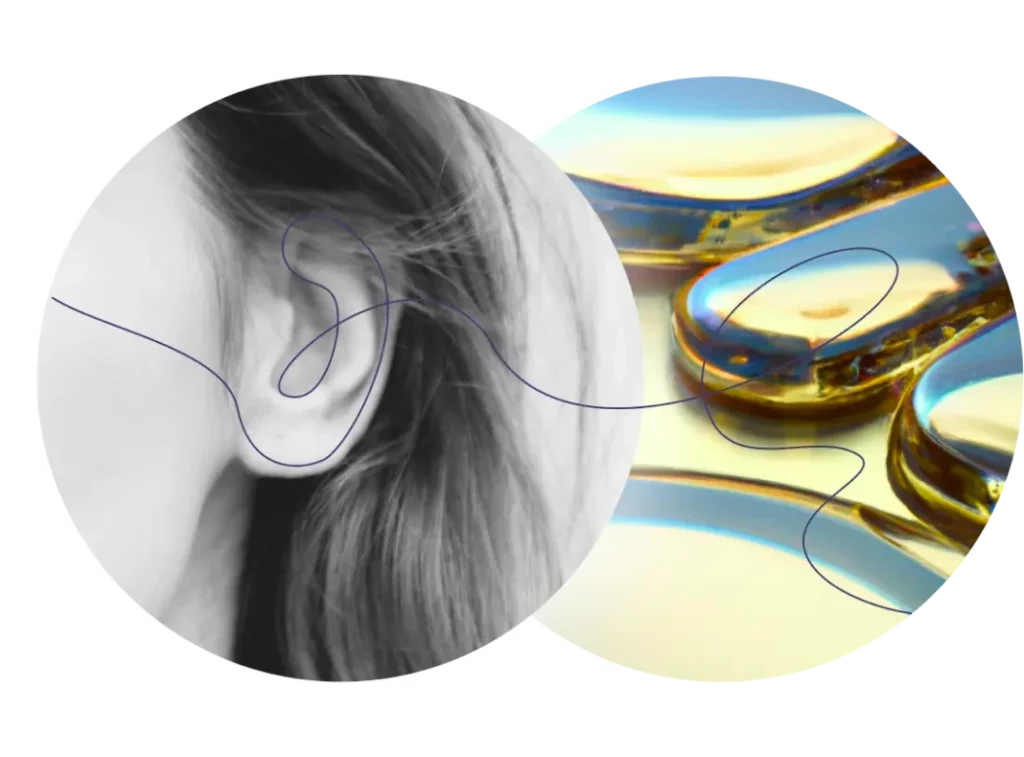
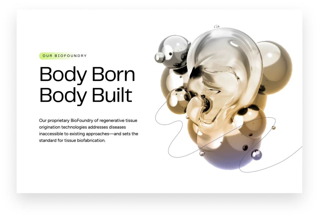
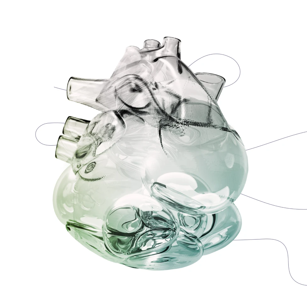
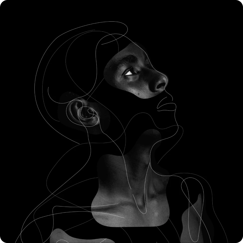
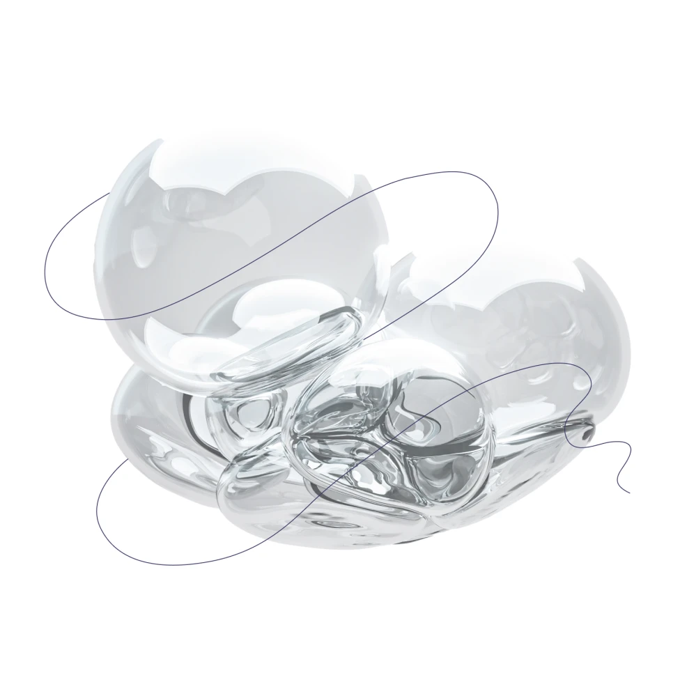
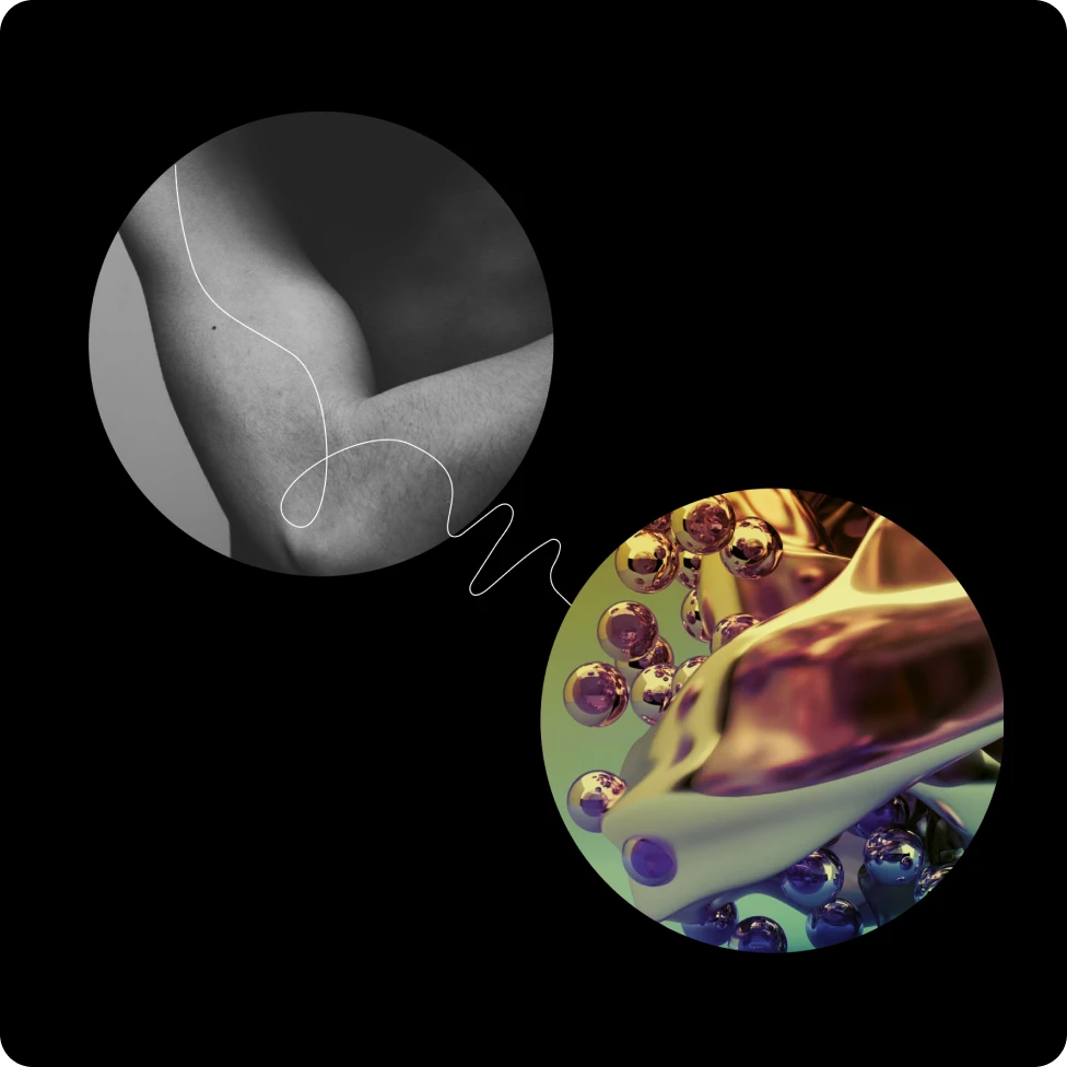
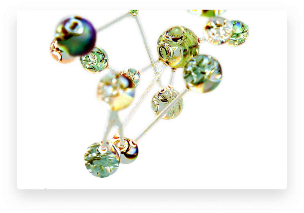
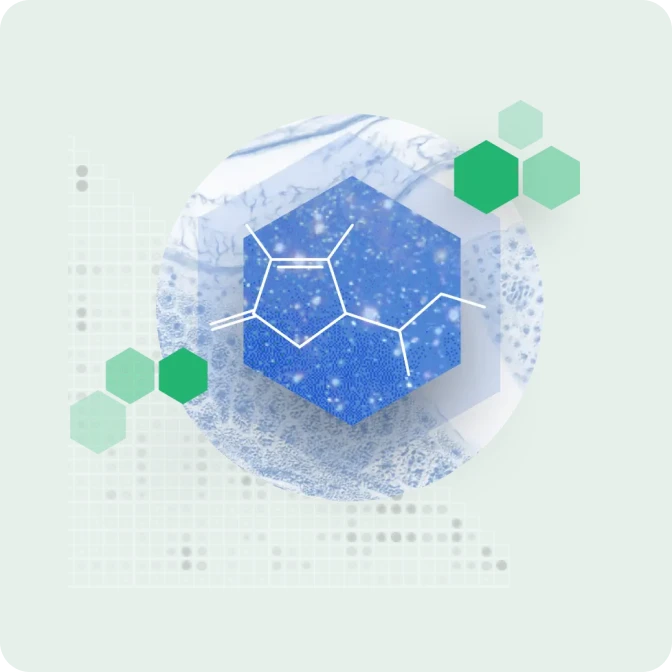
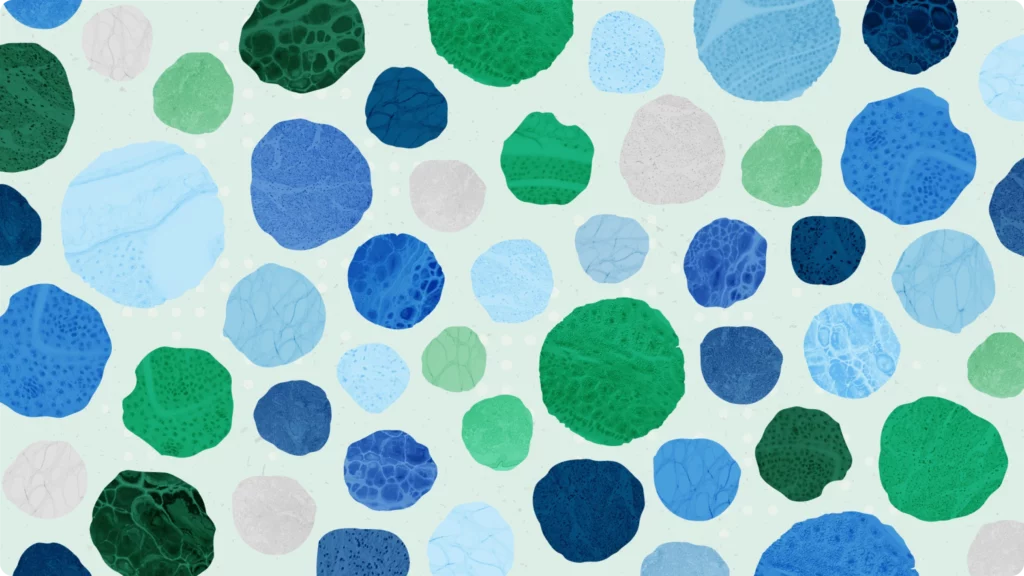
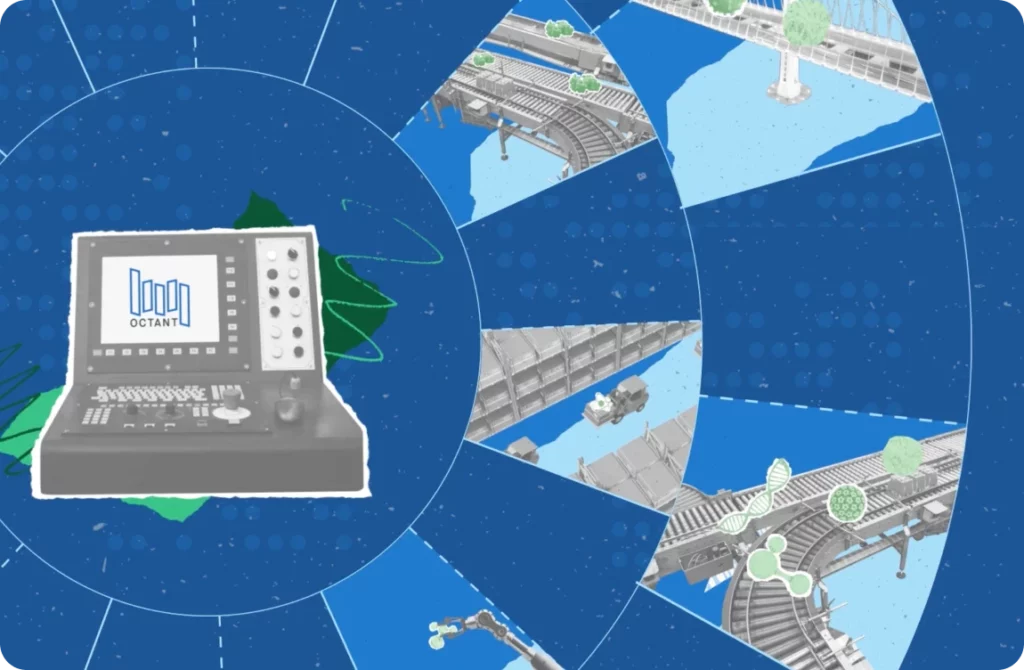
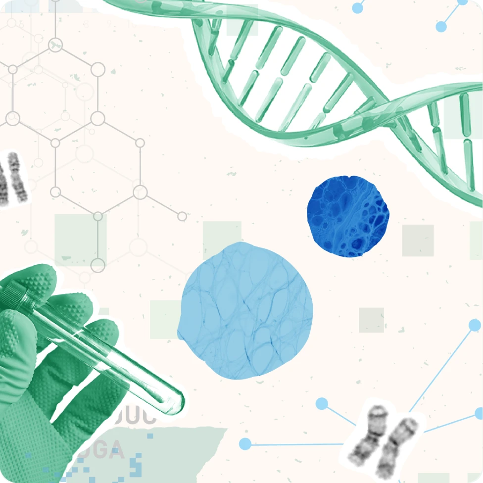
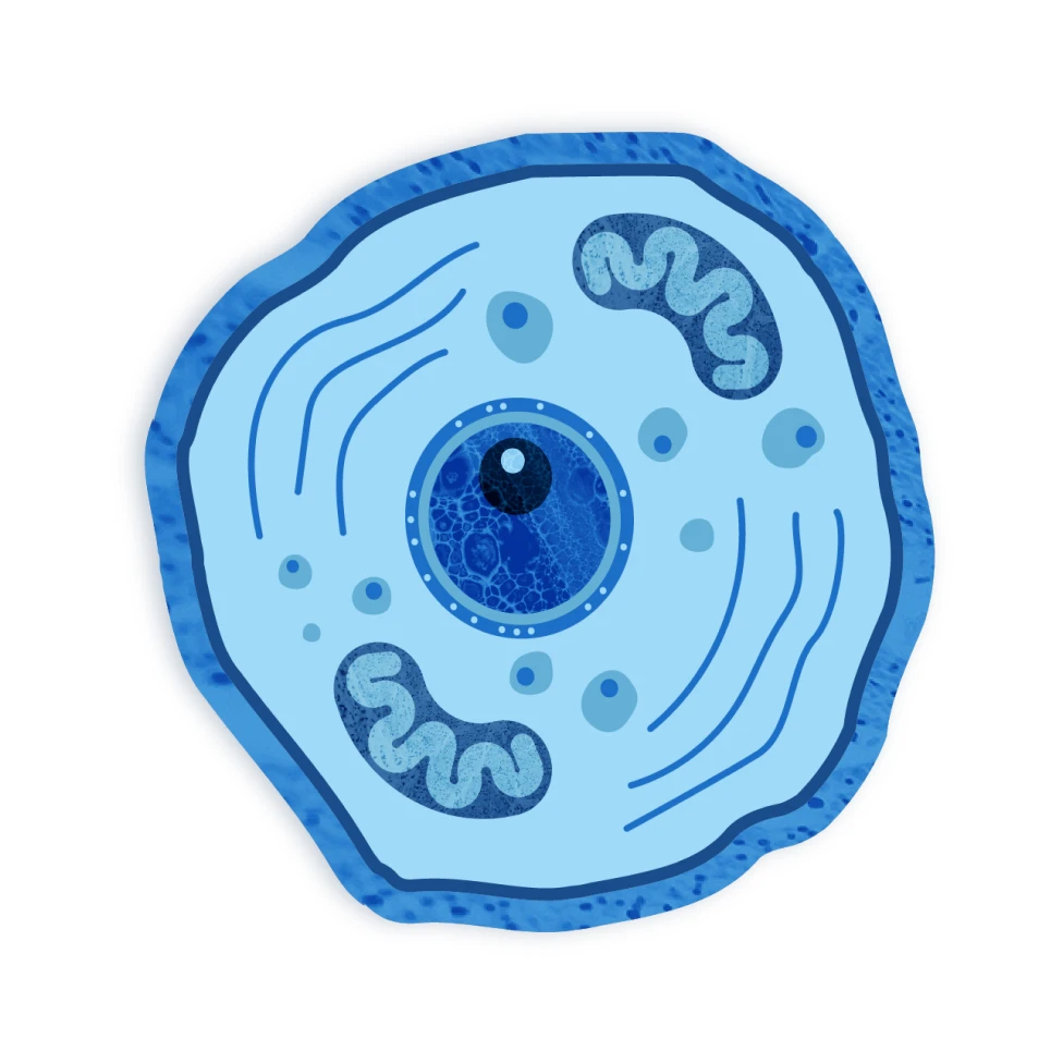
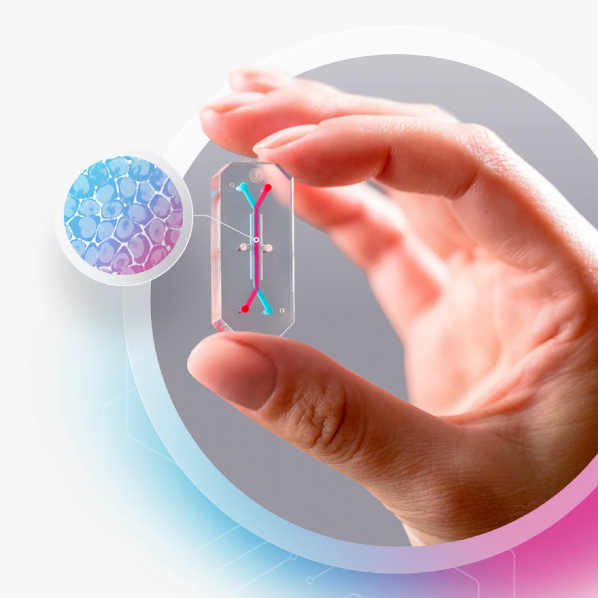
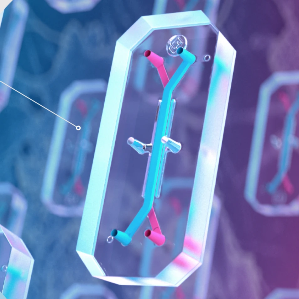
The result is a future-driven and engaging experience for visitors that elevates Emulate’s brand and reputation as a leader in the organ-chip space. The ICS team expanded upon Emulate’s visual language by layering in elements like biological microscopy details, along with glass-like transparency effects reminiscent of Emulate’s transparent organ-chip technology, introducing visual depth and elegance that connects the biology to the product. We designed content to be accessible and immersive by using custom animations, illustrations, and narrative-style page layouts to provide more opportunities for storytelling and a more captivating path to understanding the power of Emulate’s technology.
Our Role
- Logo
- Brand Identity
- Content Strategy
- UI/UX Design
- WordPress
- Creative Partner
Industry
- Biotech & Life Science

Get In Touch
We are full of ideas, we just need someone to share them with.