Sail Biomedicines
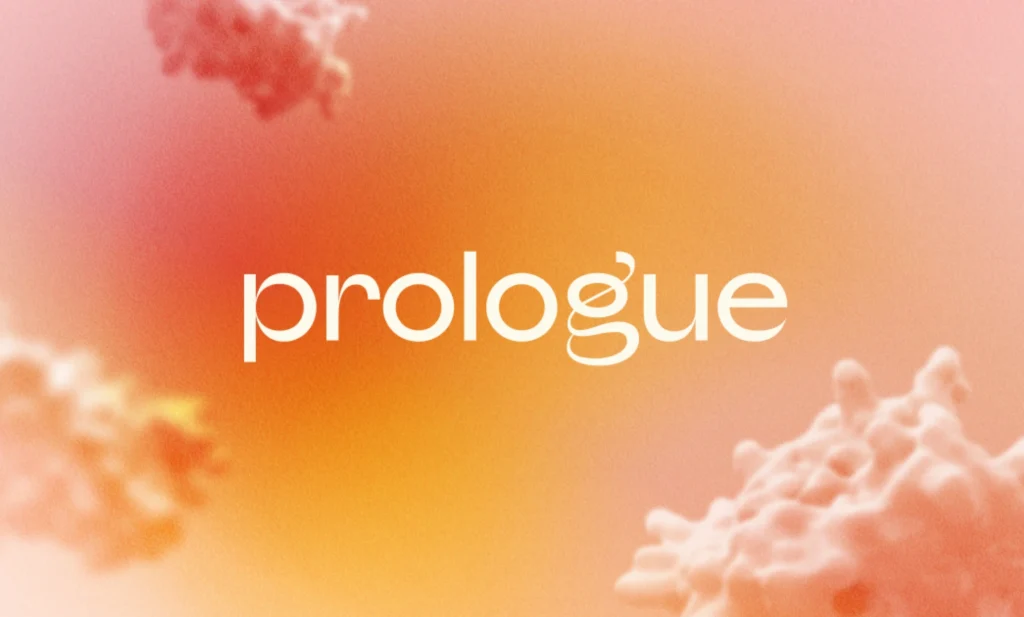
A brand built to evolve
Overview
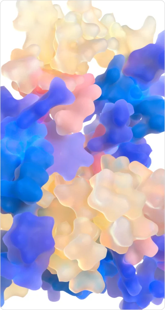
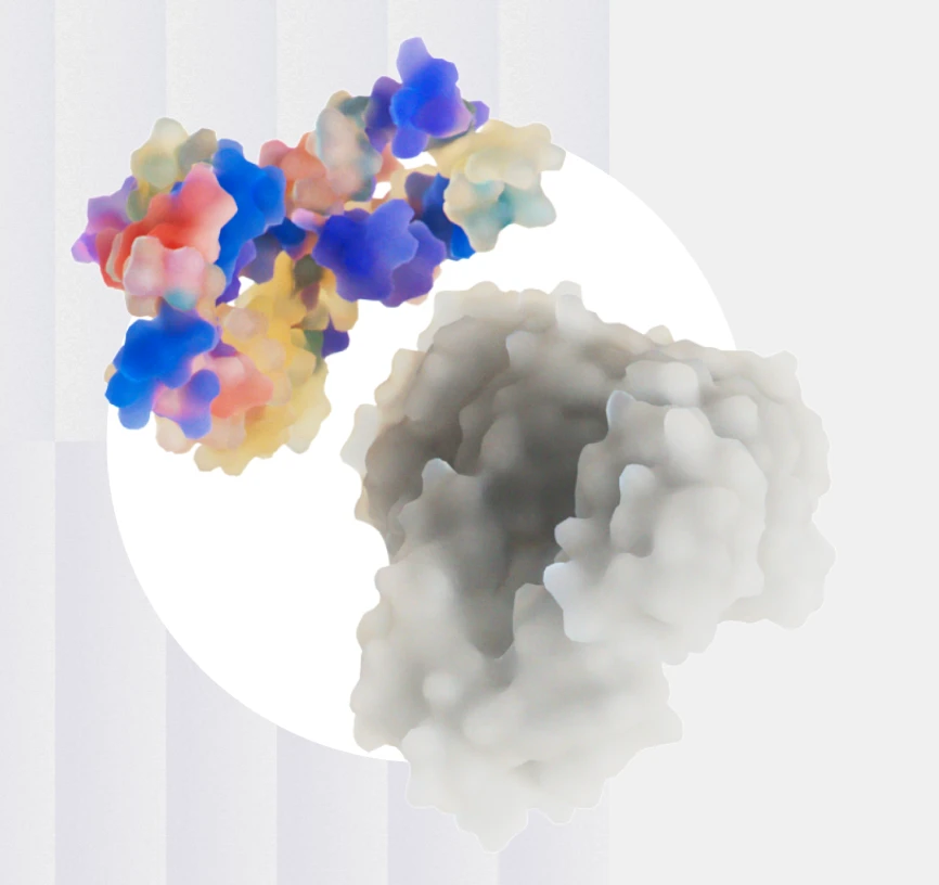
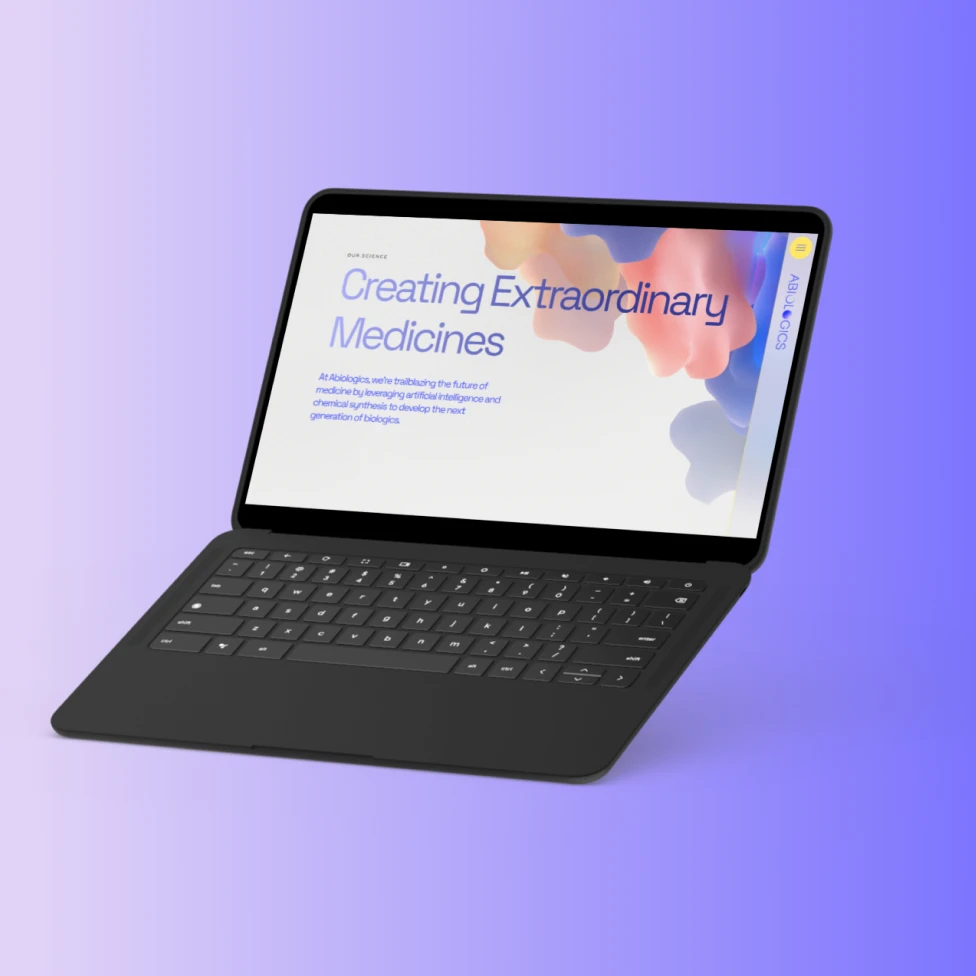
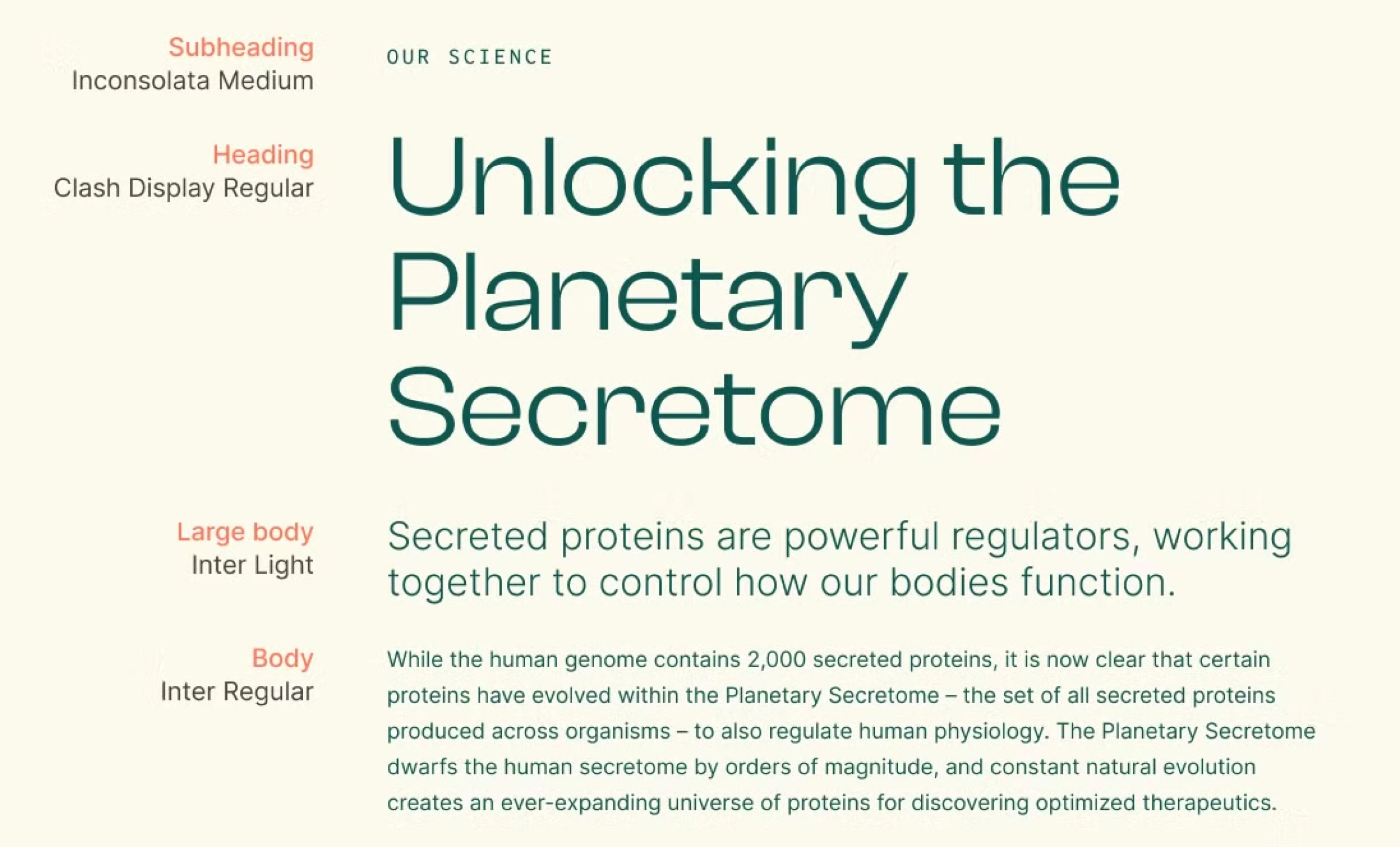
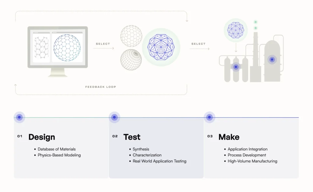
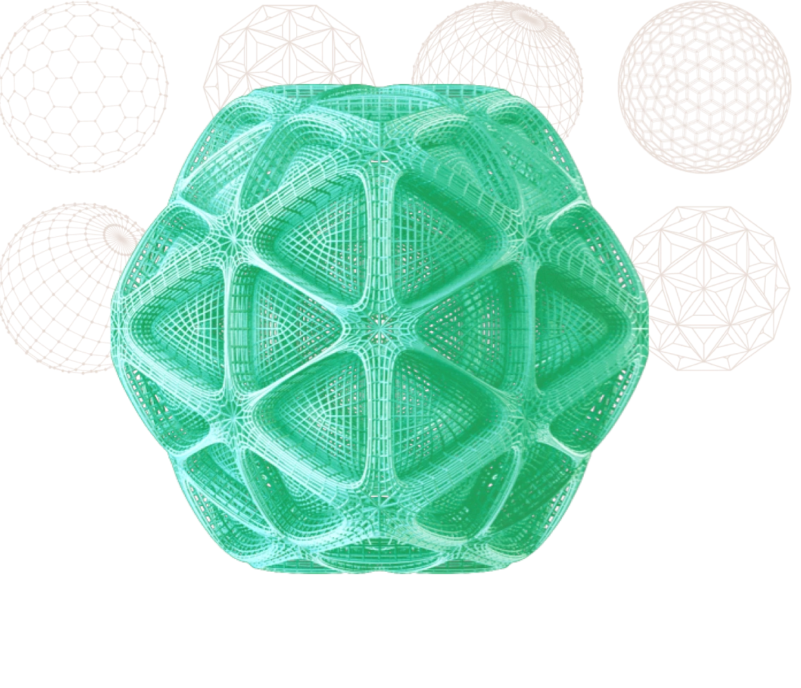
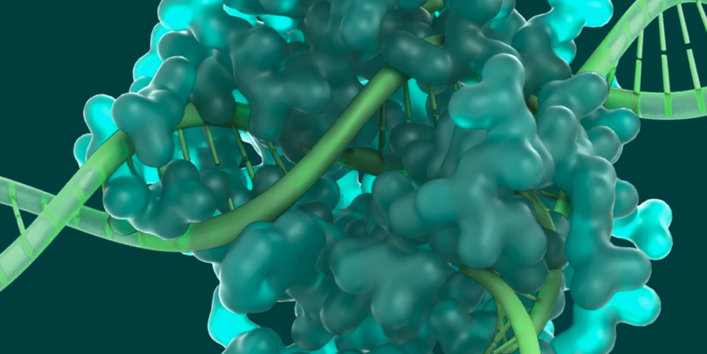
Sail Biomedicines was founded in October 2023, uniting first-in-category technologies from across the Flagship Pioneering ecosystem and bringing together more than eight years of data and multi-product platform-building expertise. The result is the Sail Platform, the most comprehensive toolkit in the industry for programming RNA medicines.
Our Role
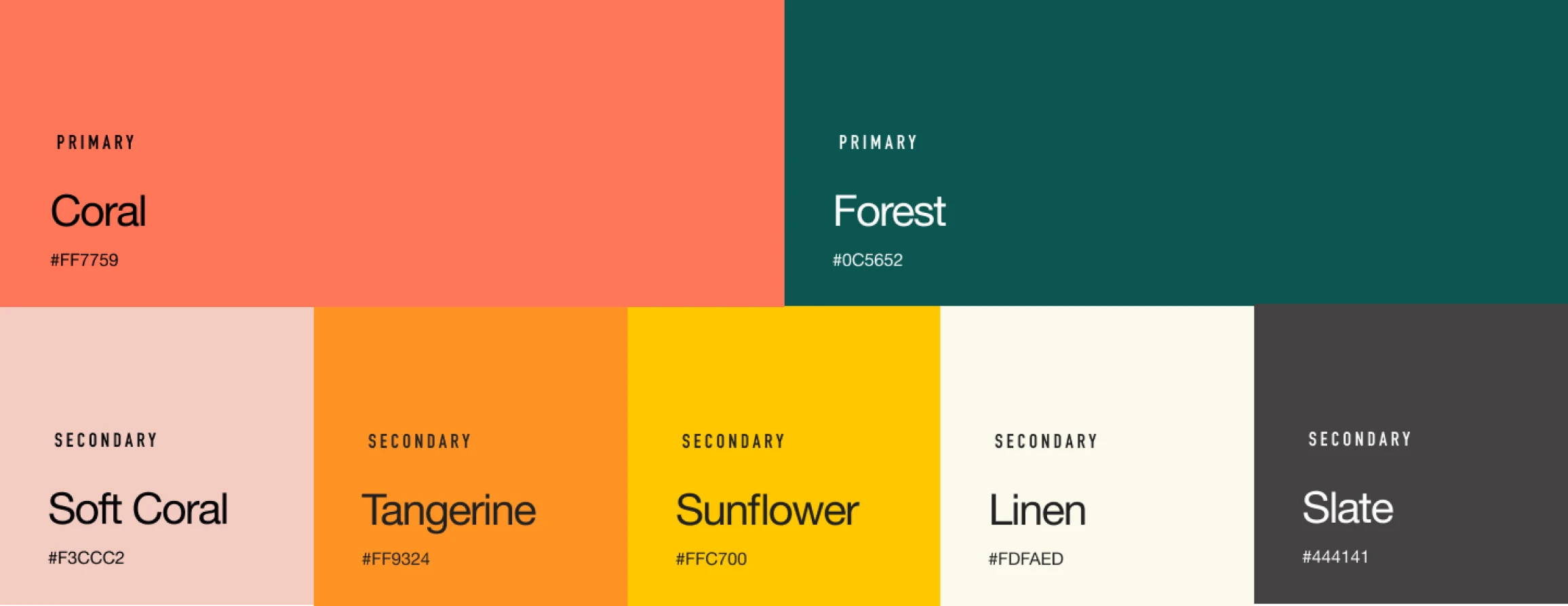
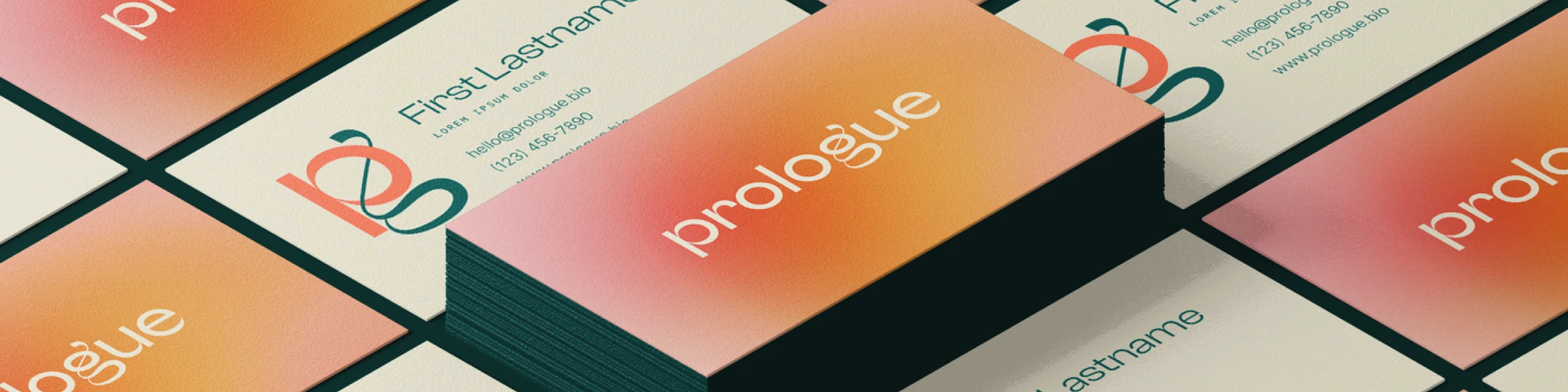
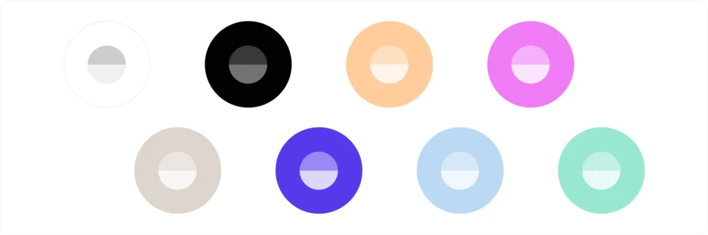
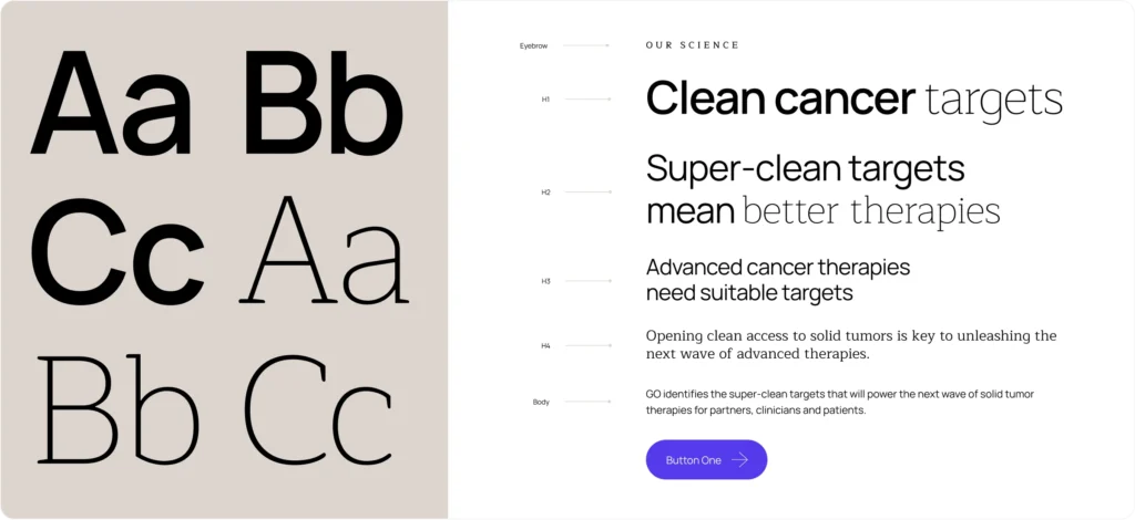
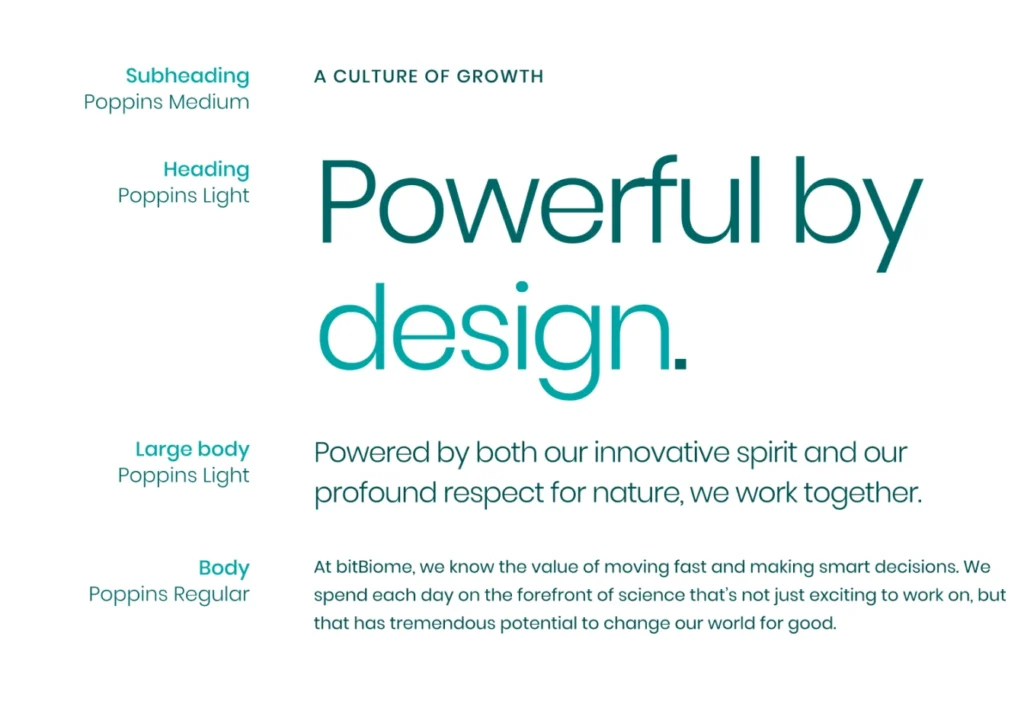
- Visual Identity
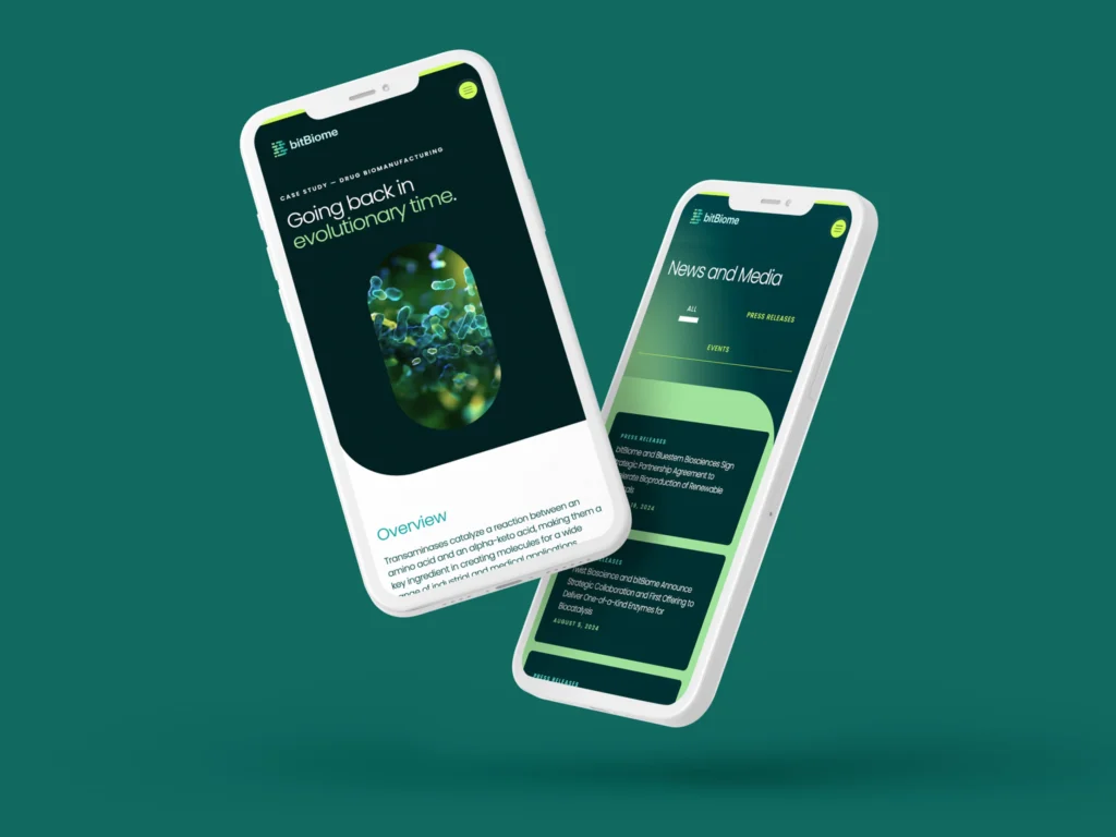
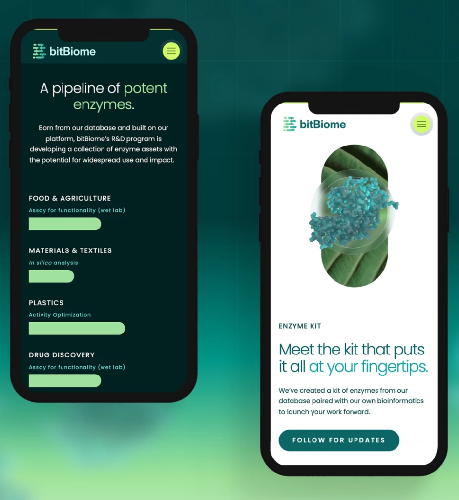
- UX/UI Design
- Webflow Development
- Content Strategy
- Brand Guidelines
Industry
- Biotech & Life Science

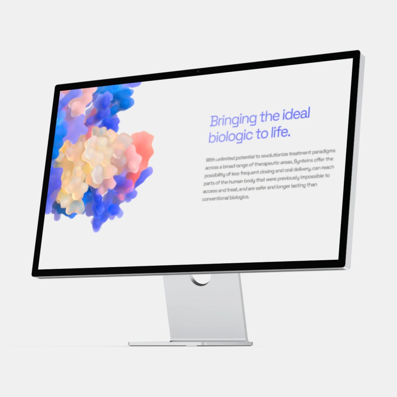
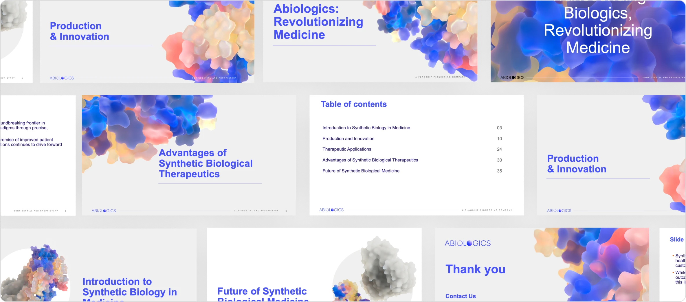
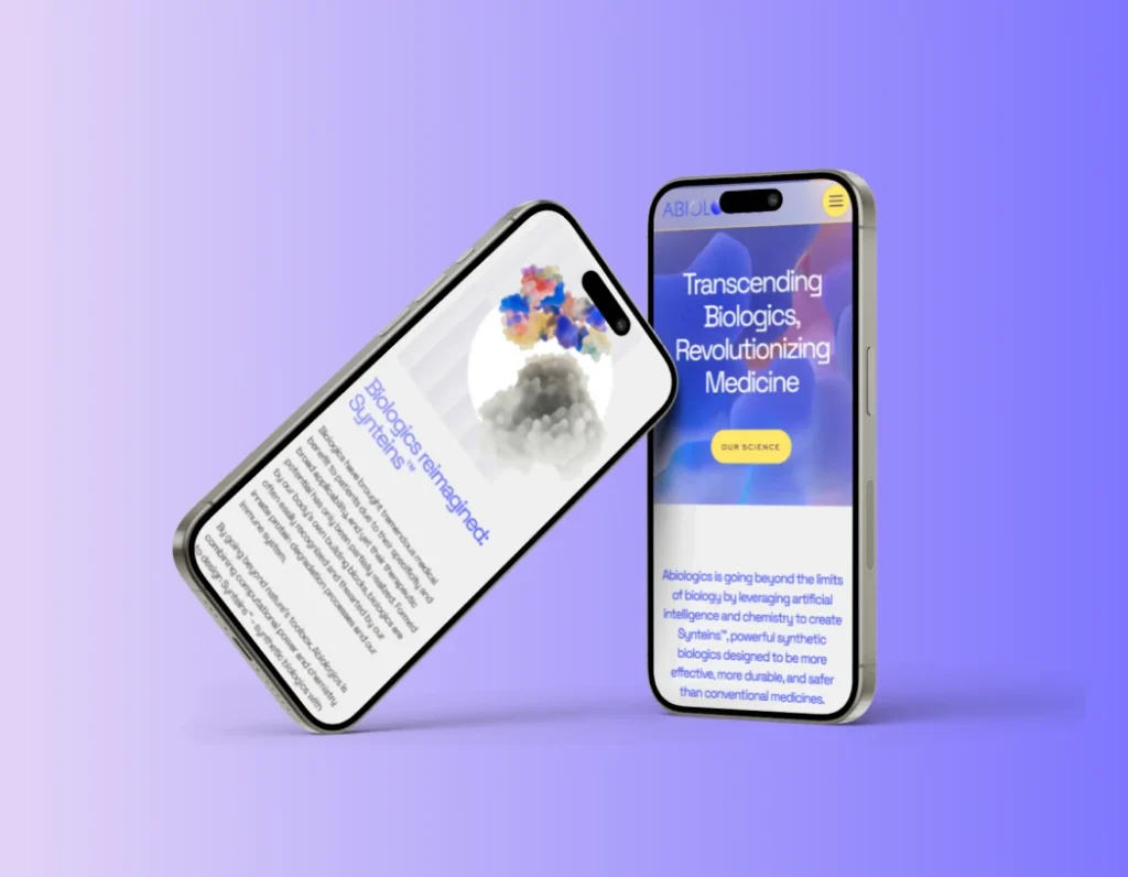
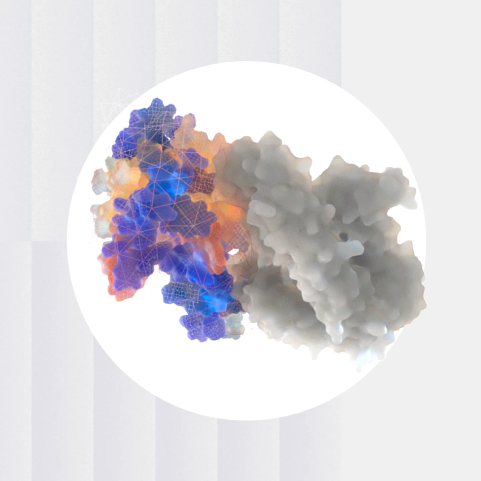
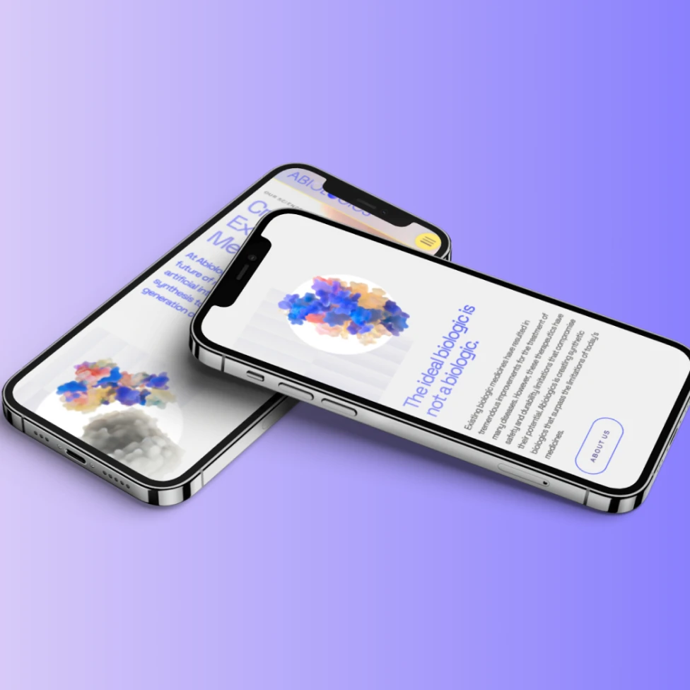
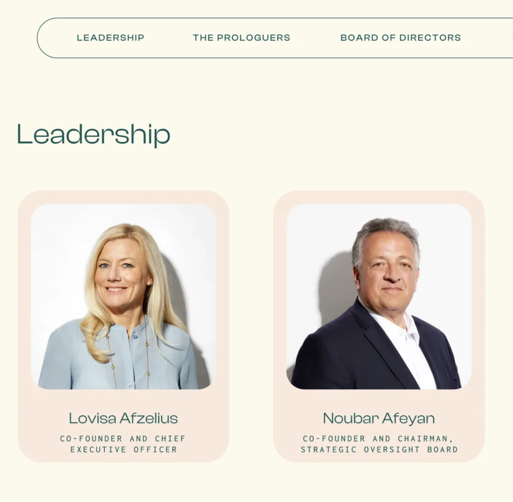
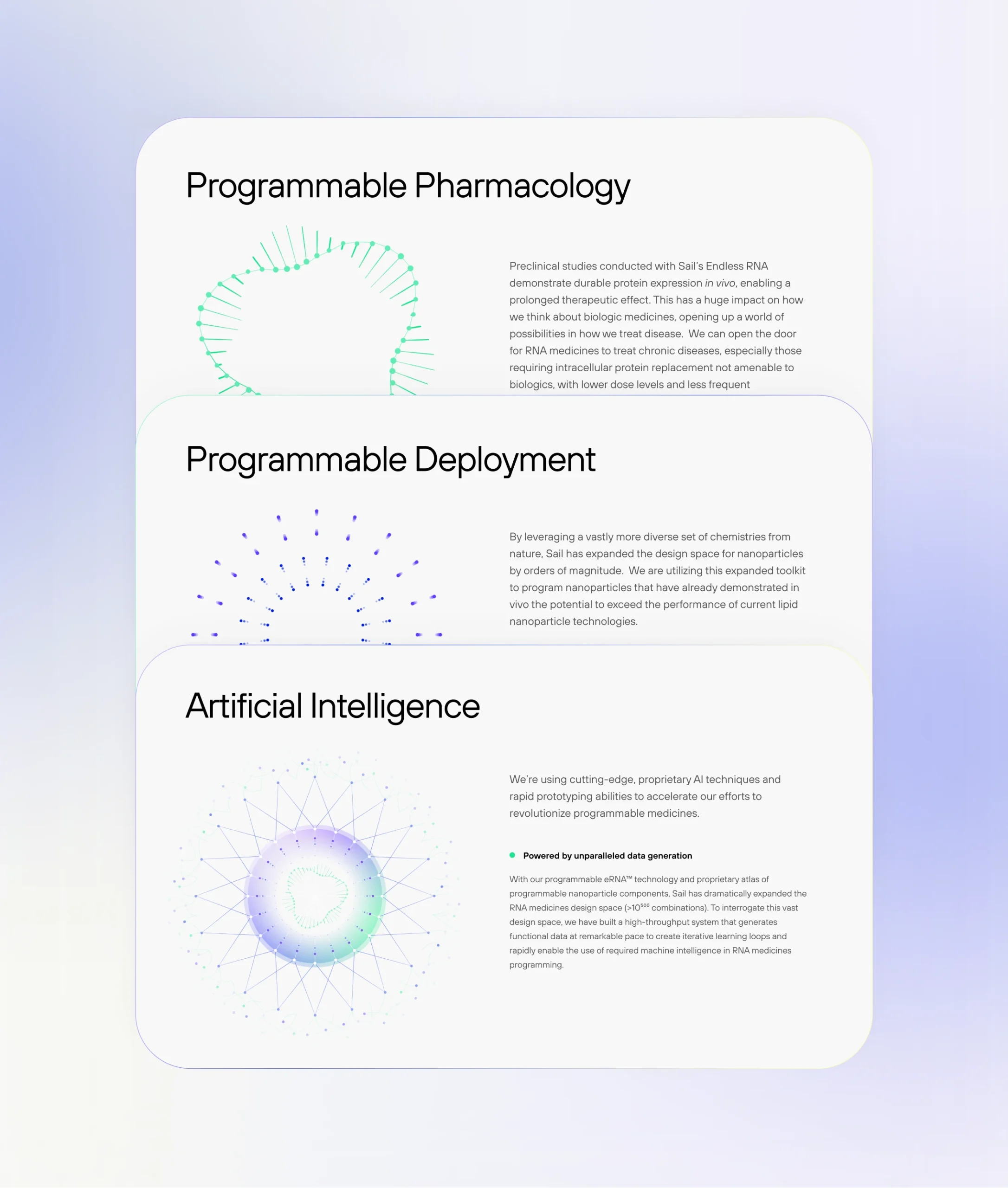
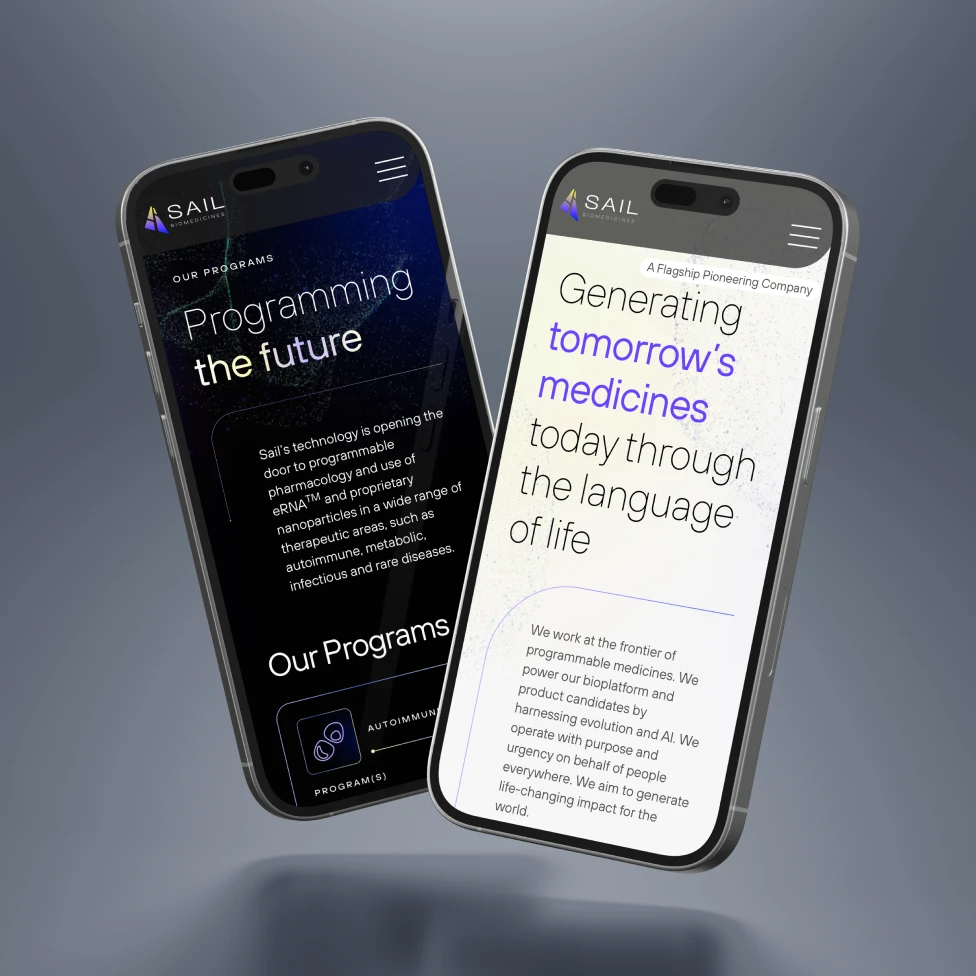
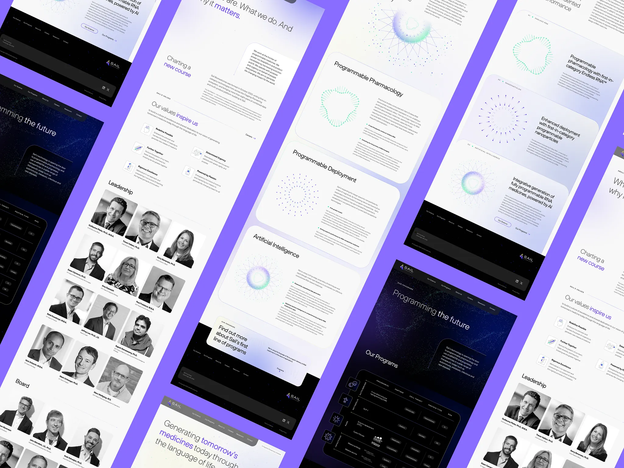
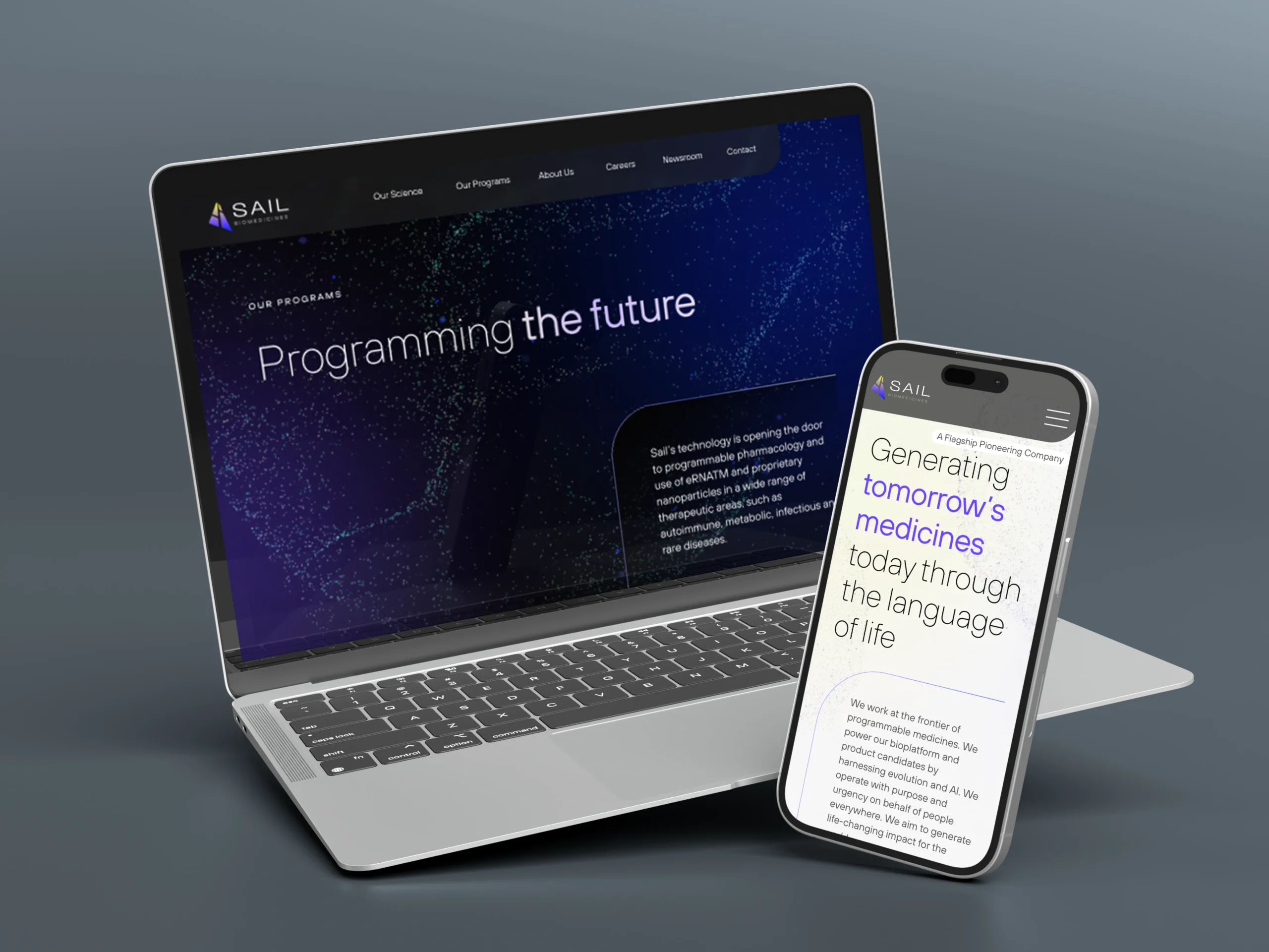
We took a phased approach to building Sail’s brand and website—balancing the immediate need for a site with the thoughtful development of a full, immersive experience. For Sail’s initial launch, we developed a brand identity, visual language, and website that positioned the company as a category leader from day one. The brand needed to capture the scale and ambition of Sail’s vision while making its complex science clear and compelling for investors, scientists, talent, and the media.
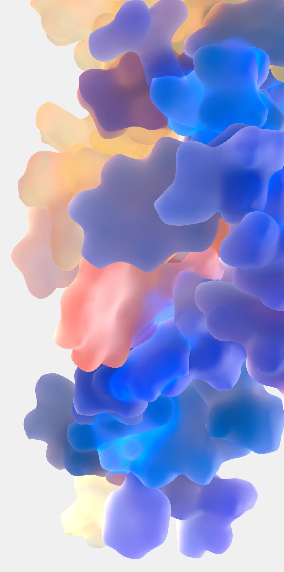
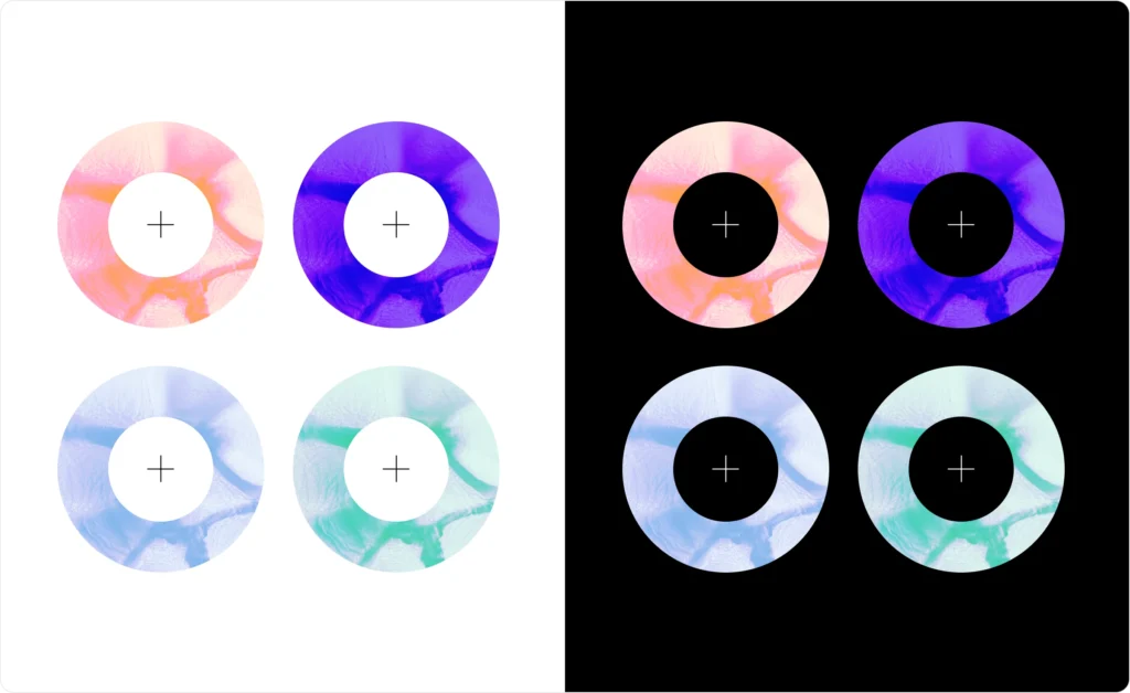
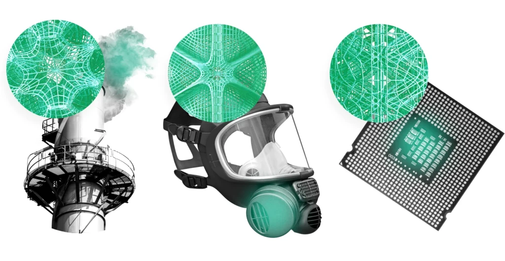
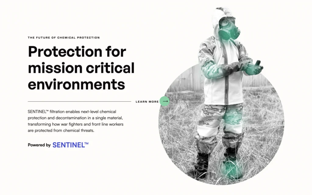
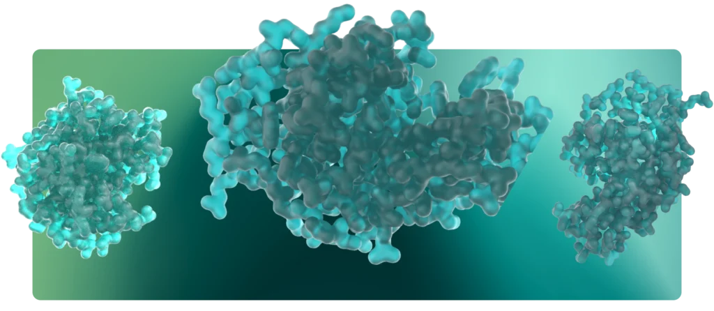
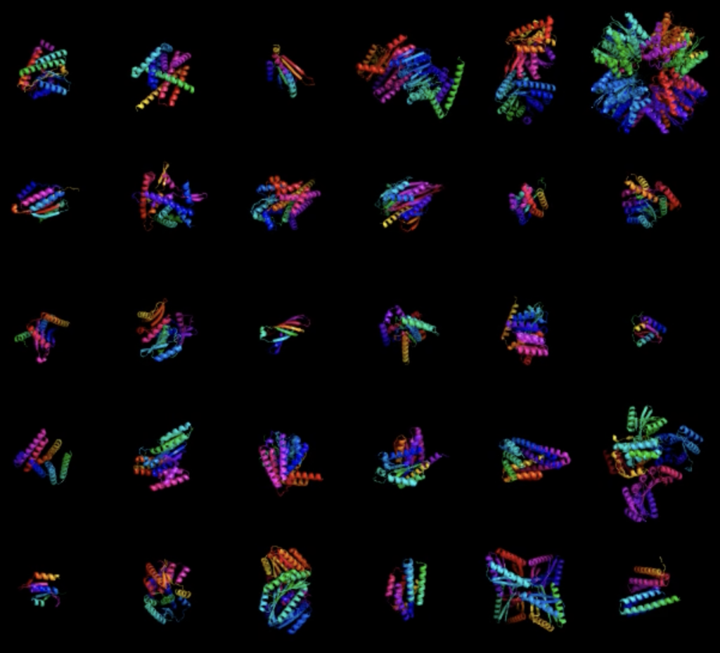
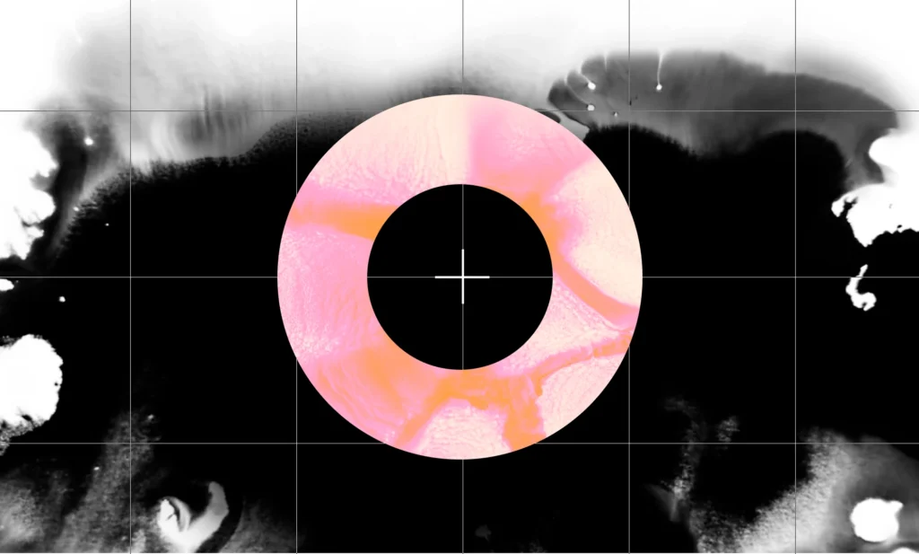
In the second phase of our work, we expanded the brand’s visual system to reflect Sail’s rapid evolution and growing momentum. Through audience insights, we refined the balance between accessibility and scientific precision, ensuring that the brand spoke to both expert and non-expert audiences without losing depth. We also explored visual storytelling approaches, testing different levels of abstraction to make complex concepts engaging while staying true to the underlying science.


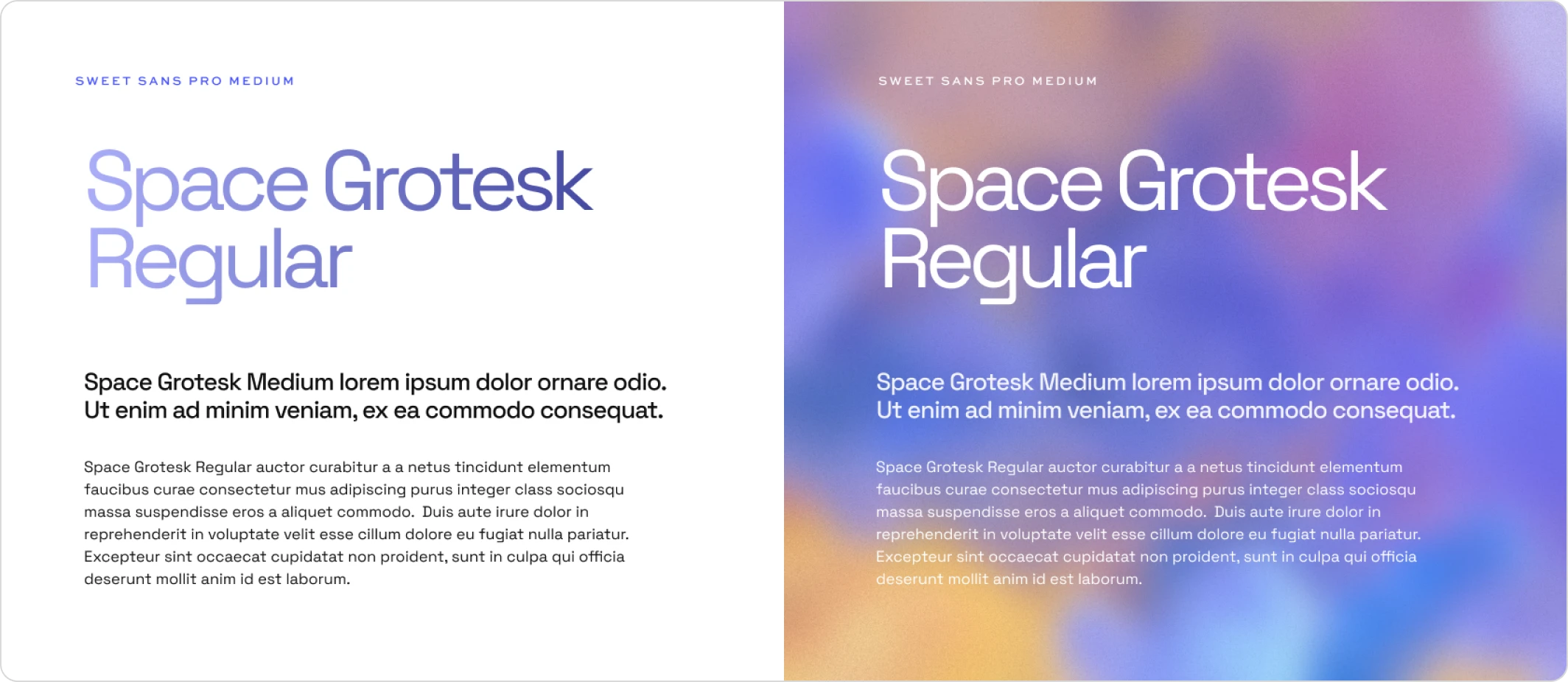
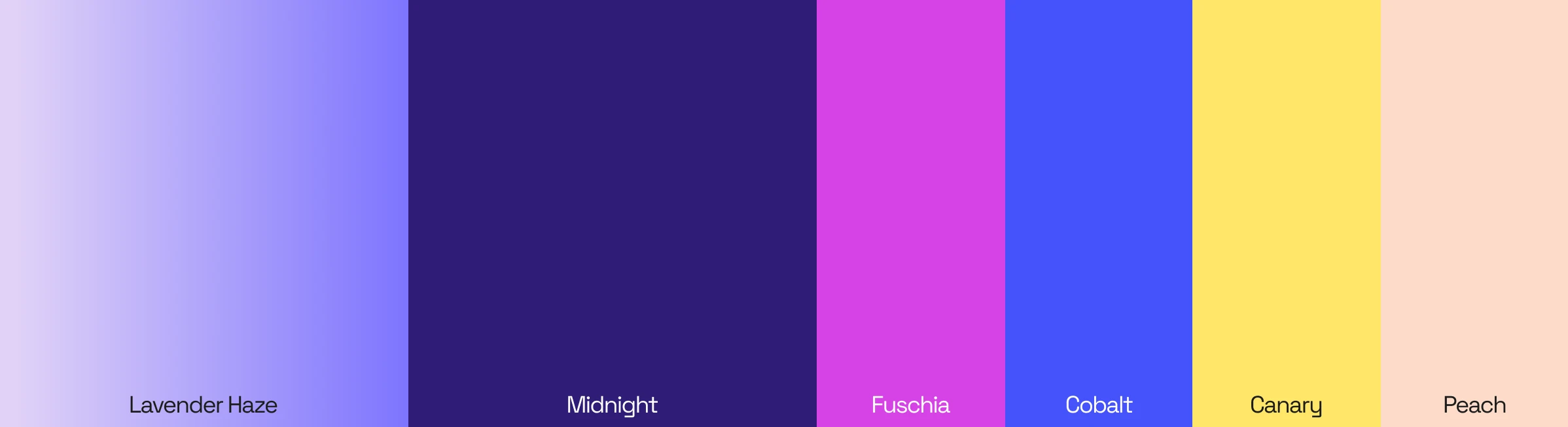
Beyond the website, we delivered a full suite of brand assets to ensure consistency and scalability across all touchpoints. This included a comprehensive style guide, an evolved logo, and a PowerPoint template, equipping Sail with the tools to maintain a strong and cohesive brand presence.
Through a refined visual system, strategic storytelling, and an enhanced digital experience, Sail’s brand signals a company that is defining the future of programmable medicines.
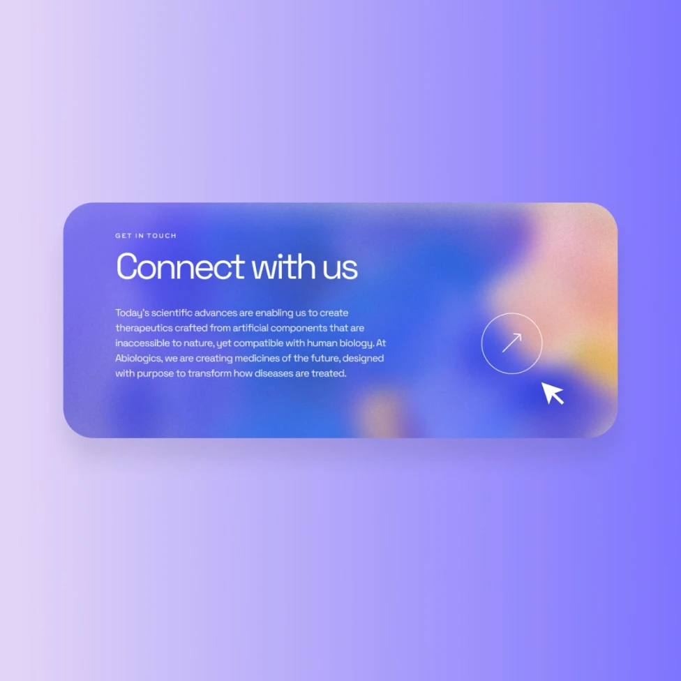
Get In Touch
We are full of ideas, we just need someone to share them with.