Slingshot
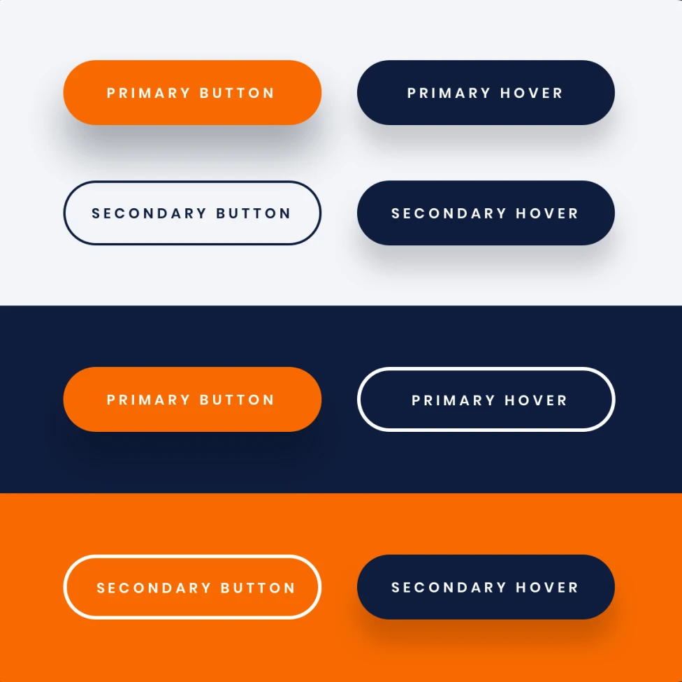
Modernizing to stand out from the crowd
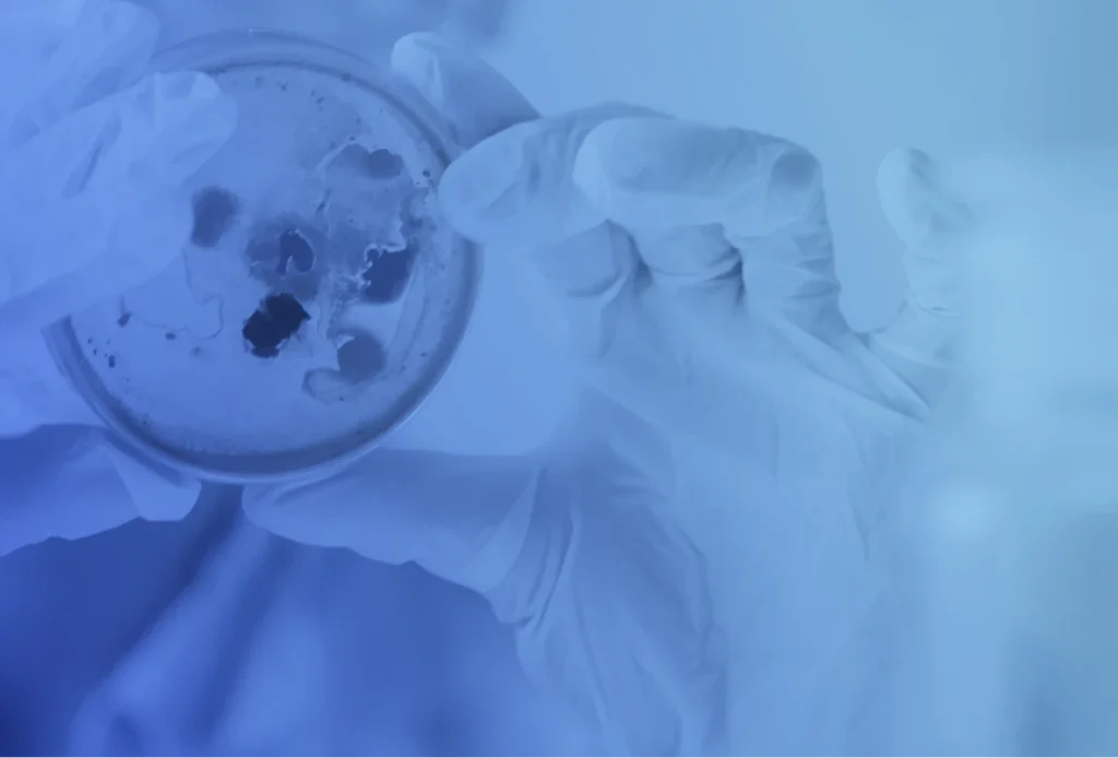
Overview
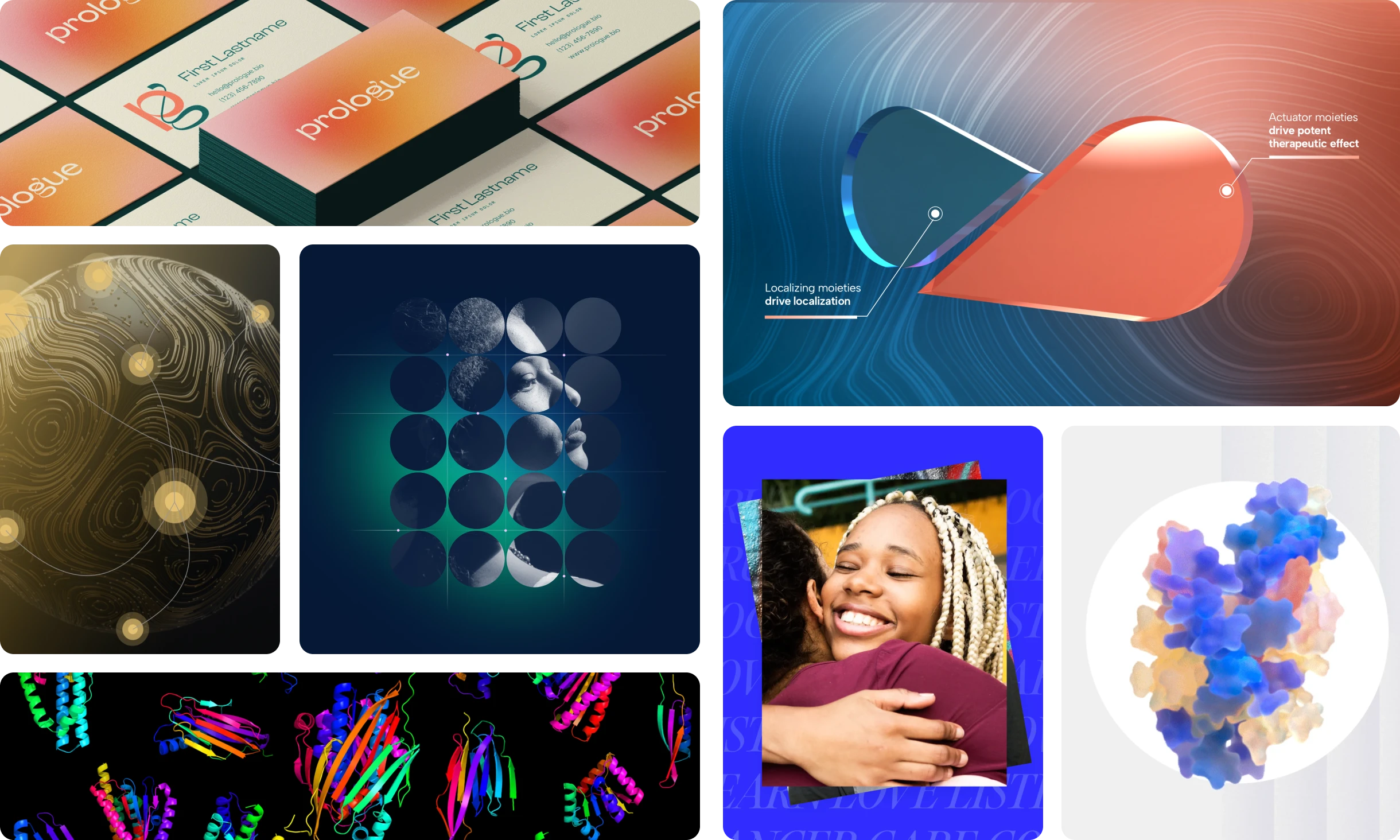
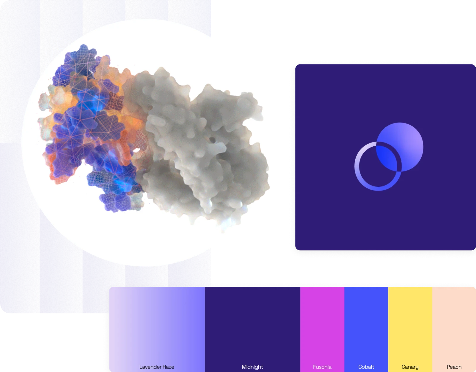
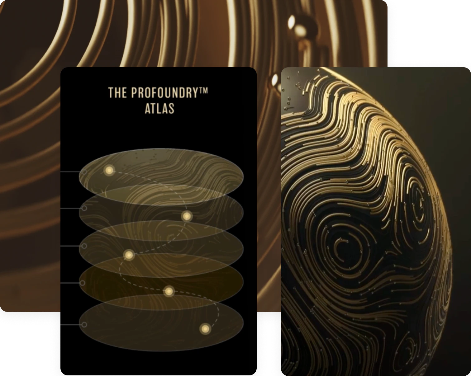
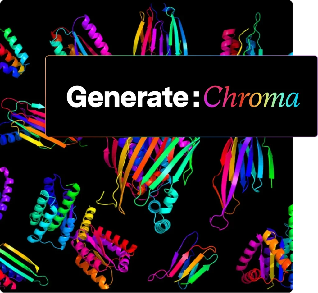
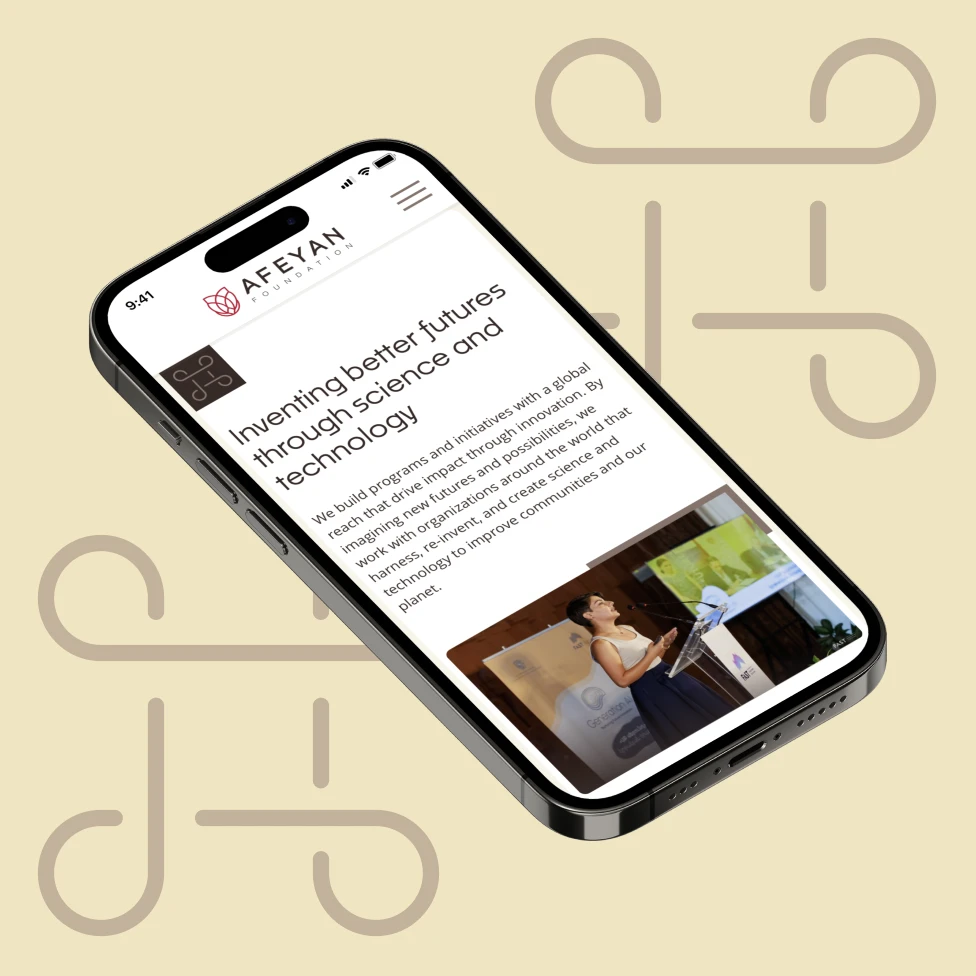
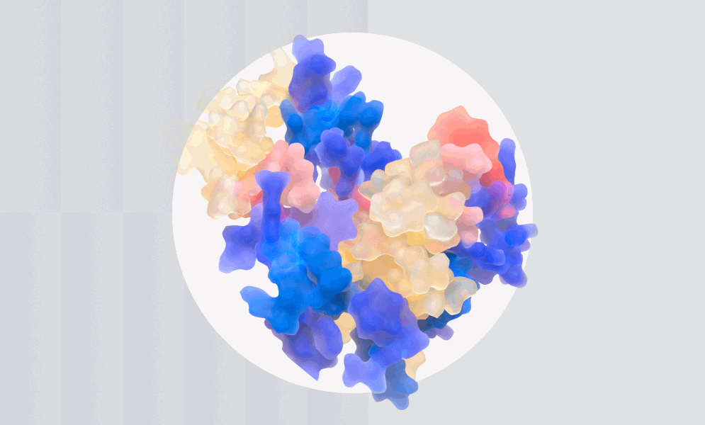
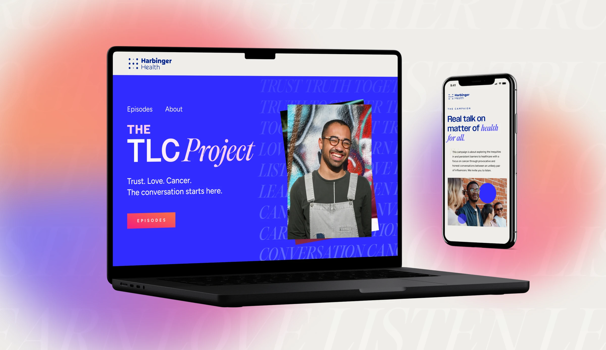
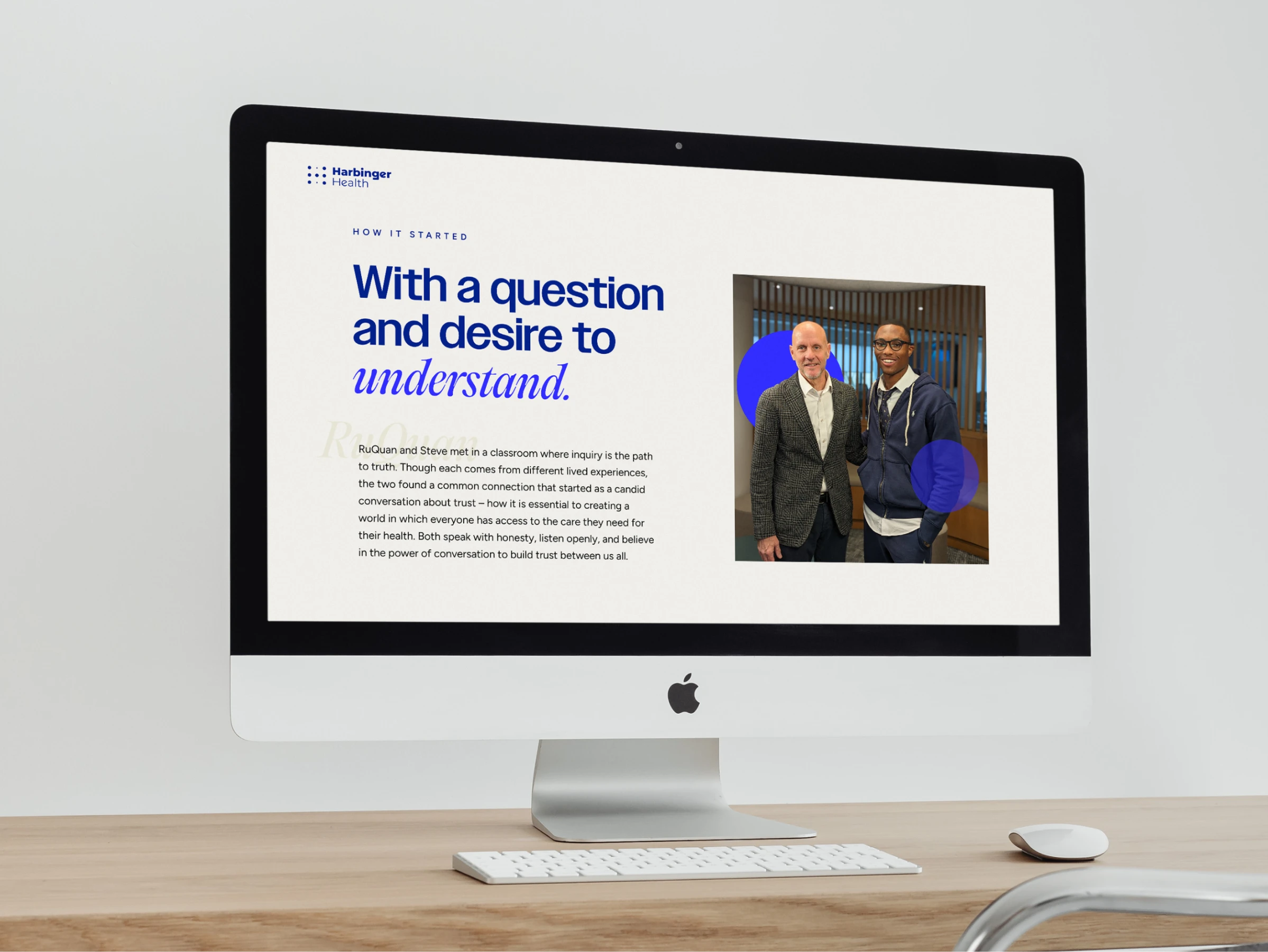
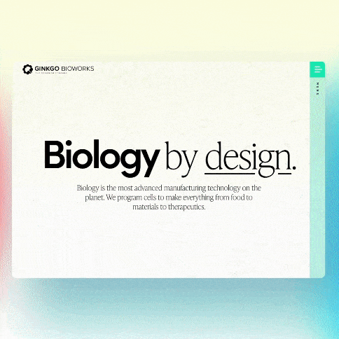
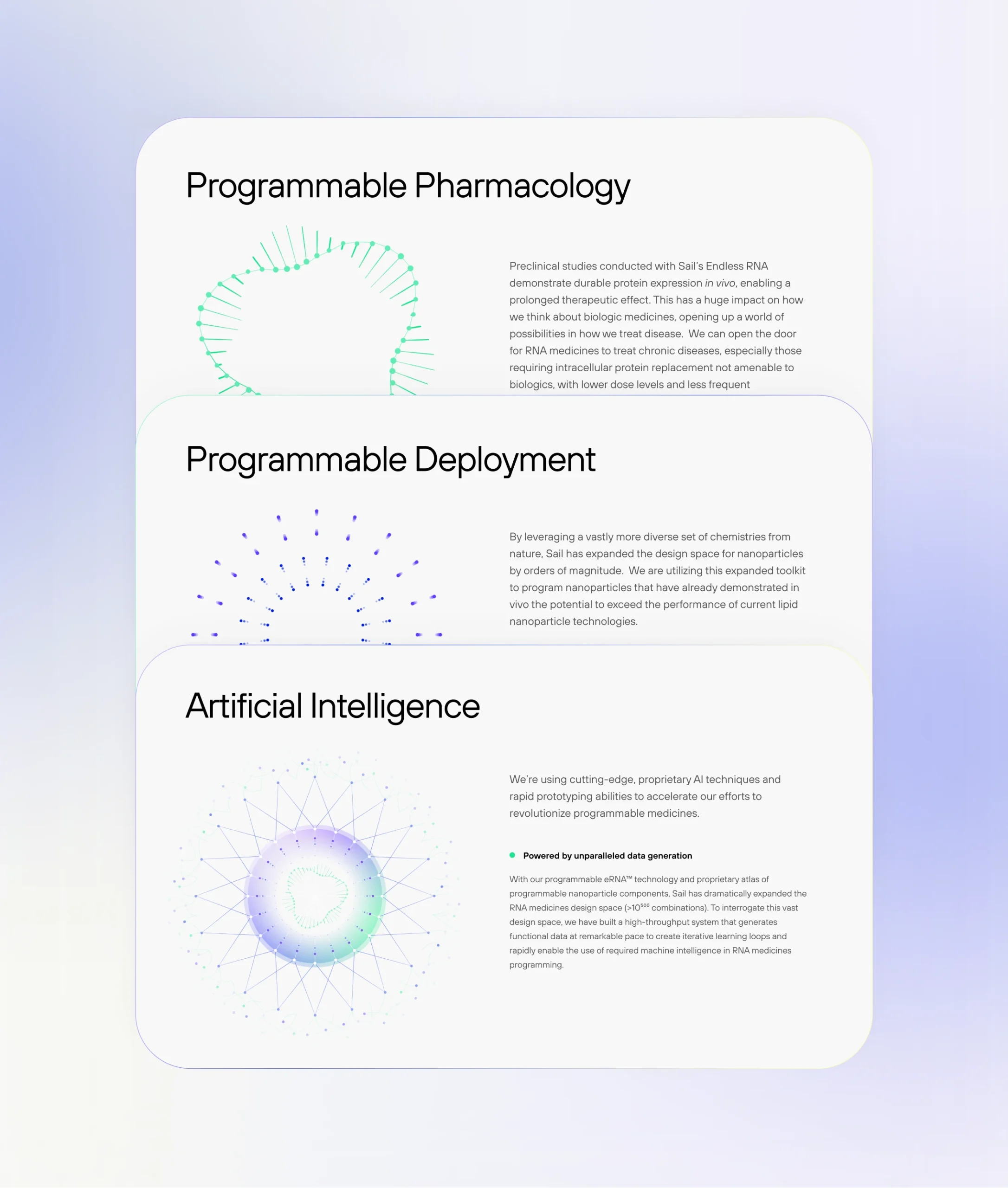
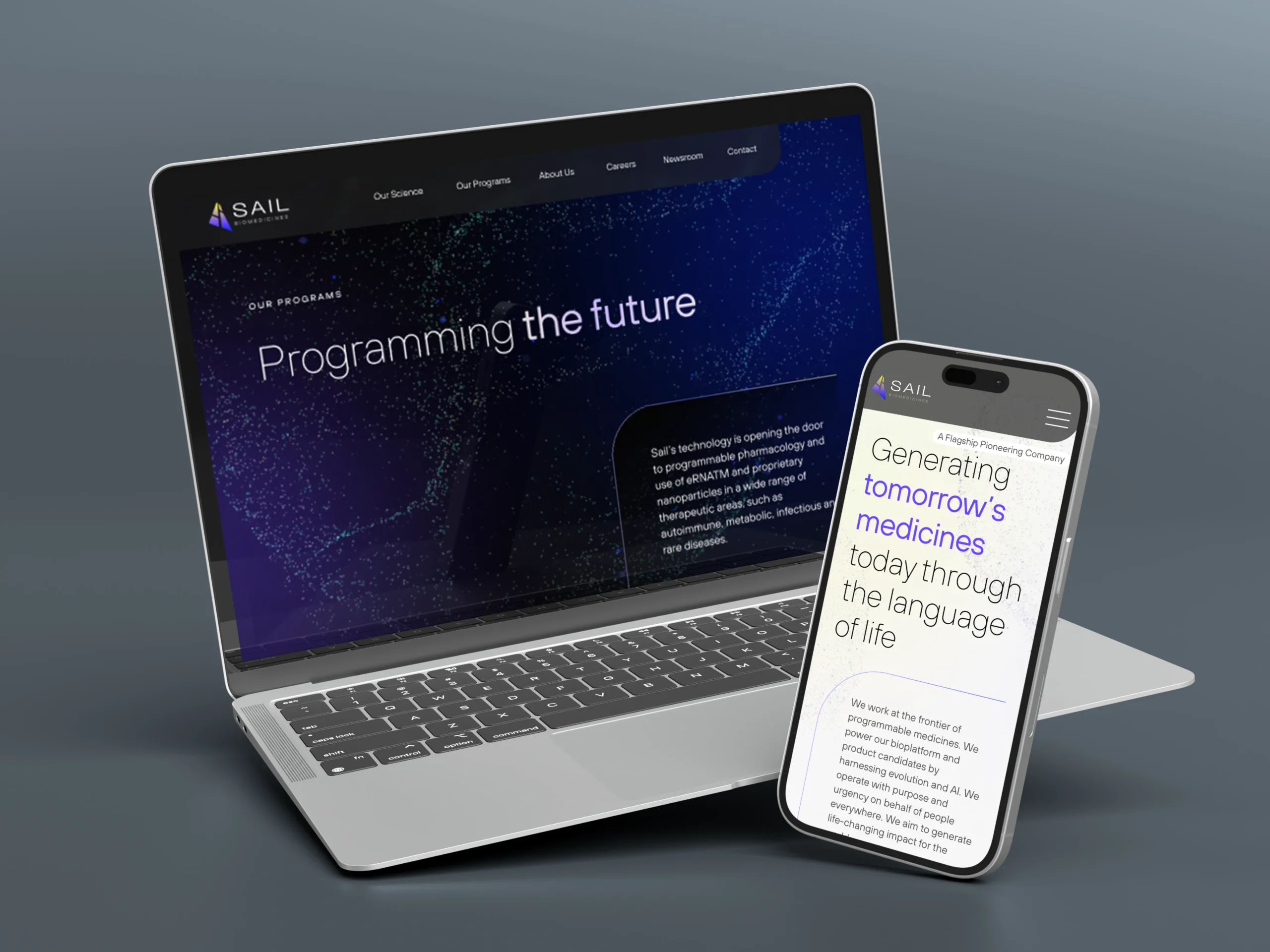
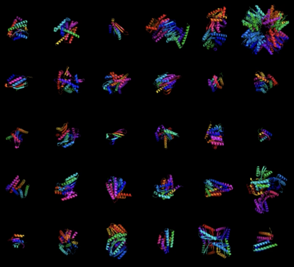
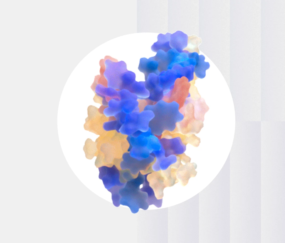
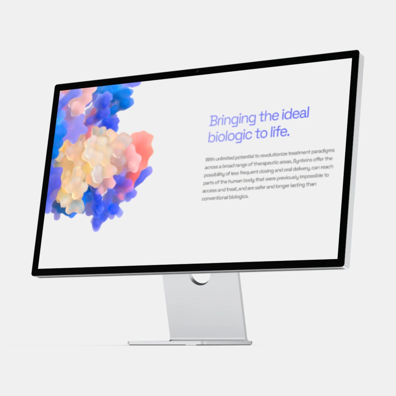
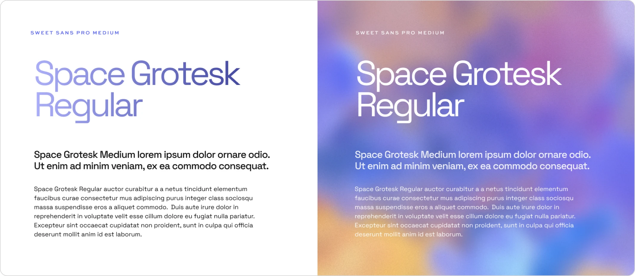
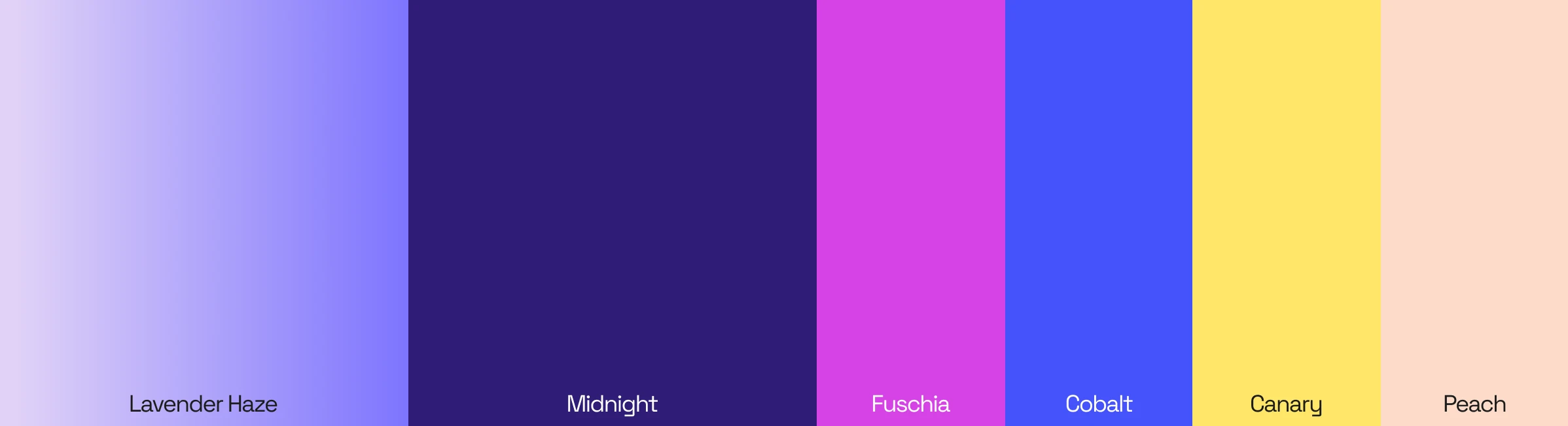
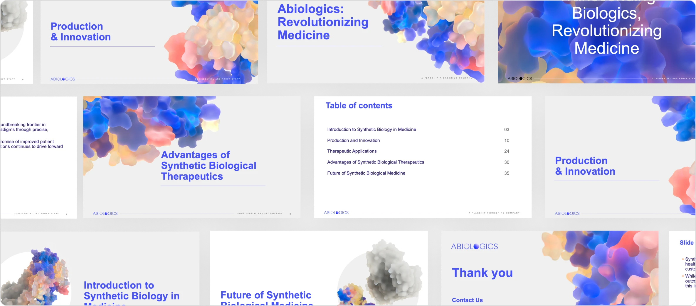
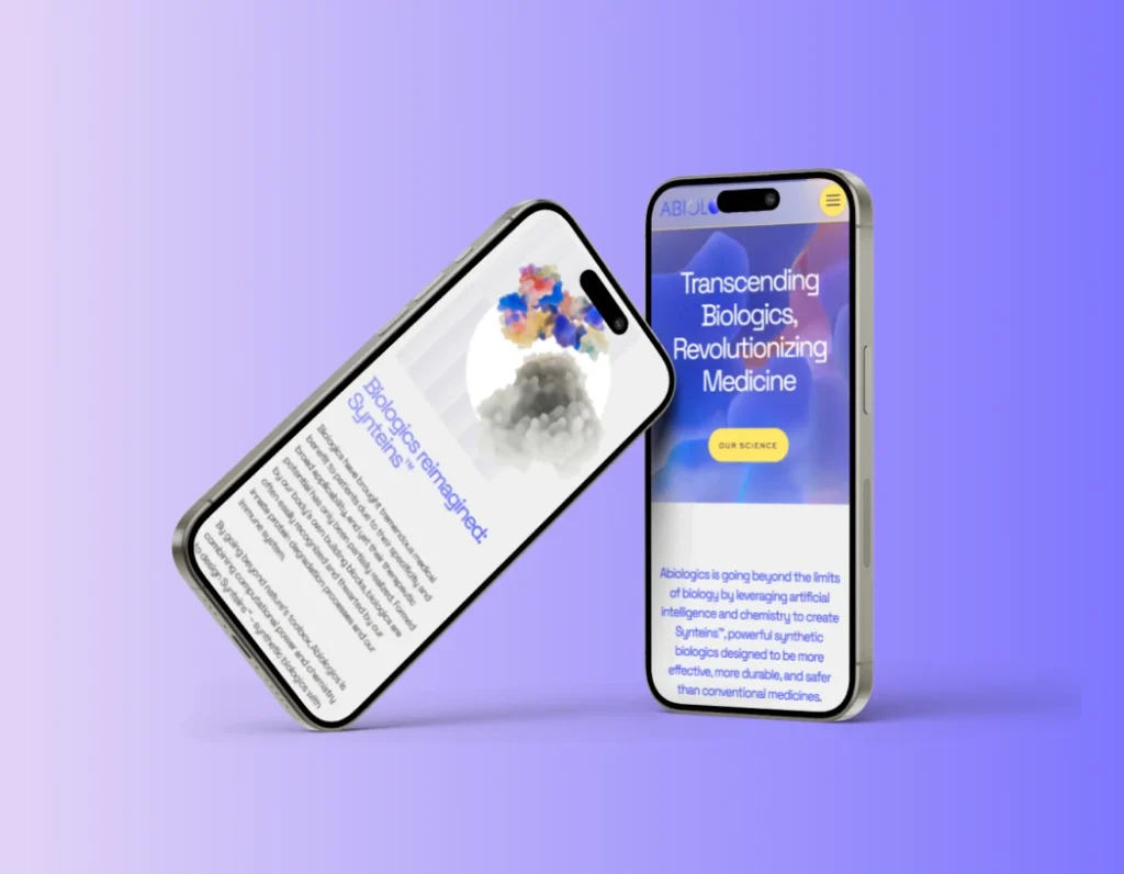
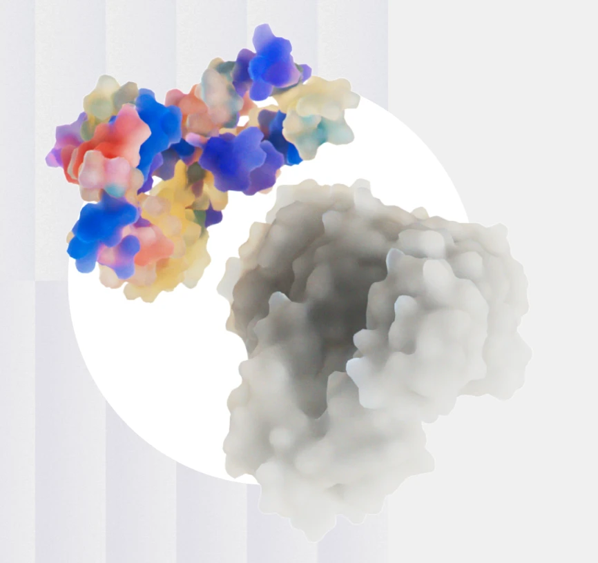
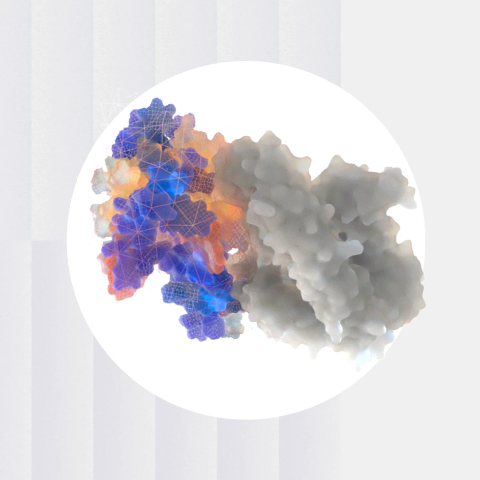
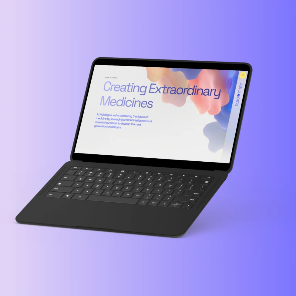
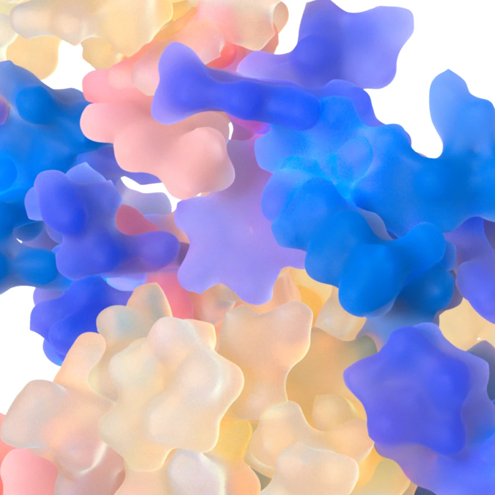
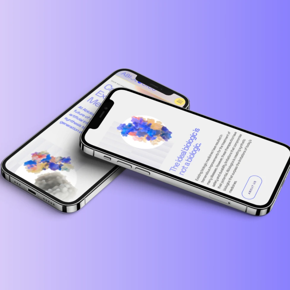
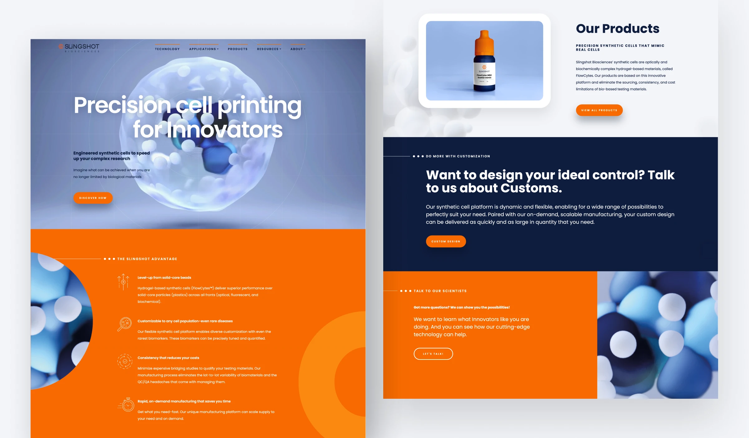
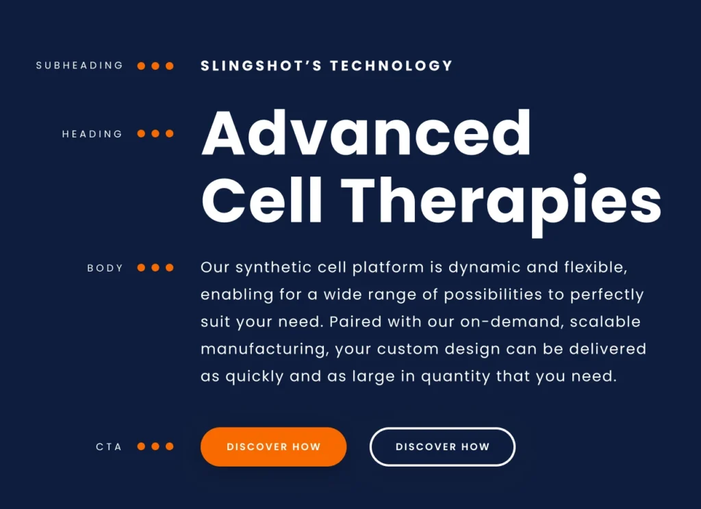
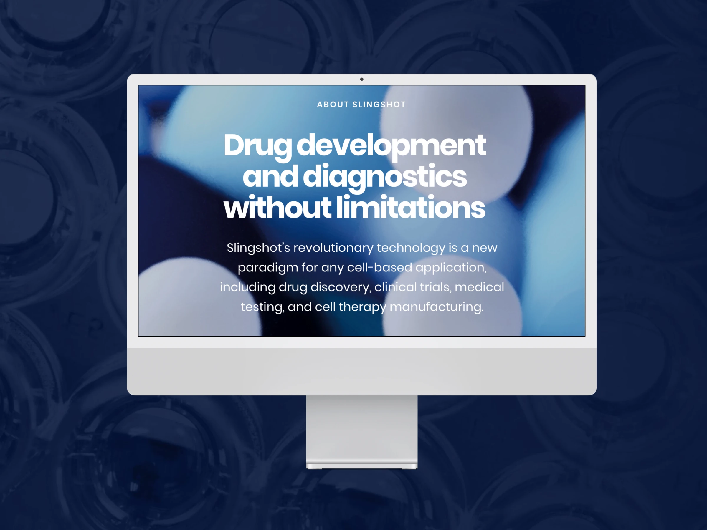
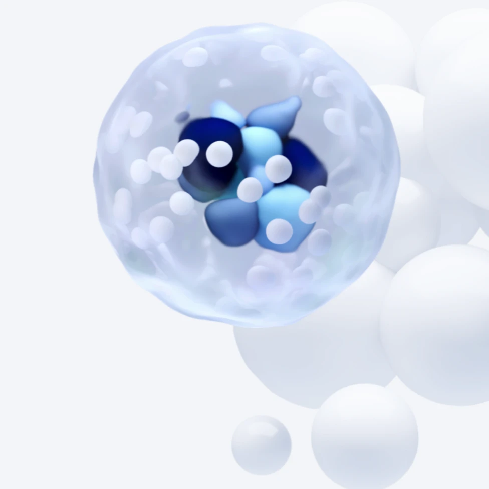
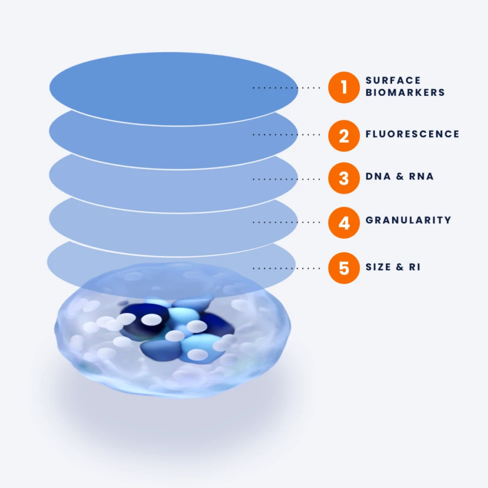
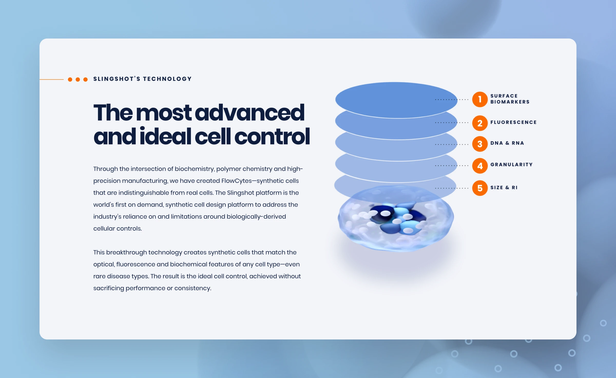
We partnered with Slingshot Bio to develop a responsive, scalable WordPress website and accompanying Shopify site that seamlessly blends cutting-edge design with an intuitive user experience. Aimed at educating skeptics and engaging scientists, investors, and future partners, the site combines bold visuals, approachable messaging, and a sleek e-commerce platform. By integrating analytics, we empowered Slingshot to track user behavior, refine strategies, and showcase their groundbreaking synthetic cell technology with confidence and clarity.
Our Role
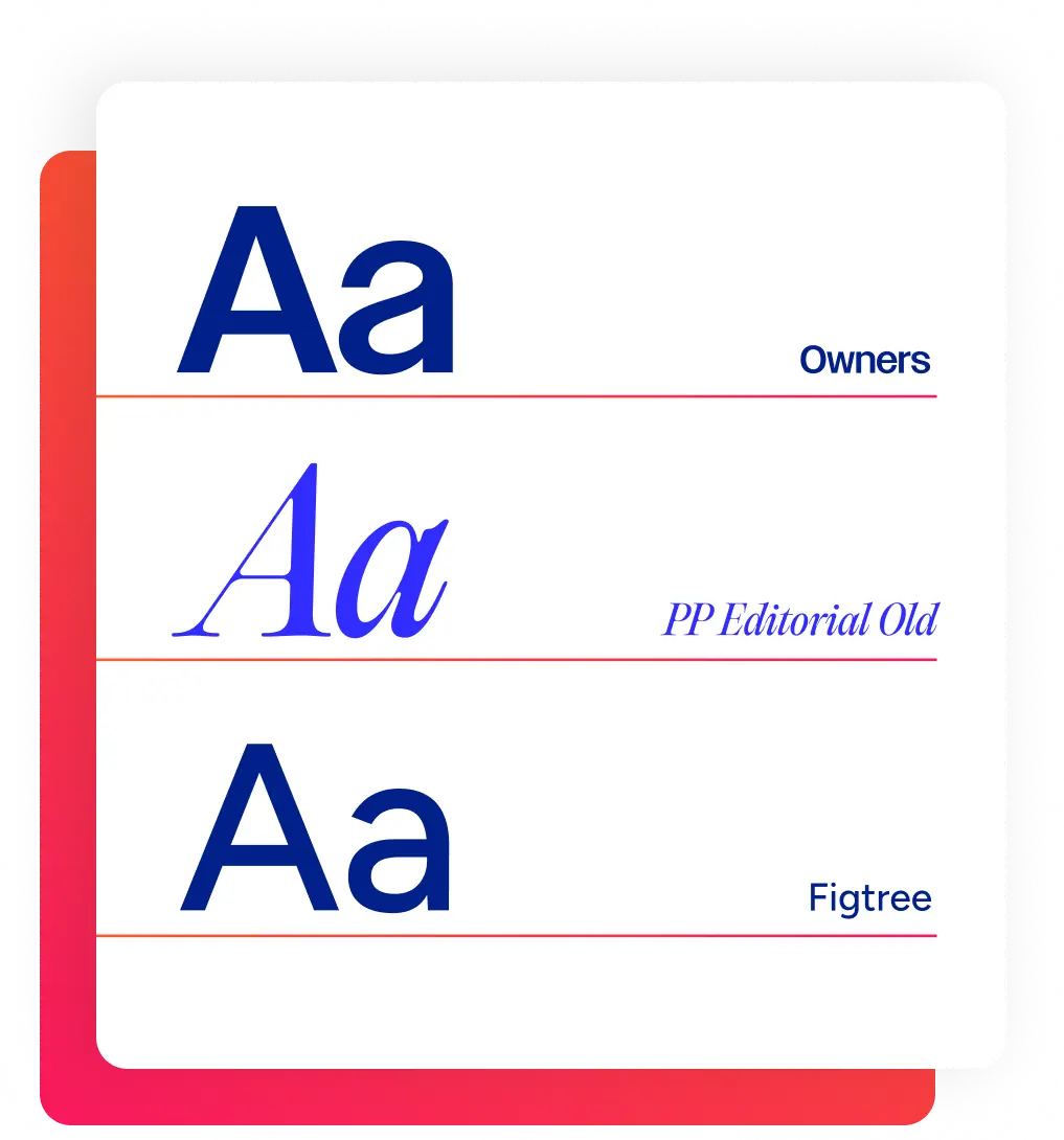
- Brand Identity
- Content Strategy
- UI/UX Design
- Creative Partner
- WordPress Development
- Shopify Development
Industry
- Biotech & Life Science

Results that matter
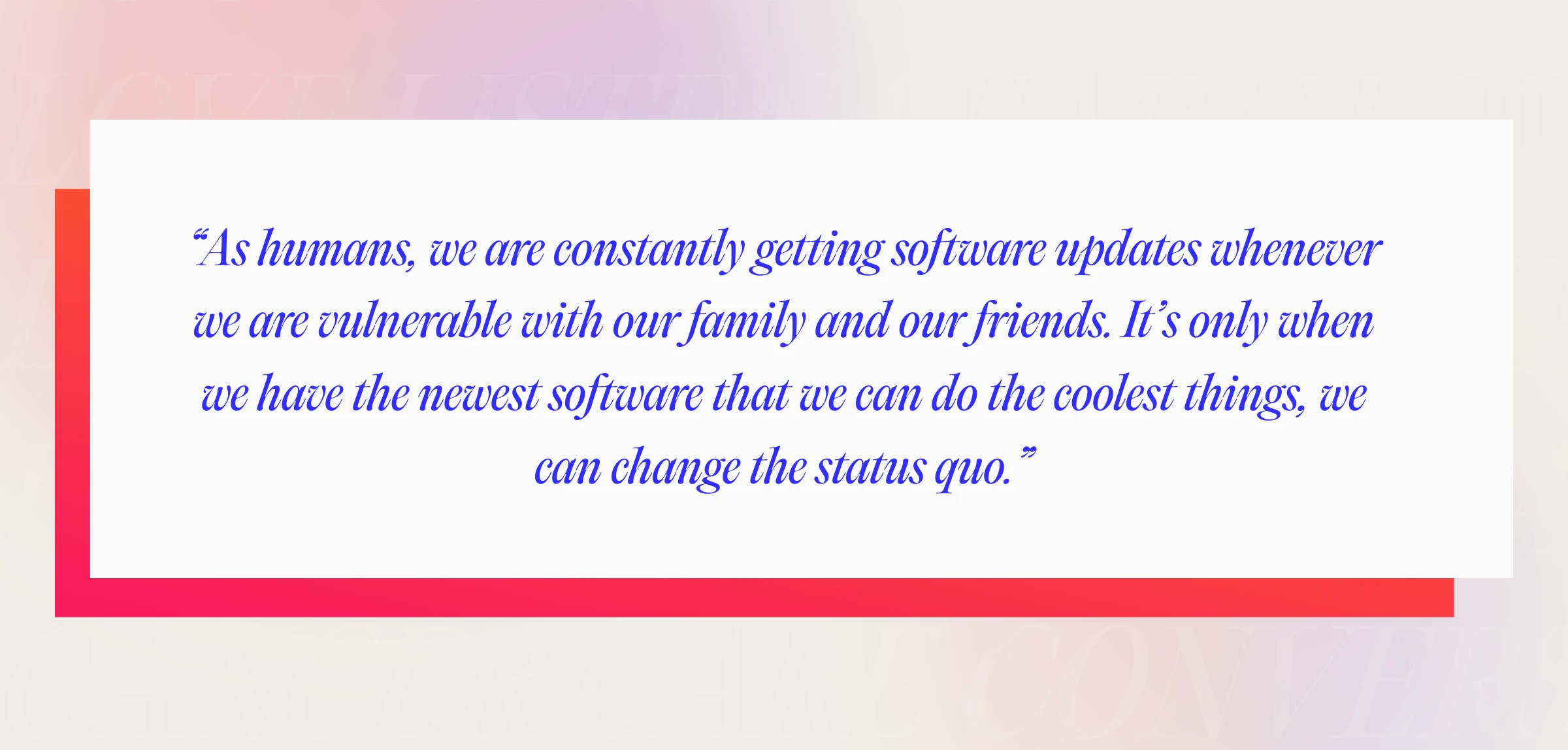
The new site made an immediate impact, driving a 30% increase in organic traffic within three months and sparking increased investor interest. Its clean, scalable design not only highlighted Slingshot Bio’s innovative products but also established credibility in a competitive market. With glowing user feedback and a foundation built for growth, this project was a testament to our ability to craft transformative solutions for companies that dare to challenge the status quo.


Get In Touch
We are full of ideas, we just need someone to share them with.