Single Cell Discoveries
Redefining the CRO
Overview
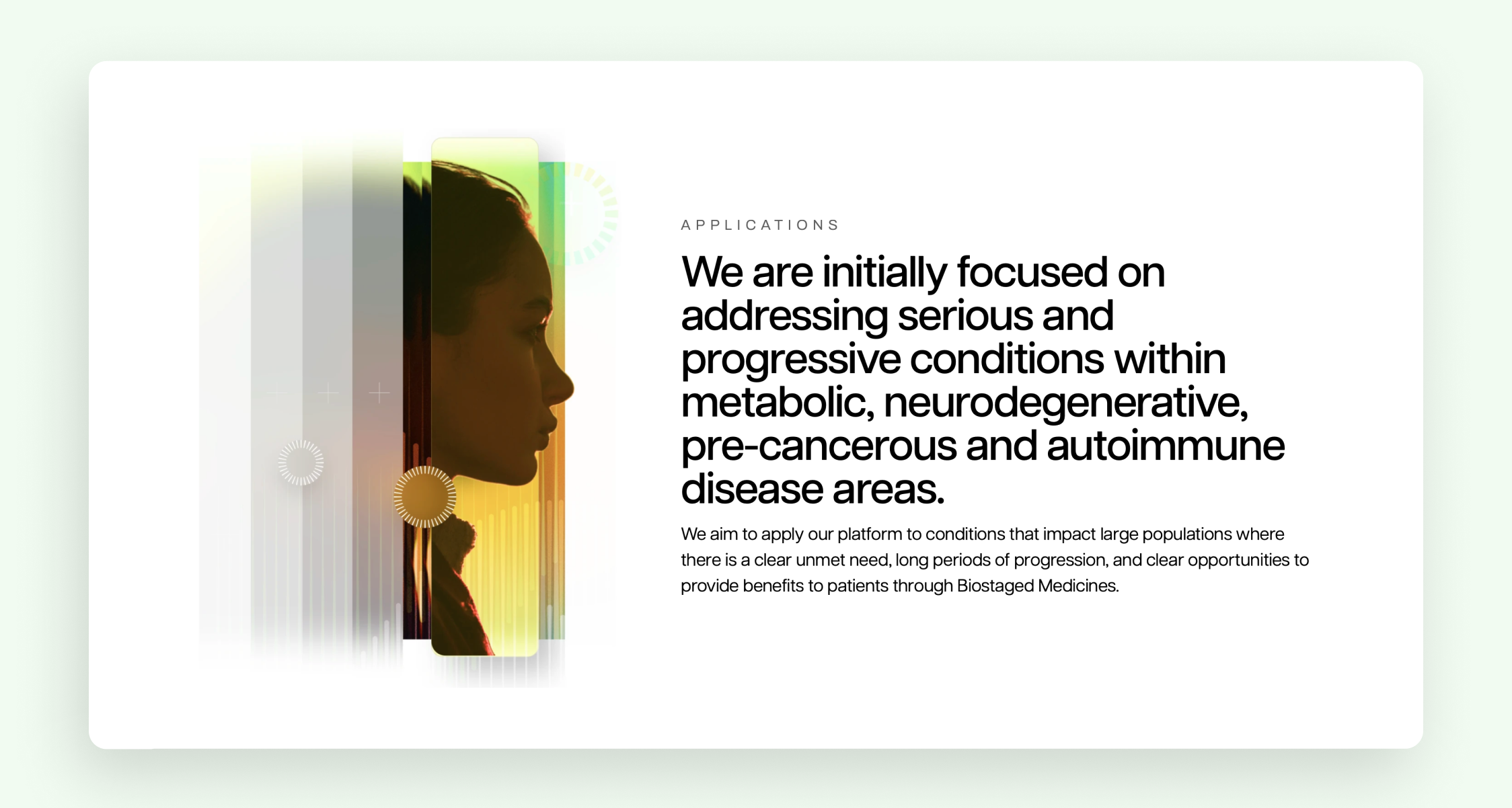
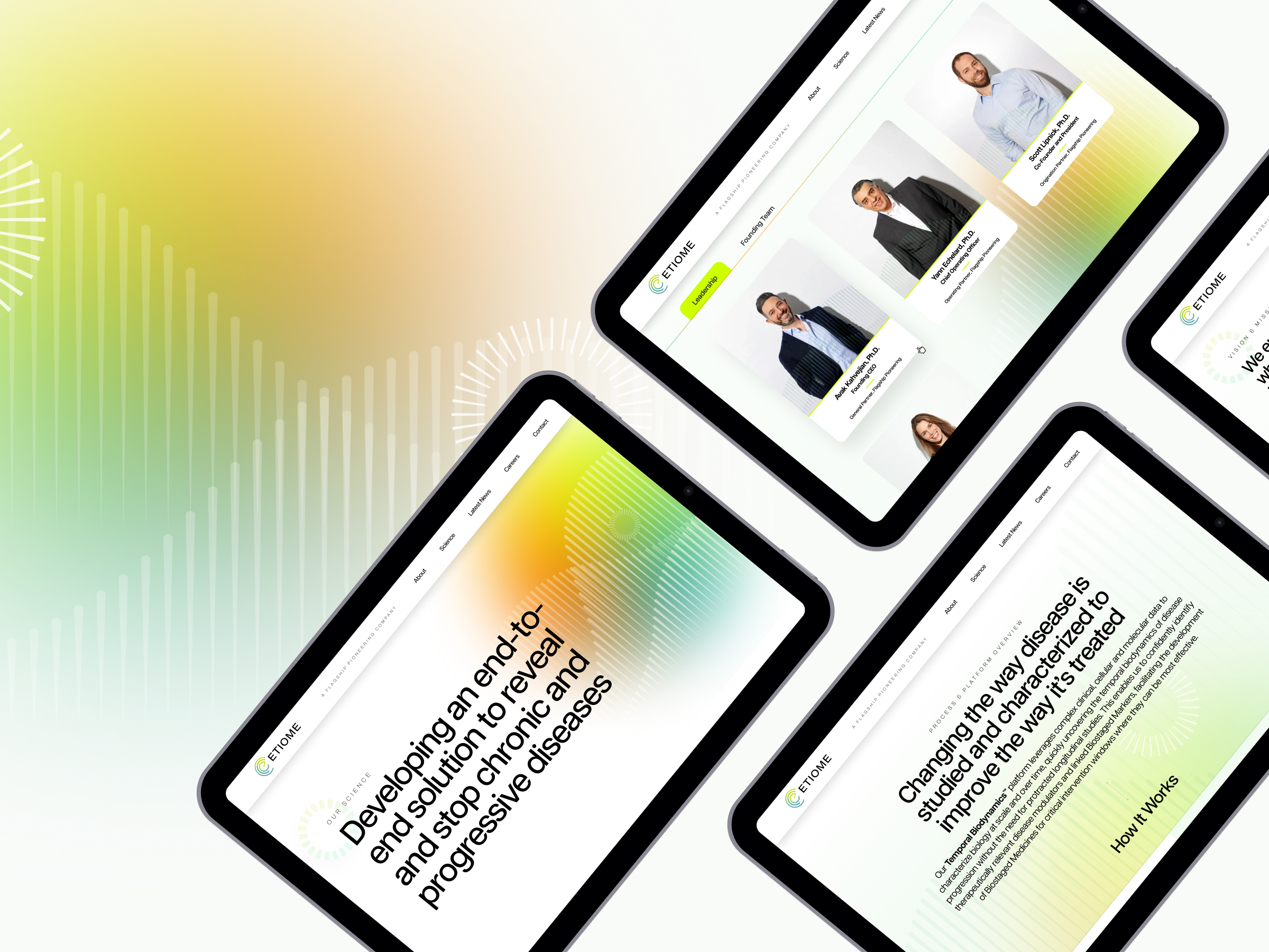
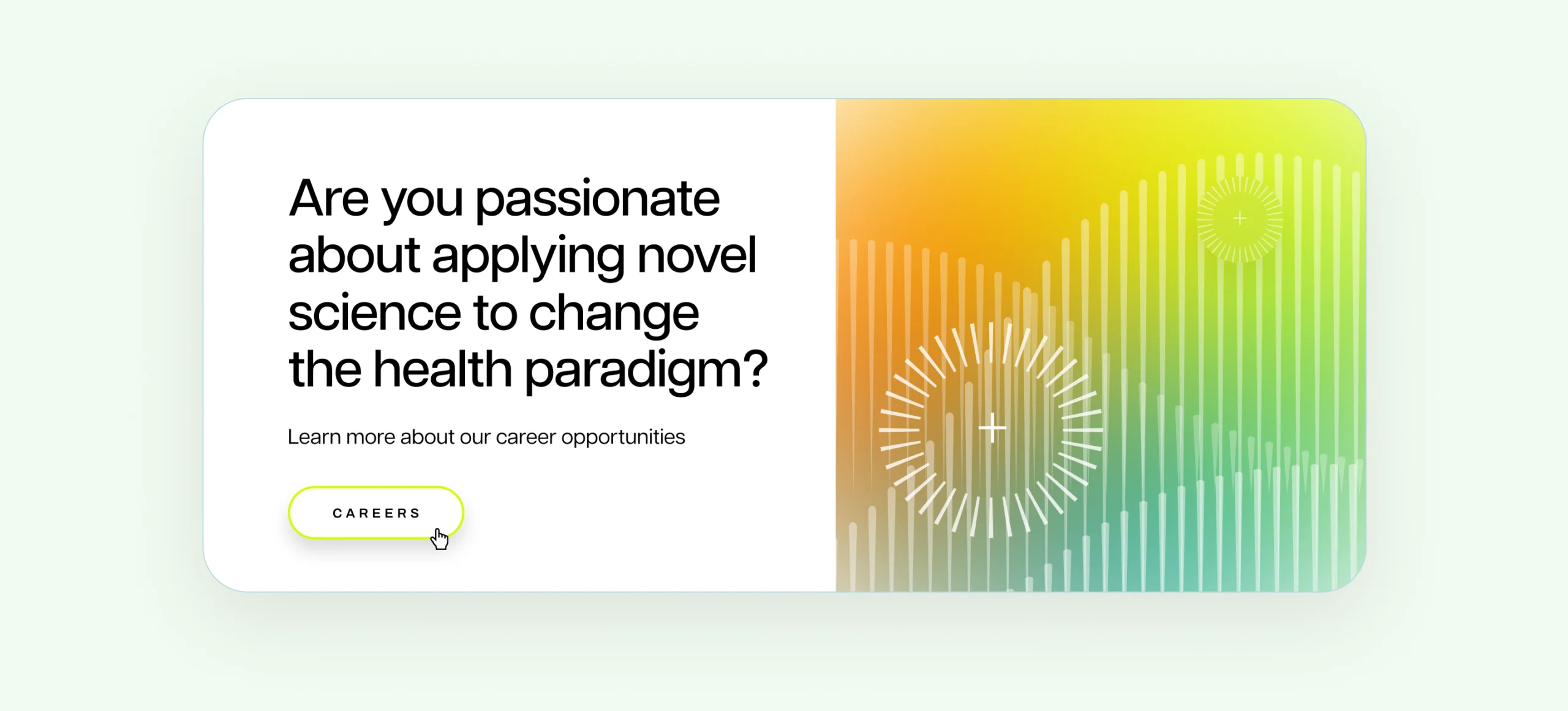
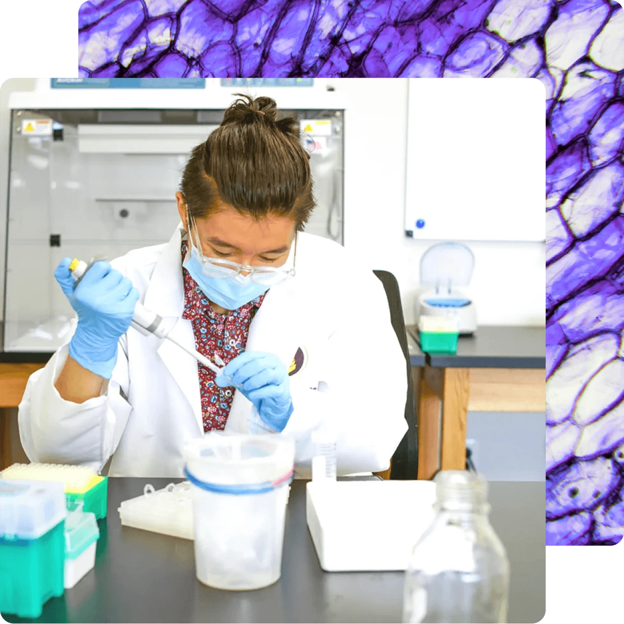
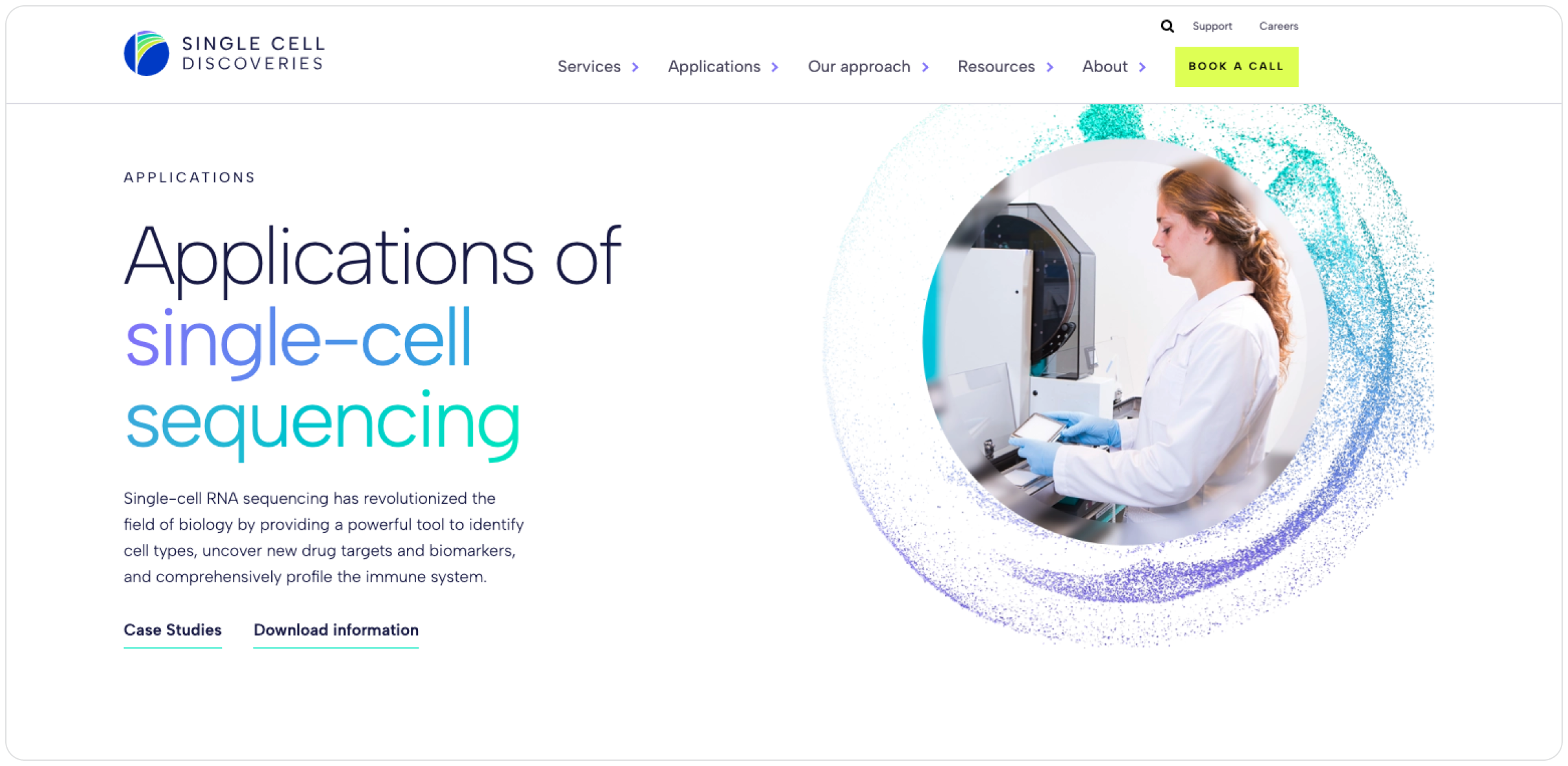
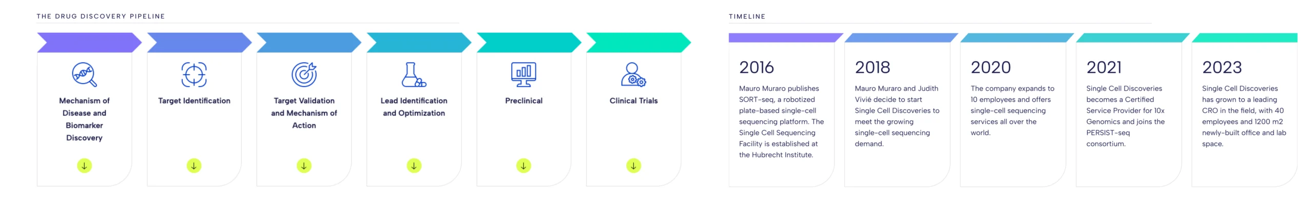
Founded in 2018, Single Cell Discoveries is a Netherlands-based CRO with a focus on single-cell sequencing services — some of which have been developed by the company’s founder. As they were entering their next stage of growth, they were building out a new lab space and wanted a brand a site to reflect this evolution.
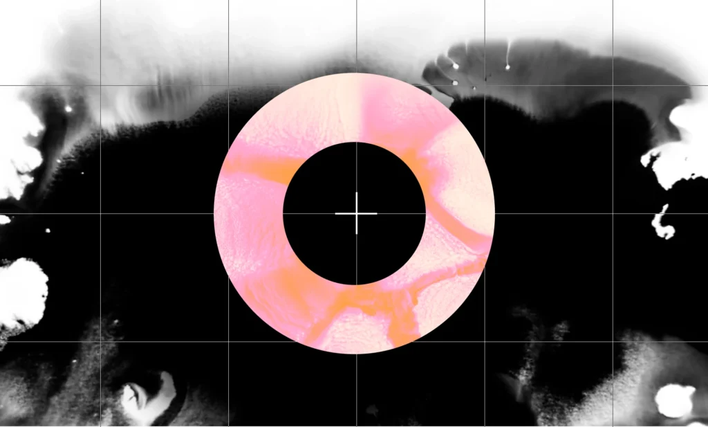
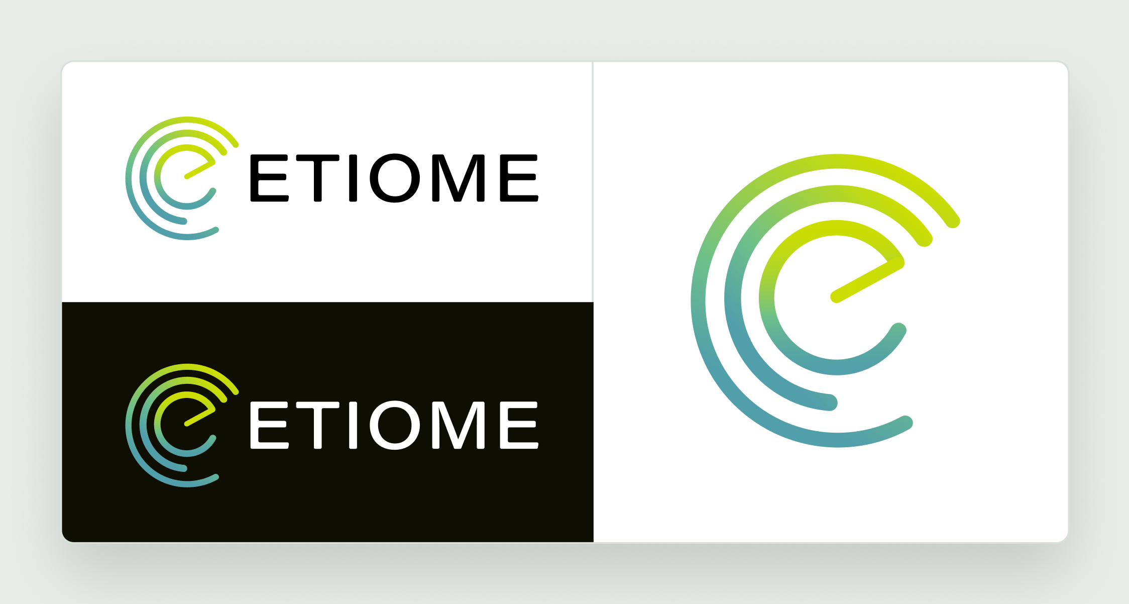
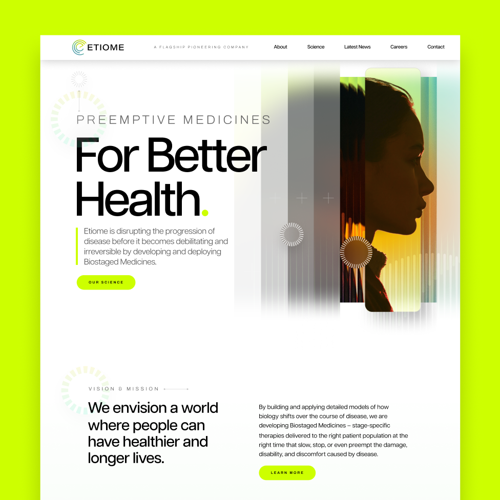
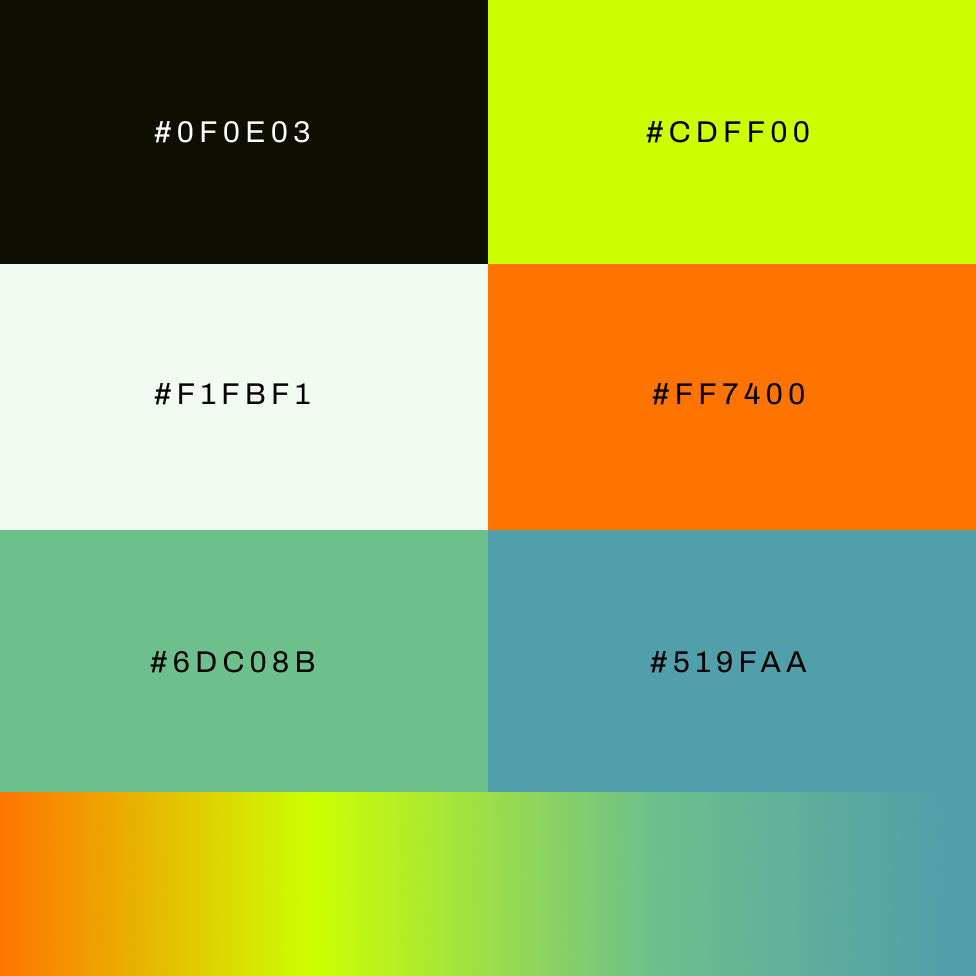
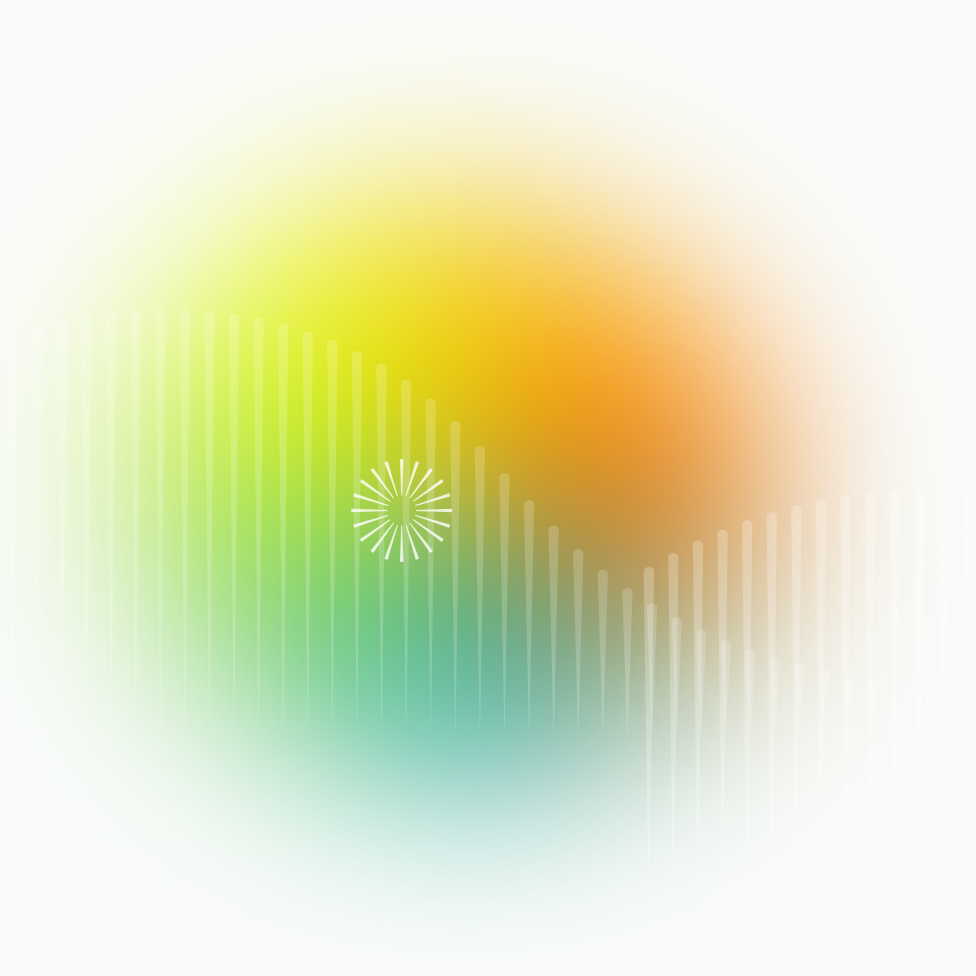
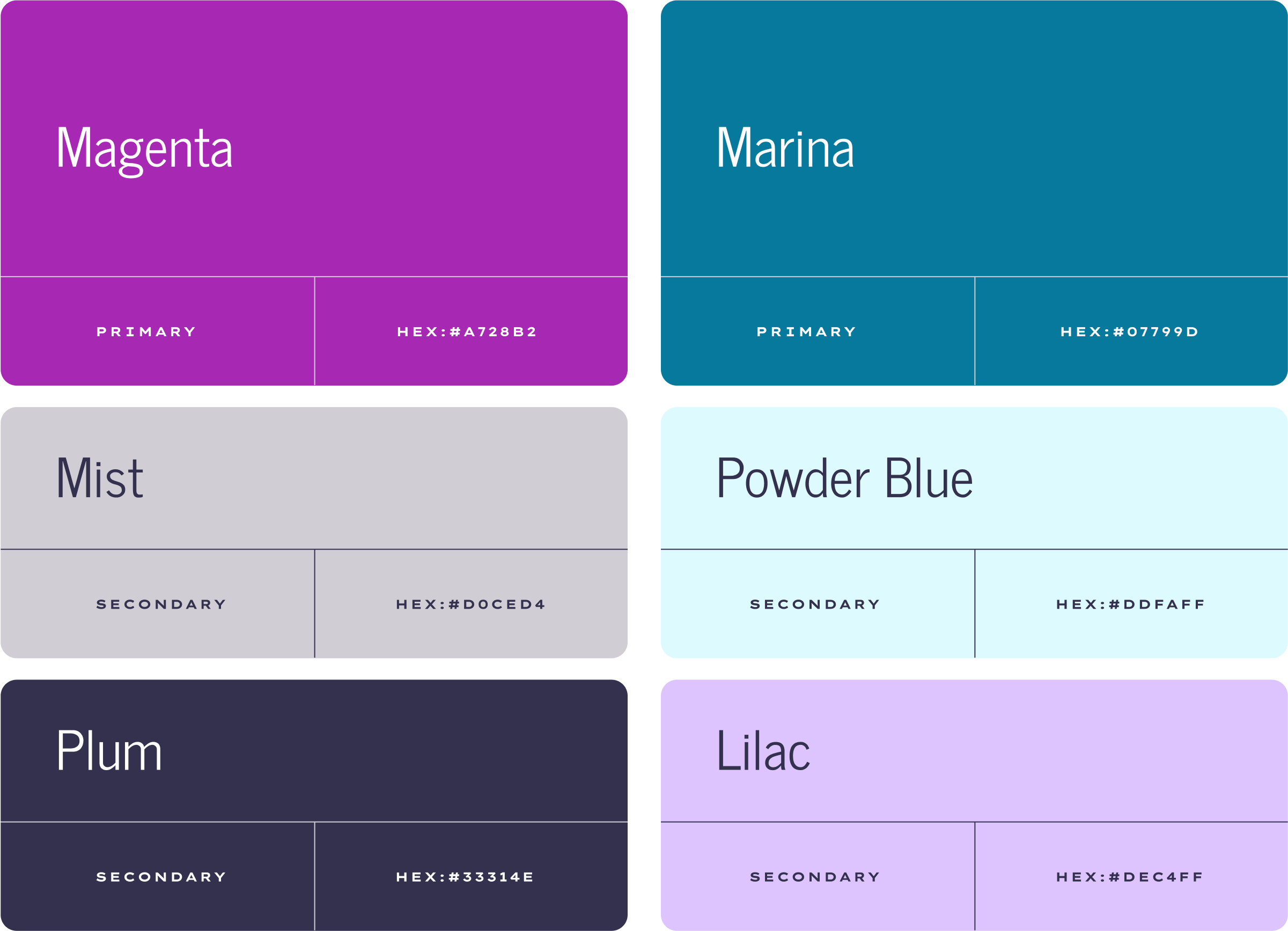
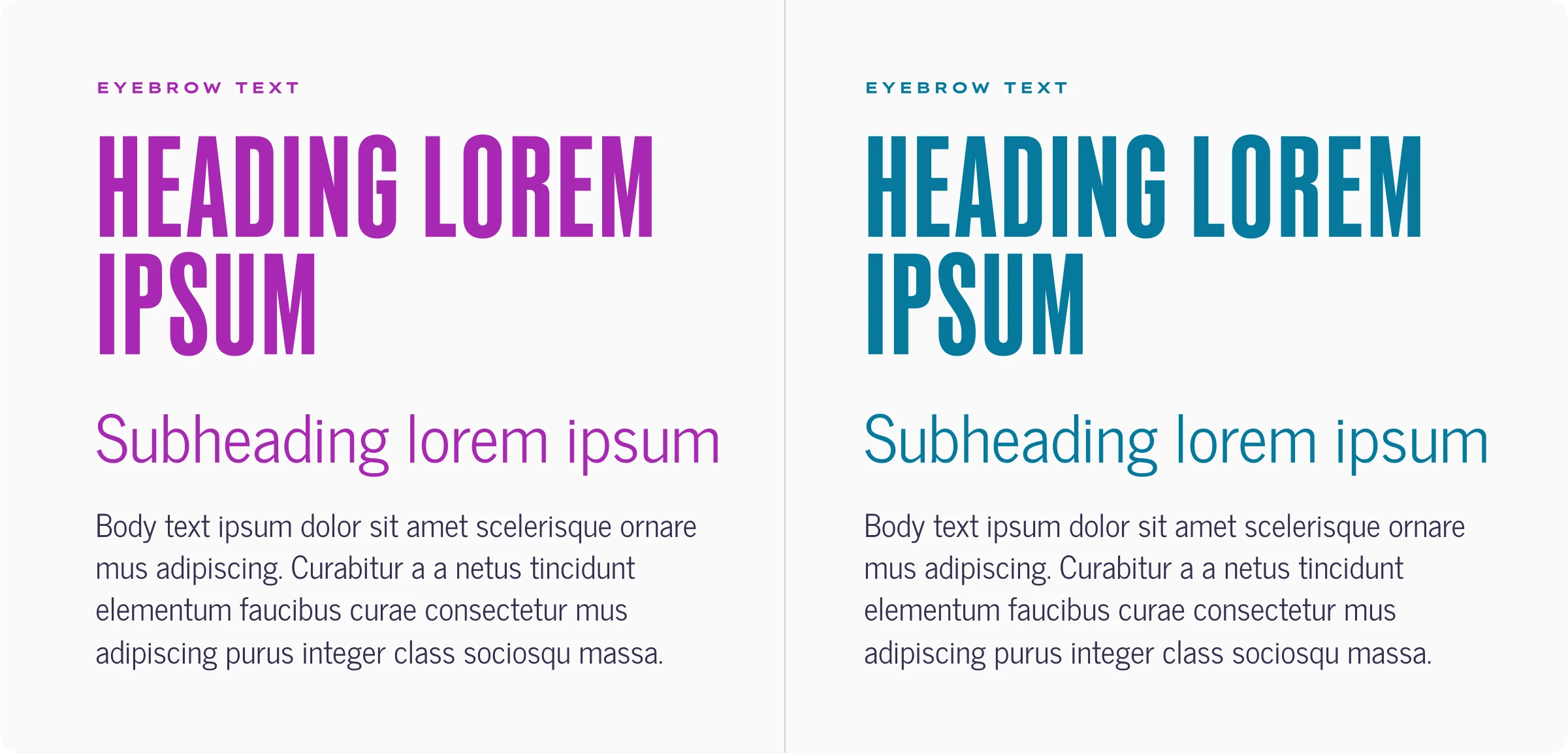
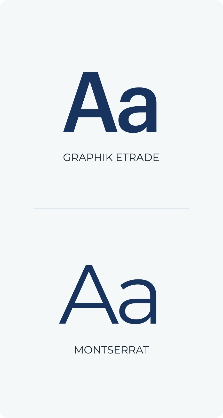
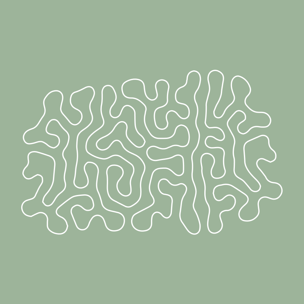
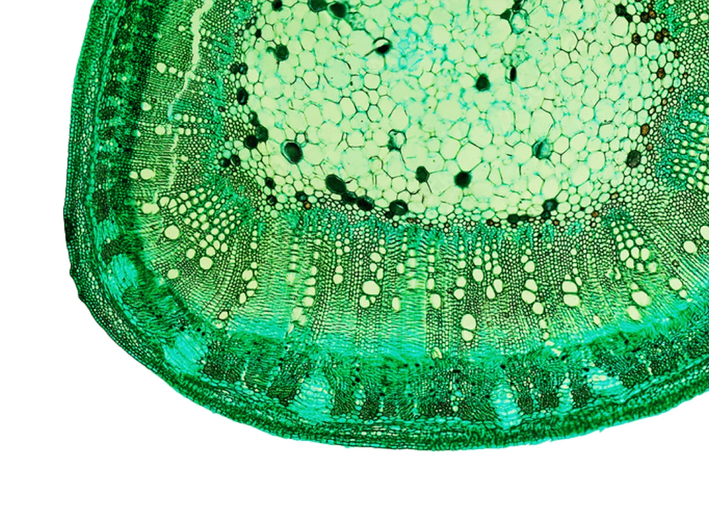
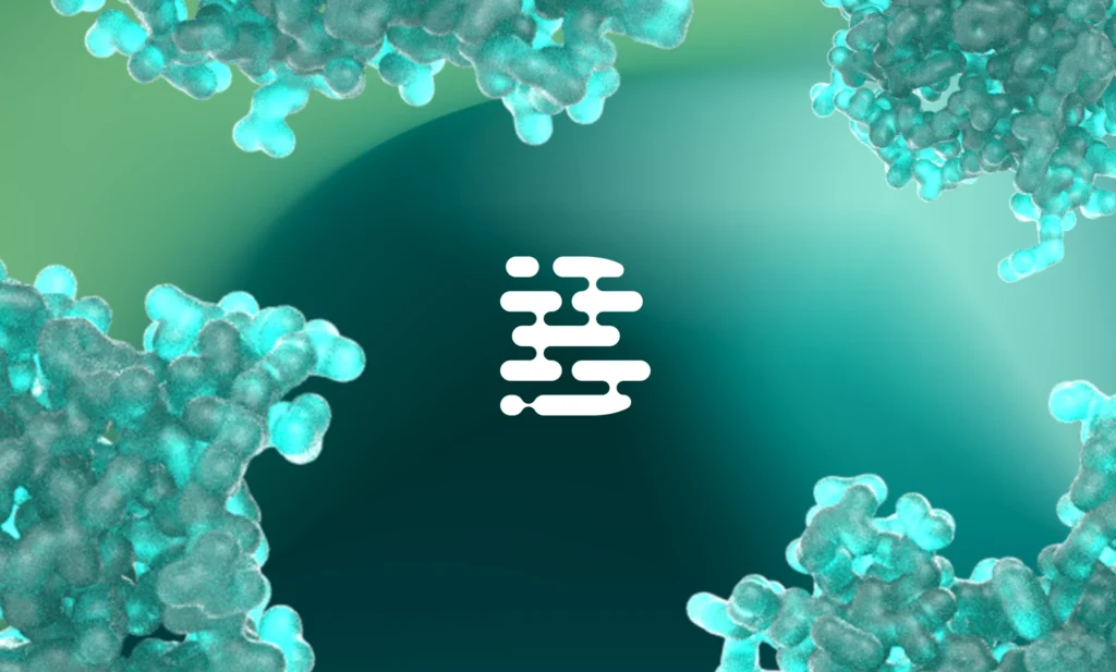
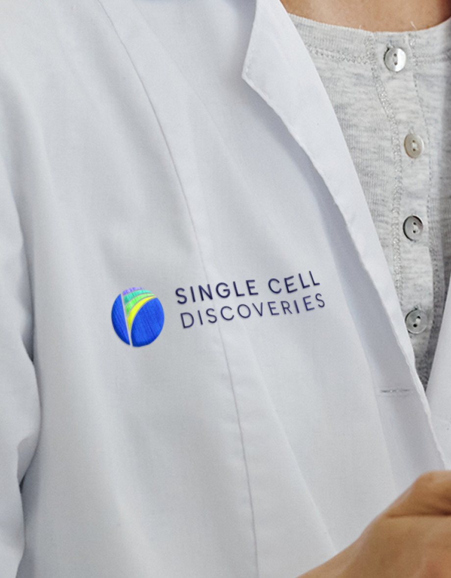
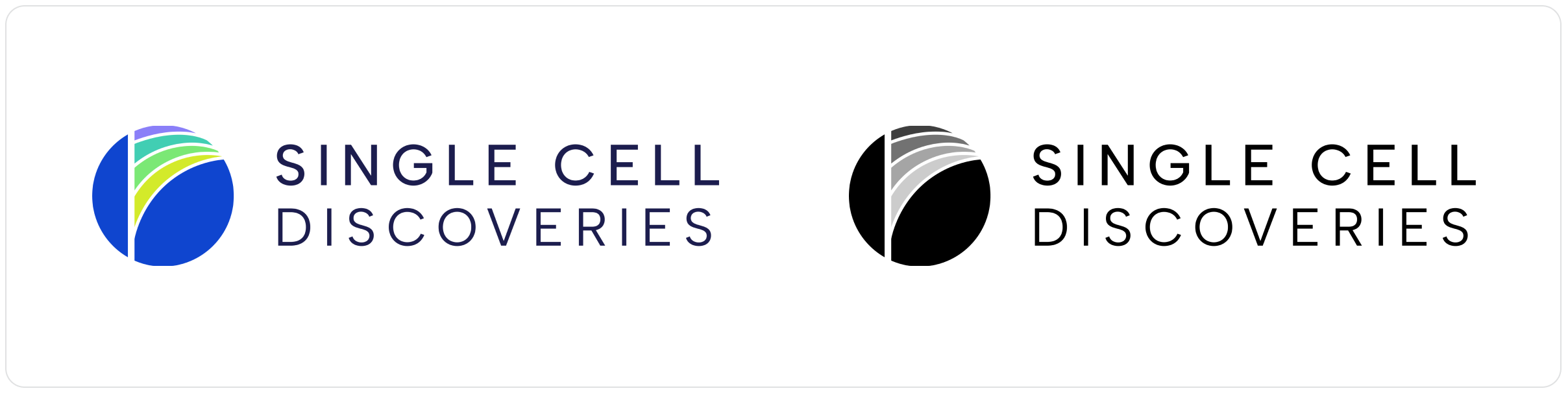
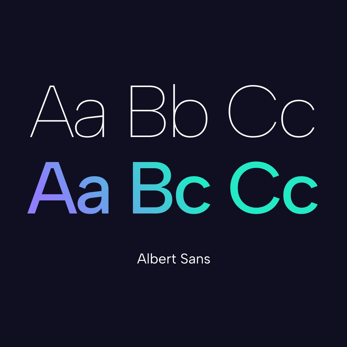
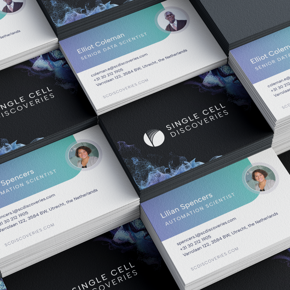
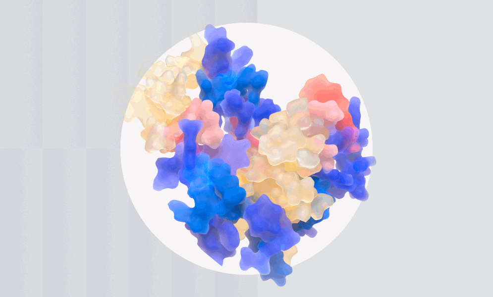
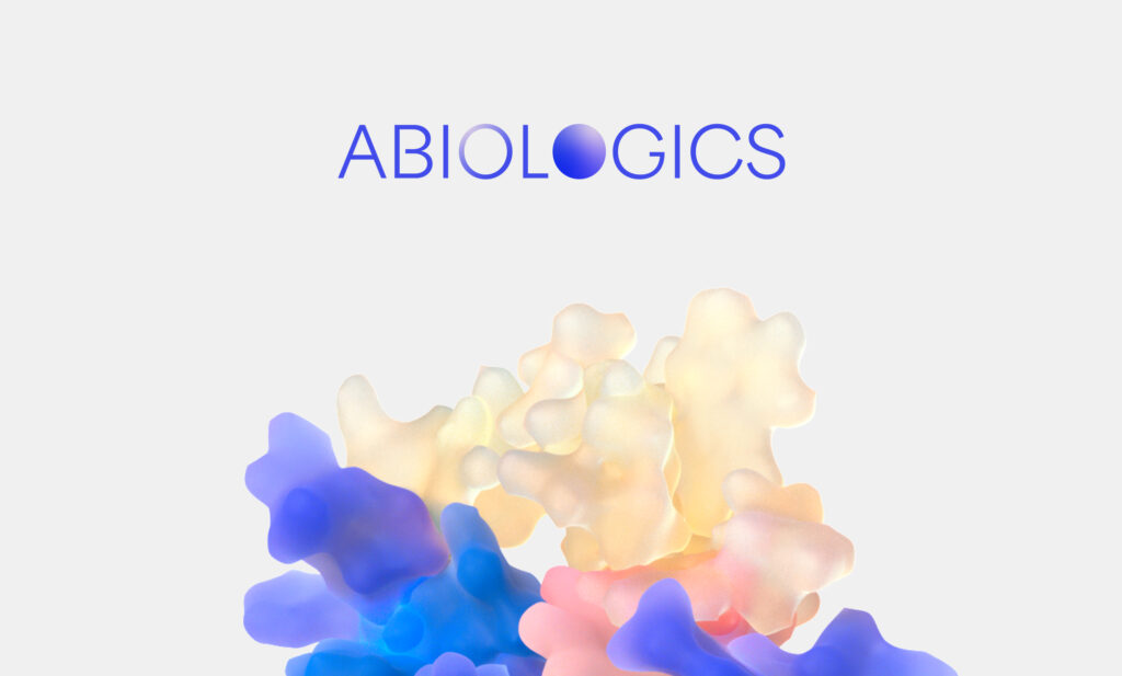
The reimagining of the logo centered on the basis of their work: the cell. We took inspiration from the spherical shape of a singular cell, adding layer details that evoke a sense of data and sequencing ultimately resulting in a bold, modernist mark that feels vibrant and dynamic with a sense of possibility and discovery. The rest of the brand was took a minimal, simplified approach to design with modern layouts that feel tech-driven and innovative, while still feeling highly approachable and accessible with colorful accent details.
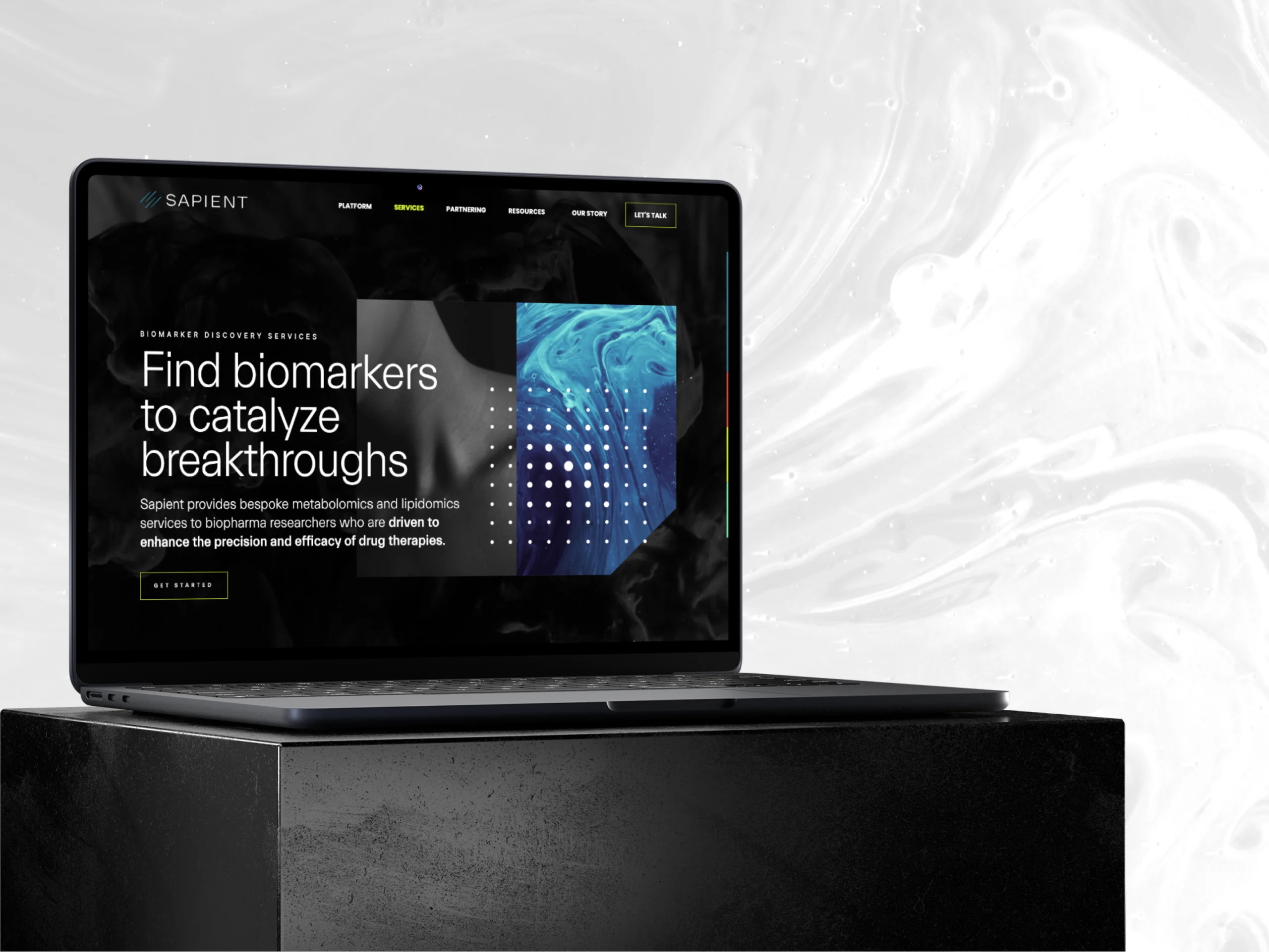
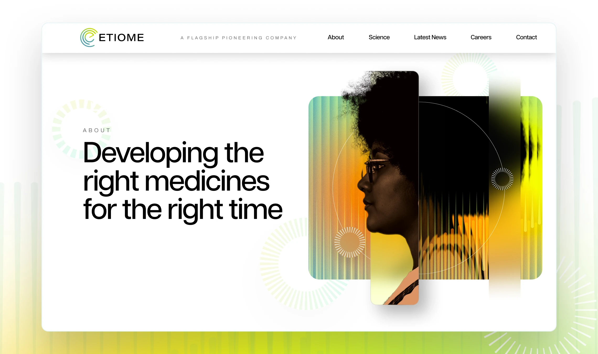
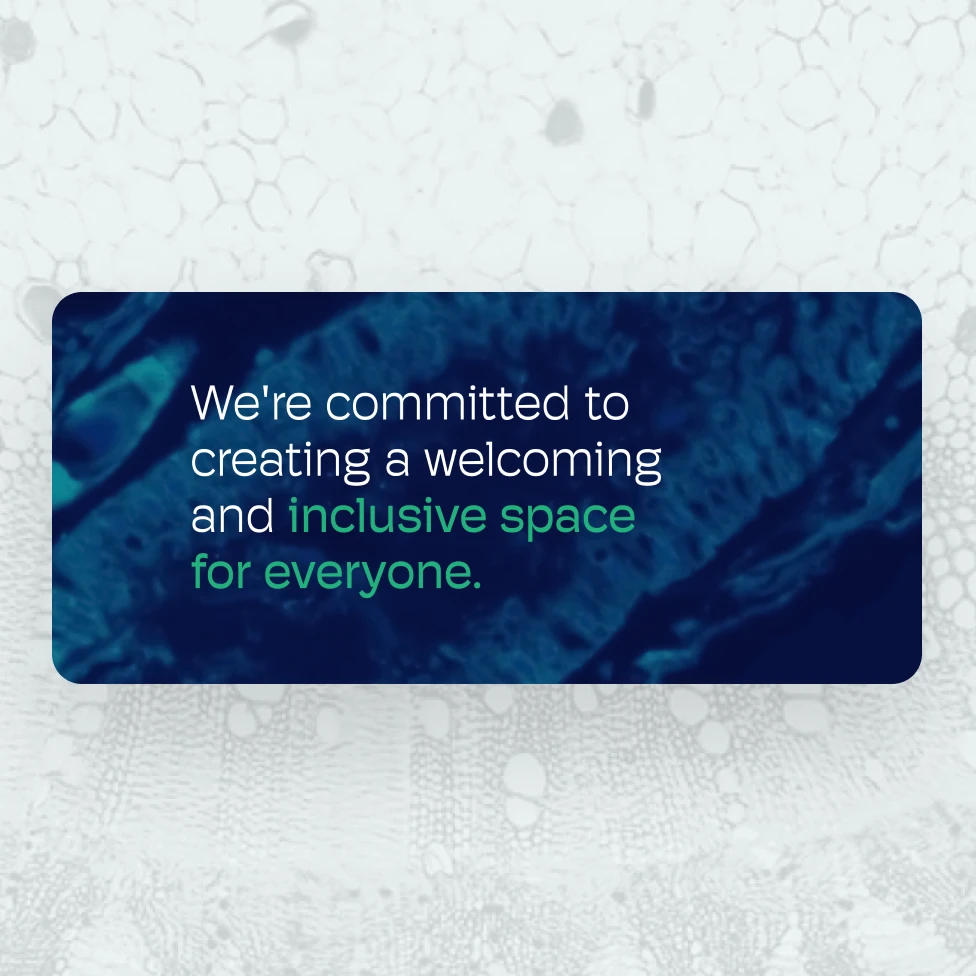
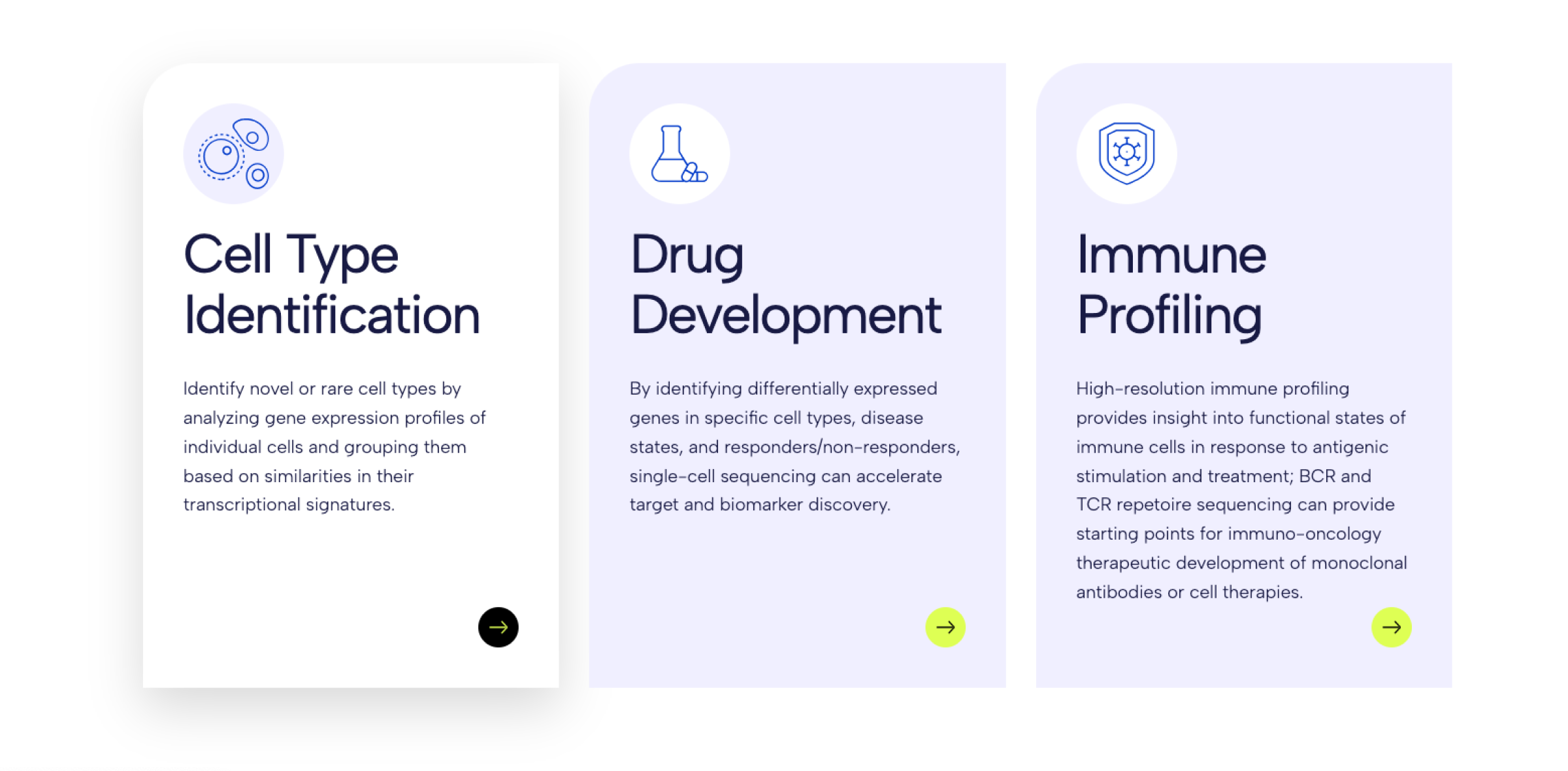
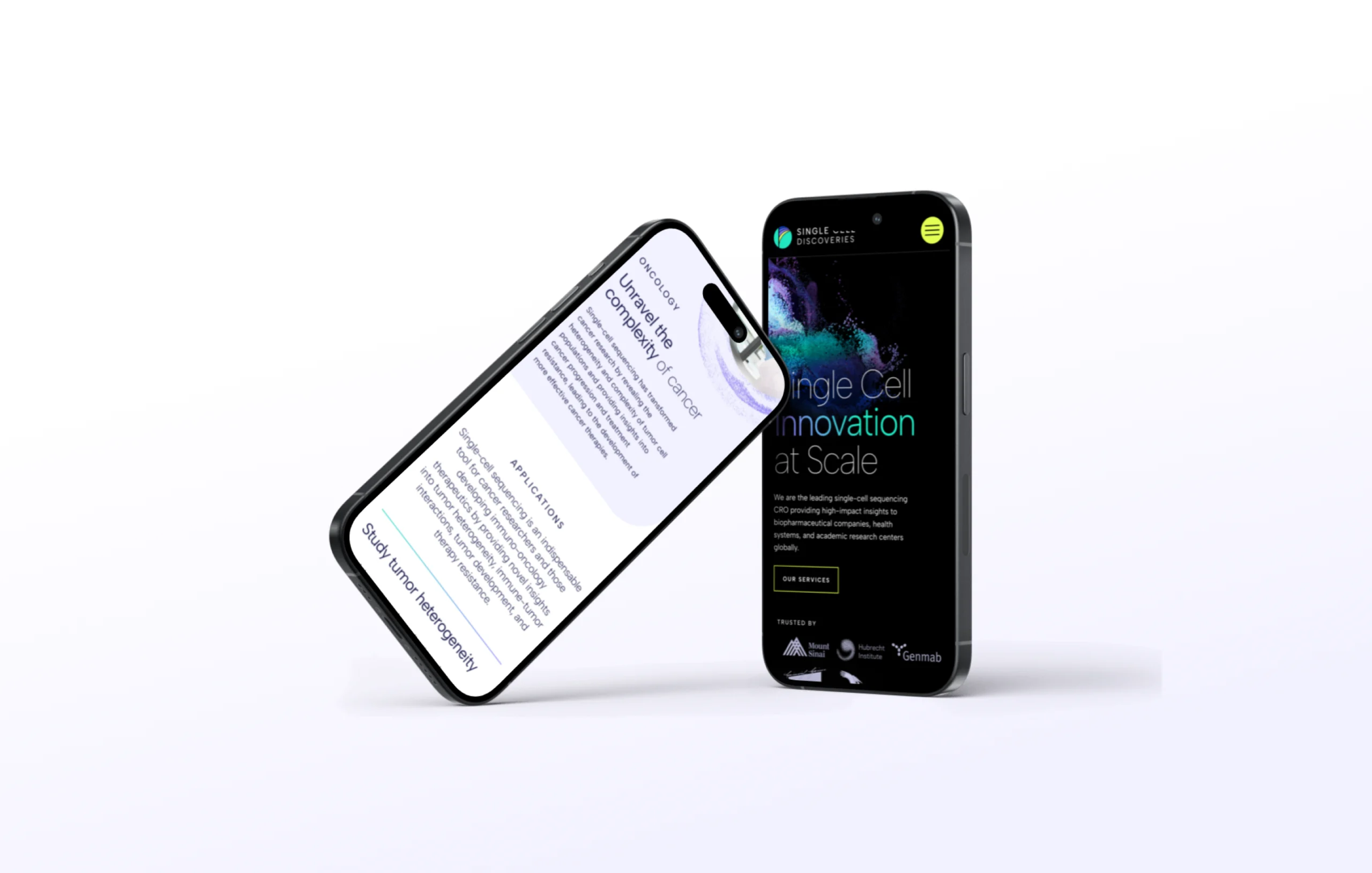
For the site, we knew the IA was going to be a crucial part of the UX. With so many service options, many of which unique to Single Cell, we had to organize them in a way that made sense to their target audience. Ultimately, we decided on a large flyout that offered enough real estate to imply hierarchy and to provide a brief description of each service. When combined with the refreshed identity and brand style, the new site exudes a confidence and scientific creativity that allows Single Cell Discoveries to transcend what it means to be a contract researcher.
Our Role
- Brand identity
- UX/UI Design
- WordPress Development
- Information Architecture
Industry
- Biotech
- CRO

Get In Touch
We are full of ideas, we just need someone to share them with.