.406 Ventures

Hitting It Out of the Park: Elevating the Digital Presence of .406 Ventures

Overview

.406 Ventures came to us with a clear goal: redesign their brand and website to reflect the thoughtful and forward-thinking nature of their brand while creating a user experience that felt distinct, approachable, and aligned with their long-standing identity. Our role was to bring that vision to life through thoughtful UX strategy and refined UI design that would set .406 apart from other venture capital firms.

A key objective of the redesign was to ensure the new site felt unmistakably .406—friendly, down-to-earth, and founder-first, while also elevating the brand’s visual identity to match its reputation for strategic focus.

Our Role

  • Brand strategy
  • Brand identity
  • Logo
  • UX/UI Design
  • Development
  • Brand Guidelines

Industry

  • Venture Capital

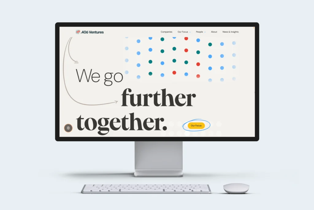
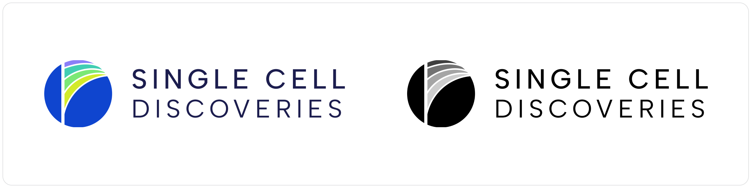
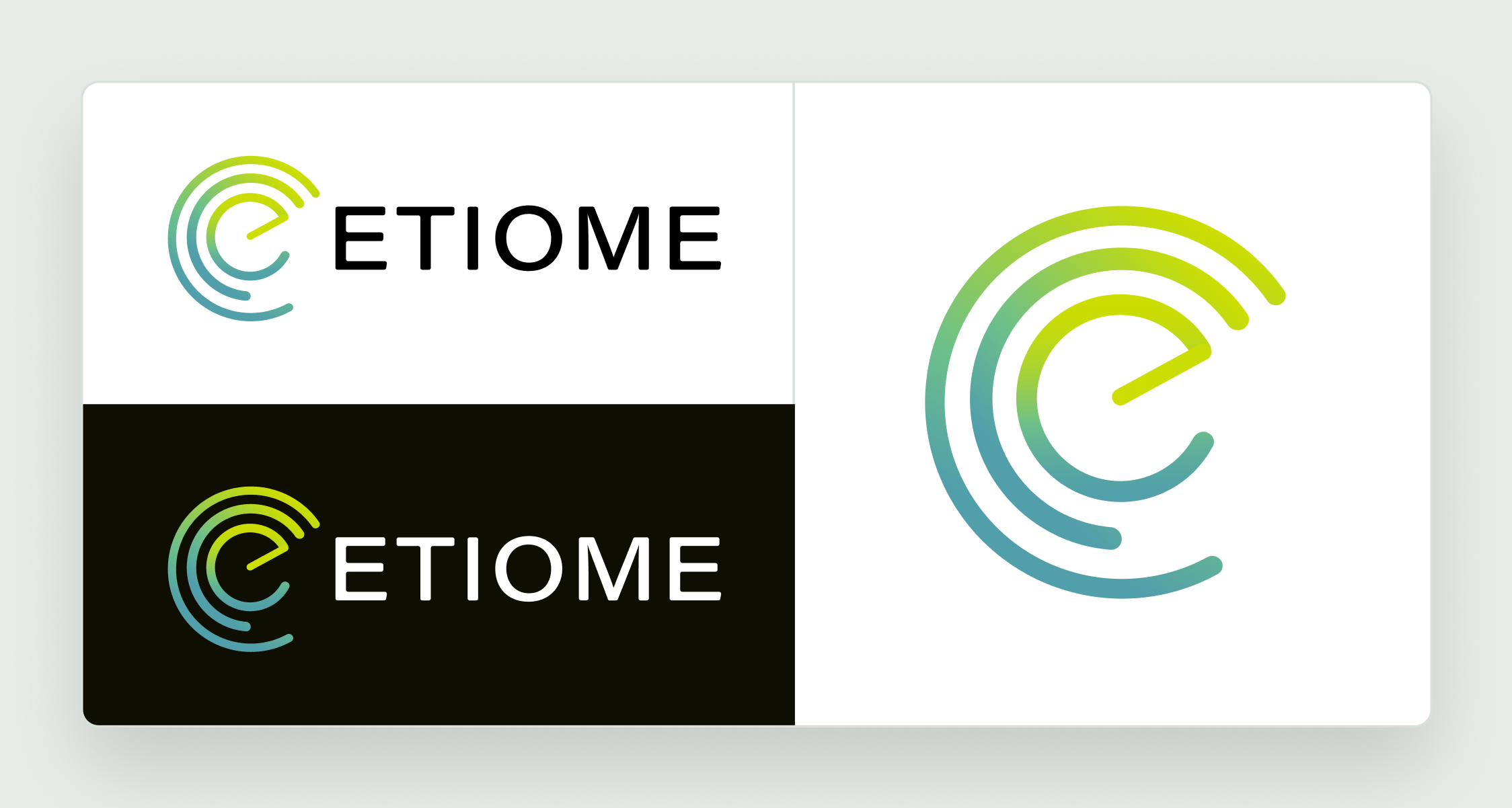
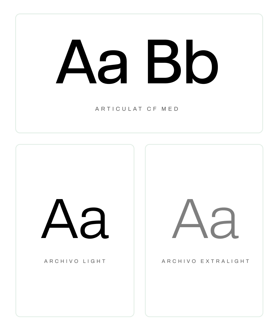
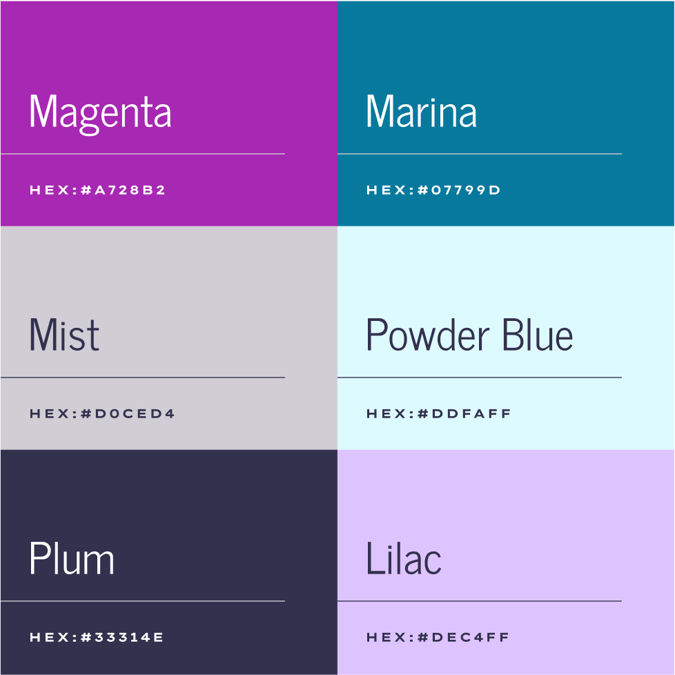
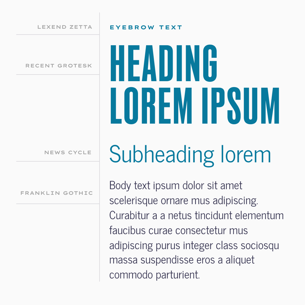
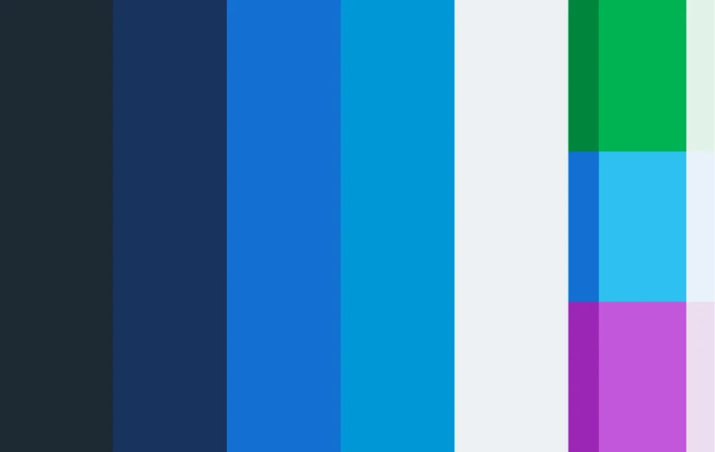
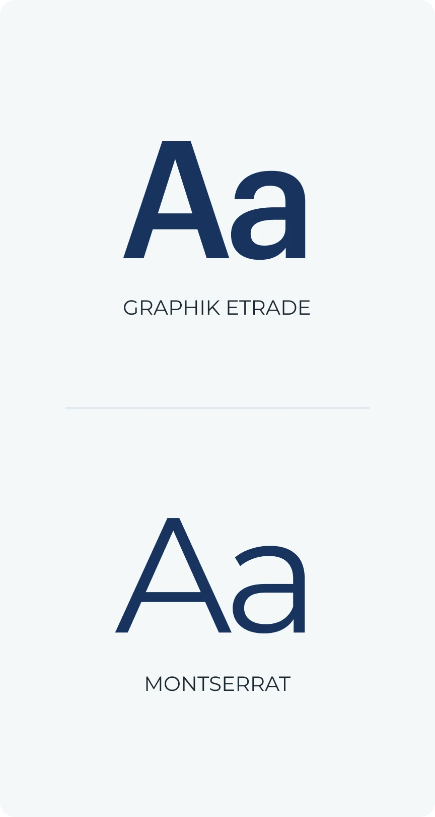
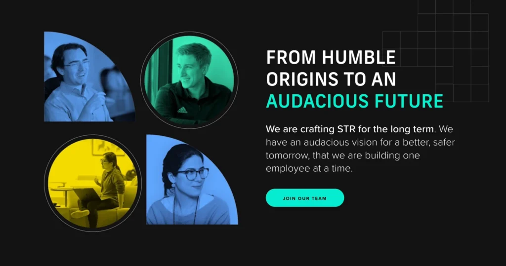
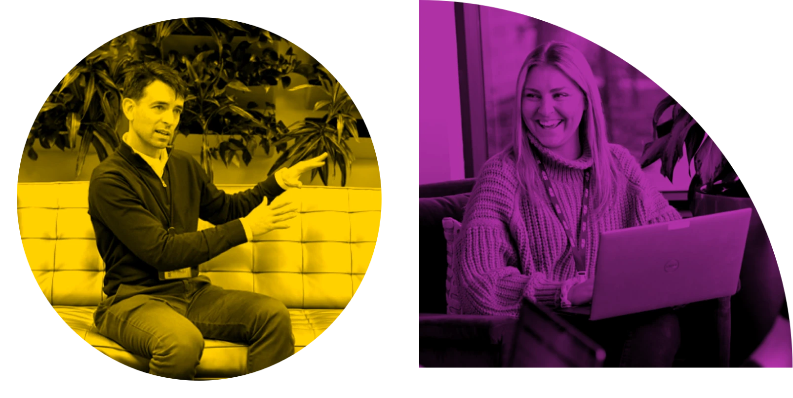
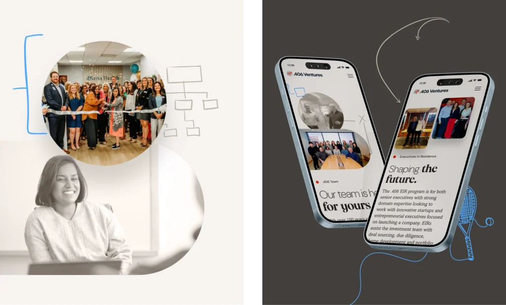
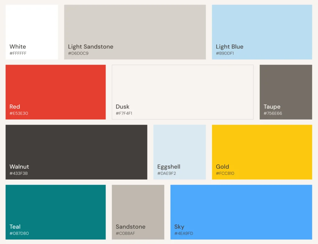
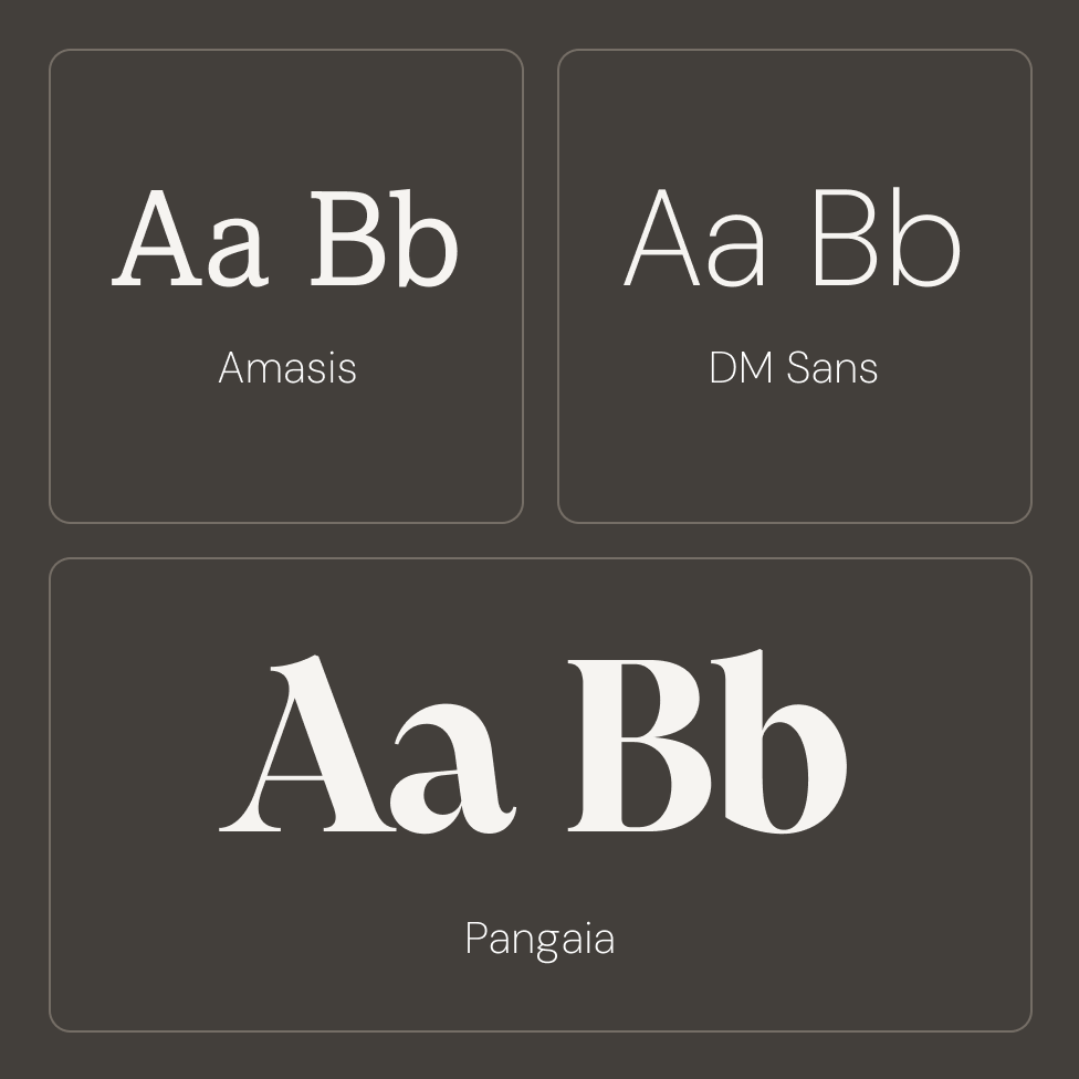
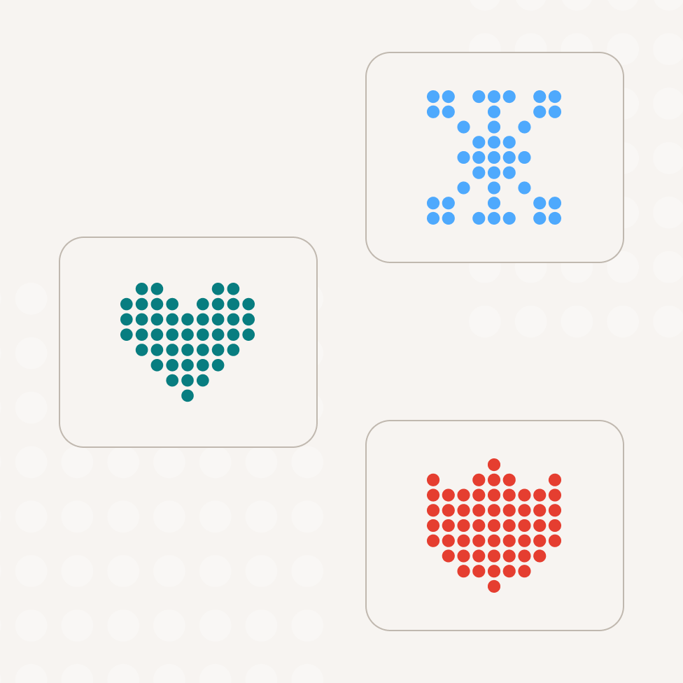
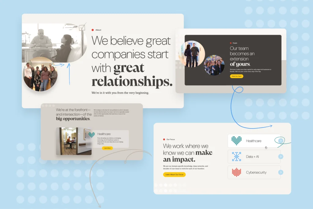
We began with a redesign of the .406 Ventures logo and an animated mark created to bring life to the new site. The next step was expanding their color palette that combined .406’s familiar teal and red with warmer neutrals and brighter accents. This combined with a bold new typographic style and the evolution of the brand began to take shape. Additionally, we turned to candid videos of .406 team members annotated by hand-drawn pen scribbles to the site to ensure a human touch throughout the system.

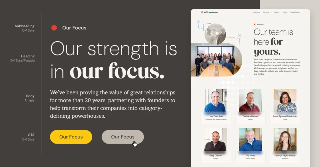
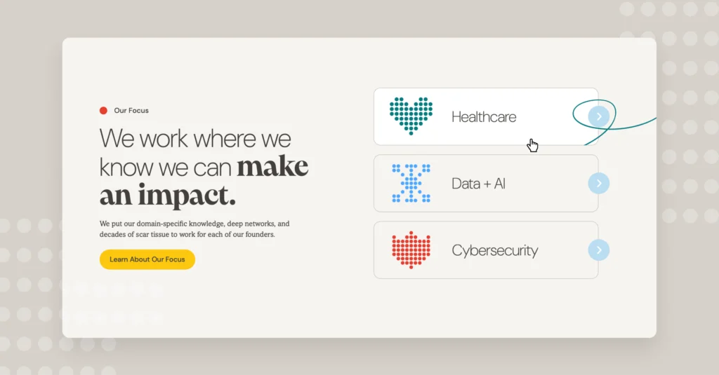
During discovery, we quickly saw a need to better connect portfolio companies, .406 partners, and their areas of focus. To do this, we developed a streamlined user experience designed to emphasize .406’s investment sectors, portfolio successes, and core differentiators—all while reducing repetitive content and supporting readily changing needs.

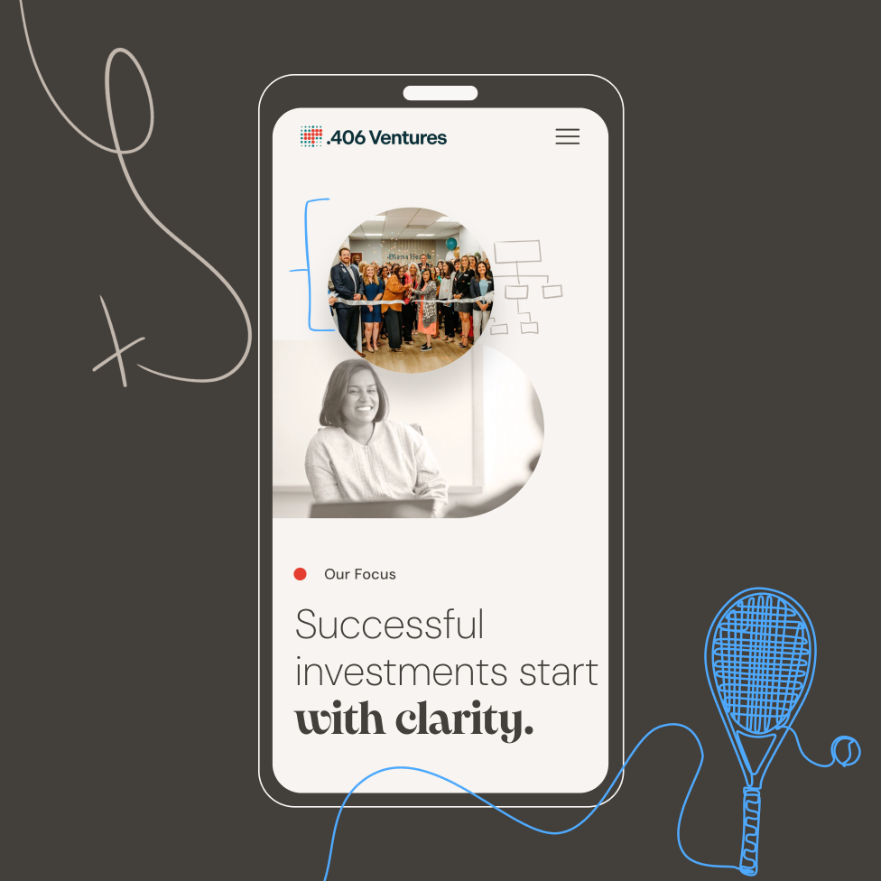
The result is a website that delivers on the client’s goals: it differentiates .406 from peer firms, makes key information easy to find for founders, limited partners, and other stakeholders, and creates a confident first impression. The new site authentically communicates who .406 is with an approachable tone and aesthetic that feels entirely their own.

Get In Touch

We are full of ideas, we just need someone to share them with.

Terrana

A Confident Launch for a Breakthrough RNA Ag Bio Platform

Brand Backstory

Founded by Flagship Pioneering in 2021, Terrana Biosciences is using RNA to create adaptive, non-GMO crop protection and resilience tools. The science is deep, but the goal is simple: help growers meet climate and yield challenges faster, cheaper, and more precisely than chemical sprays or breeding ever could.

Our Role

  • Logo
  • Brand identity
  • Content Strategy
  • UI/UX Design
  • Development
  • Creative Partner

Industry

  • Sustainability and AgBio

The Business Problem

Terrana had a groundbreaking platform and $50M in initial funding but no public-facing narrative. The site needed to launch simultaneously with press coverage and immediately establish credibility with investors, partners, and talent. We had to get the science right and make it actionable for people who weren’t steeped in synthetic biology.

The Aha Moment

Our breakthrough insight came from a shift in framing: Terrana’s RNA platform doesn’t alter the plant genome—it delivers adaptive instructions. That mental model helped us communicate complexity with clarity. That shift from genetic engineering to adaptive instruction reframed everything. It gave us permission to lean into accessibility, adaptability, and immediacy across the Platform and Possibilities pages.

Translating Insight to Strategy

We anchored our content and design work in four core principles:

  • Accessible Science: Lead with clarity, not jargon—no buried ledes or whitepaper walls.
  • Dual Value Frames: Make it matter for investors and growers, without diluting either.
  • From Platform to Possibility: Show not just how it works, but what it enables.
  • Durable Modularity: Design content components Terrana could reuse in decks, press, and BD.
Platform Page UX

Modular layout introduces the platform and product classes (Prevent™, Protect™, Improve™) in scrollable sections.

Navigation & Flow

Cross-linking and clear CTAs connect pages and drive users toward Contact and Careers.

Possibilities Page

Reframes the tech as real-world solutions: climate resilience, disease defense, and soil health.

Visual Language

RNA-inspired patterns and movement cues communicate scientific energy without relying on biotech clichés.

Early Impact

While long-term metrics are still maturing, Terrana’s team reports:

  • Investor confidence: Platform page now used in investor and BD outreach.
  • Streamlined messaging: Core messaging applied across decks and collateral

What’s Next

As Terrana evolves its pipeline and enters new partnership conversations, ICS is helping define analytics benchmarks and content plans to support the next chapter—positioning the site not as a static asset but as a strategic tool.

Get In Touch

We are full of ideas, we just need someone to share them with.

Eyepoint

Shaping the Future of Retinal Care

Overview

As a long-standing leader in the eye care space, EyePoint was undergoing a strategic shift, from its pharmaceutical roots to a more biotech-forward future. With deep expertise in drug delivery and a growing pipeline of therapies that simplify and enhance treatment for retinal diseases like wet AMD, they were ready for a reimagination of their brand. 

This repositioning marked a unique departure from our typical biotech brand projects. Rather than creating a new identity from the ground up, ICS partnered with EyePoint to thoughtfully evolve an established brand to reflect the cutting-edge innovation already fueling its work.

Our Role

  • Brand strategy
  • Brand identity
  • UX/UI Design
  • WordPress development
  • Collateral
  • Brand Guidelines

Industry

  • Biotech & Life Science

The creative solution

This new digital presence highlights innovation, expands the visual identity, and better communicates EyePoint’s scientific leadership. As part of the engagement, ICS also designed EyePoint’s Investor Relations (IR) site, an essential and critical platform for this public company. In fact, one of the most pressing needs we identified during discovery was to ensure a seamless transition between the corporate and IR sites. This was critical not only for UX, but in reinforcing brand consistency, and building trust with investors and stakeholders alike.

Throughout the new site, we emphasized the concept of vision both literally and metaphorically by incorporating imagery of the eye to evoke clarity and focus. We modernized the visual identity by expanding the original color palette and introduced updated scientific imagery to better showcase EyePoint’s depth of expertise while staying within the newly established design system.

A cohesive brand

The result is a refreshed digital presence that feels both forward-looking and deeply-rooted in the company’s commitment to innovation in retinal care.

Get In Touch

We are full of ideas, we just need someone to share them with.

Single Cell Discoveries

Redefining the CRO

Overview

Founded in 2018, Single Cell Discoveries is a Netherlands-based CRO with a focus on single-cell sequencing services — some of which have been developed by the company’s founder. As they were entering their next stage of growth, they were building out a new lab space and wanted a brand a site to reflect this evolution. 

The reimagining of the logo centered on the basis of their work: the cell. We took inspiration from the spherical shape of a singular cell, adding layer details that evoke a sense of data and sequencing ultimately resulting in a bold, modernist mark that feels vibrant and dynamic with a sense of possibility and discovery. The rest of the brand was took a minimal, simplified approach to design with modern layouts that feel tech-driven and innovative, while still feeling highly approachable and accessible with colorful accent details.

For the site, we knew the IA was going to be a crucial part of the UX. With so many service options, many of which unique to Single Cell, we had to organize them in a way that made sense to their target audience. Ultimately, we decided on a large flyout that offered enough real estate to imply hierarchy and to provide a brief description of each service. When combined with the refreshed identity and brand style, the new site exudes a confidence and scientific creativity that allows Single Cell Discoveries to transcend what it means to be a contract researcher.

Our Role

  • Brand identity
  • UX/UI Design
  • WordPress Development
  • Information Architecture

Industry

  • Biotech
  • CRO

Get In Touch

We are full of ideas, we just need someone to share them with.

Sapient

Seeing the invisible — at scale

Overview

Sapient is a specialized CRO that facilitates drug development by identifying biomarkers through advanced technology, data analysis, and a large patient database. Armed with a fresh logo, they came to ICS for a modern website designed to give users an understanding of their technology and to differentiate them from other CROs. The plan was to design a clean, simple UX for easy website navigation, reflecting Sapient’s ability to handle complex tasks at scale and clearly communicate its primary value proposition.

Sapient’s visual identity embodies its industry leadership through sleek, minimalist, and highly polished design. “Dark Mode” elements with darker backgrounds and strategic use of bright, bold colors project innovation and strength. We used the “Specificity at Scale” theme and visualized the discovery of the imperceptible using details within complex elements, referencing the abstract linear elements of the new Sapient logo.

Our Role

  • Brand identity
  • Web Design
  • WordPress development

Industry

  • BIotech
  • CRO

Get In Touch

We are full of ideas, we just need someone to share them with.

Etiome

Designing a brand to make the invisible visible

Overview

What if we could stop disease before it starts to feel like disease?

Most of the healthcare world treats illness after symptoms appear — by then, the damage is already done. Etiome is flipping that model.

Built on the science of Temporal Biodynamics™, Etiome is pioneering a new category of care: preemptive healthcare. Their platform detects “silent-stage” disease — the early, invisible shifts happening at the molecular and cellular level — and develops biostaged medicines that can halt or even reverse progression before it becomes irreversible. It’s bold. It’s sophisticated. And it needed a brand experience to match.

Our Role

  • Brand strategy
  • Brand identity
  • UX/UI Design
  • WordPress development
  • Collateral
  • Brand Guidelines

Industry

  • Biotech & Life Science

Designing for a new kind of medicine

Etiome came to us to help them introduce this wholly new way of thinking about health with a visual identity and website that could carry the weight and potential of the idea.

They weren’t looking for sleek futurism or wellness-lite. They needed a design that could express the precision of their science, the humanity of their mission, and the potential of building a platform to detect disease before it’s even felt.

So that’s where we started: with time, biology, and the belief that invisible doesn’t mean unknowable.

Making time visible

Etiome’s platform doesn’t just detect disease — it maps the progression of disease biology over time. It identifies where someone is along the disease continuum, confirms biostages with temporally relevant biomarkers, and enables interventions that are precisely timed to stop the progression of disease.

That idea — identifying and delivering stage-specific therapies to the right patient at the right time — shaped everything we designed.

We developed a visual system that blends geometry with humanity: silhouettes layered with subtle distortion, structured patterns that suggest motion, clarity, and control. A restrained palette, confident type, and flexible design system gave the brand both scientific credibility and creative range.

The UX and UI followed suit — intuitive, clean, and carefully paced to guide users through a complex story without overwhelming them. Every scroll, every detail, aimed to make the invisible feel real, and the future of medicine feel tangible.

From stealth to standout

The site launched alongside Etiome’s emergence from stealth in Spring 2025 — helping them introduce a high-stakes new idea to the world with the kind of presence it deserves.

Now, with a brand that reflects the boldness of their science, Etiome is positioned to attract top-tier talent, secure partners and investors, and build the future of preemptive healthcare — one biostage at a time.

Get In Touch

We are full of ideas, we just need someone to share them with.

Solu Therapeutics

A platform for the clinic and beyond

Overview

We partnered with Solu Therapeutics to craft a bold, science-forward brand and digital experience that clearly communicates the promise of the CyTaC Platform and the strength of the innovation behind it.

As Solu moves closer to clinical trials, they recognized the need for a digital presence that could evolve alongside it, one capable of conveying its scientific approach, mission, and momentum to a range of  audiences.

We set out to establish a compelling, professional website that reflects the sophistication of Solu’s science and the impact of its work. The new site needed to articulate the capabilities of the CyTaC Platform, spotlight progress in Solu’s lead program and broader pipeline, and introduce the leadership team behind the innovation. Designed with future investors, pharmaceutical partners, and prospective hires in mind, the site serves as both a storytelling platform and a strategic communications tool.

Our Role

  • Brand strategy
  • Brand identity
  • UX/UI Design
  • WordPress development
  • Collateral
  • Brand Guidelines

Industry

  • Biotech & Life Science

The creative solution

To bring this vision to life, we developed a digital experience grounded in scientific precision and innovation. Abstract visuals and technical patterns signal discovery and progress, while clean, open layouts ensure clarity across complex subject matter. Scrollytelling, paired with dimensional illustrations and modular content, helps explain the CyTaC Platform in a way that is both engaging and accessible. Strategically placed video content offers a glimpse into Solu’s collaborative team culture and reflects the human purpose behind its breakthroughs. The site also highlights the speed and breadth of Solu’s pipeline and elevates the leadership team’s deep expertise. Throughout, content is carefully structured to underscore the novelty and potential of the platform, setting a strong foundation for continued growth as Solu advances toward the clinic.

A cohesive brand

Beyond the website, we delivered a cohesive set of brand assets to support consistency and scalability across all public-facing communications. This included a comprehensive style guide, custom business cards, and a branded PowerPoint template, tools that enable the Solu team to present a polished, unified identity across all channels.

Solu’s evolved brand integrates a refined visual system, strategic storytelling, and a seamless digital experience, positioning them as a company moving forward with clarity and confidence. The CyTaC Platform is presented not only as a breakthrough in targeted medicine, but as a platform of rigorous methodology and a bold, future-facing vision.

Get In Touch

We are full of ideas, we just need someone to share them with.

Gradifi

The benefit of financial wellness

Overview

On the verge of being acquired by Morgan Stanley, Gradifi, a student loan and financial wellness benefits provider, was in need of a brand overhaul. They were looking for a way to appeal both to companies who might be interested in adding these benefits as well as the employees themselves. Along with this, they needed their site to communicate what Gradifi does and the benefits it offers employers and employees.

In order to vet our concepts, ICS enlisted the help of a variety of users from across the country. These live message tests quickly surfaced favorable messages and visual concepts. From there, we refined to better align with the existing style and the needs of the client team. We used color to connect with specific products, updated photos to look more natural and less classically stock, all while using strong, concise messaging, and a generally clean, bold look. The result was a fresh brand identity that built upon their existing brand colors and assets.

Our Role

  • Brand Identity
  • UI/UX Design
  • Competitive Analysis
  • Message Testing

Industry

  • Financial Services

Get In Touch

We are full of ideas, we just need someone to share them with.

STR

Bringing clarity to a complex mission

Overview

STR makes the world a safer place by developing technology and applying it to solve emerging national security challenges. Their technology platforms tackle tough problems in cybersecurity, distributed sensing, and artificial intelligence to deliver mission performance. However, because of the sensitivity of the work they do, they found it difficult to attract technical talent to their rapidly growing company.

We worked with their team to design a site and brand that would show off a bit about what they do and give job seekers a true sense of their open, dynamic company culture. The brand identity uses a combination of custom candid photography married with bright, engaging colors, and geometric precision to emphasize the human foundation of their technical mission. The site was organized in a way to allow users to deeply understand their commitment to collaboration and diversity while providing just enough information about their projects without becoming a national security risk. The resulting brand is fiercely dynamic and driven without ignoring the people and perspectives that make them who they are as a company.

Our Role


  • Logo Refresh
  • Brand Identity
  • UI/UX Design
  • WordPress Development
  • ATS Integration

Industry

  • Software & Technology

Get In Touch

We are full of ideas, we just need someone to share them with.

The Double Bull

Beer hall meets dive bar

Overview

Coming out of huge downturn Covid dealt to the restaurant industry, long-time ICS collaborators at the Webber Group had a completely different restaurant concept. They were looking to rebrand and revamp their large airy, industrial-modern space once home to a steakhouse into something with a much wider appeal. The Double Bull Taphouse — a reference the very inner bullseye on a dart board — would be a bit like a beer hall with an elevated pub-inspired menu, but with six dart boards, shuffleboard, a bocce court, and a rotating mix of modern and classic arcade games and pinball — all with a rock and roll dive bar feel.

Like our work on The Bancroft and other Webber Group restaurants, we were given the opportunity to imagine the brand from the logo all the way through to the pens and matchbooks. We landed on a cozy retro look that made use of familiar combinations of strong, saturated colors and various vintage-inspired typefaces. This direction allowed us the freedom to create a number of varied but still tightly related smaller designs and lockups that made their way from the menu, to signage, to an 8’ x 7’ neon logo on the wall.

Our Role

  • Logo
  • Brand Identity
  • Content Strategy
  • UI/UX Design
  • Print and Other Collateral

Industry

  • Restaurant

Get In Touch

We are full of ideas, we just need someone to share them with.